Monday, 23 December 2013

OUGD504 - Design For Print & Web: Website Research

When it came to starting designs for my website, I looked into a few other restaurant websites that were around, looking into the content which was on them and how this was displayed.

Montagü
The designer of this website has created it in a format that can be replicated easily onto any sized screen as it works in squares/rectangles to built the page up. Throughout the different responses each is maintaining very clear grid lines and not straying from these. This design also means that no gutters are needed between sections.
I like this design because of how striking each page is. The concept behind the design is very simple, but uses bold images and white content boxes to contrast against one another and create a very clean, professional looking website.
http://www.behance.net/gallery/Montague/11632237

Oyler Market Barbecue & Brewery
The branding of this restaurant is all monotone, and this is reflected through the website design. There is a mix of photographs, vectors and technical drawn elements, particularly in the phone App design. Everything is centralised and the information displayed is only the necessary information.
I like this website design because of it's simplicity. The background is simple a photograph, and then the content boxes/content appears over the top. It is clearly a website built for it's purpose and not to have all the bells and whistles. The monotone also works well, especially when the information is in the white writing over dark images.
 
http://www.behance.net/gallery/Oyler-Market-Barbecue-Brewery/12801457

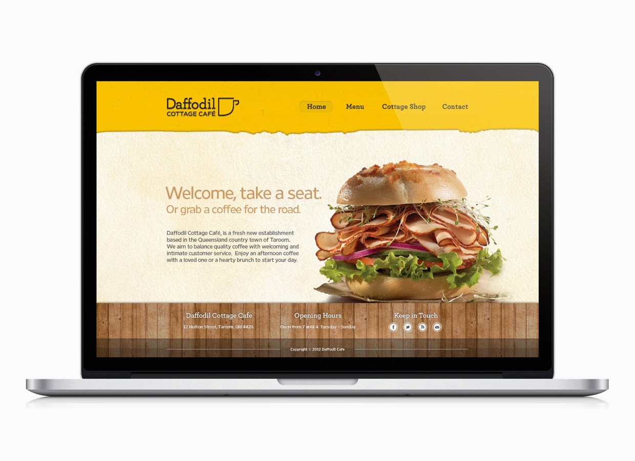
Daffodil Cottage Cafe
The design for this website is different from the two above because it is built to look a lot more homely and welcoming than them. There is still a clear grid to the way these pages have been built, but the content within the pages is what is making it a lot more of a clean design. The App has an interesting idea where users can take photos of their purchases, so this is one of the better parts of the design.
I am not too keen on this website because I prefer the more professional and striking ones, but it does show how a more relaxed and laid back approach to a website.
http://thomasbutler.prosite.com/93772/836856/projects/daffodil-cafe

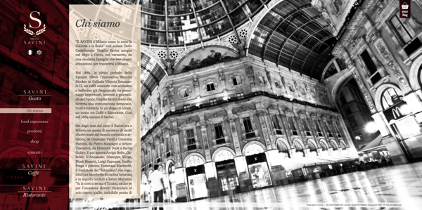
Savini Gusto
This design of website reflects the professionalism of the restaurant itself. It is structured in a clear way and keeps the same format for every page, just the content box spreading across depending on the page. The deep red of the navigation bar makes it obvious to the viewer that this is the most important element on the page, and makes it stand out against the content and background images.
I like the initial first page, however I'm not a huge fan of the content moving out from the side. In this instance it does work because of the context, but I would prefer the information to be central.
 
http://www.behance.net/gallery/Savini-Gusto/10314831

Common Man
This is the homepage for the Common Man restaurant. It has a very simple layout, which works very well because of the contrast of the text to the images, and then the images to the background. It is all central and all fits onto one page so there is no scrolling necessary.
I like the way the rollover buttons work, changing colour dramatically and bringing that image to the forefront of the website against the brown. I like these buttons in general as not many websites use images like this for the links.
http://www.josipkelava.com/41371/505875/gallery/common-man-restaurant

Tequila Grill
Once again this website uses images as the background to the pages. The navigation bar on this website is fixed and in the orange, which stands out against any of the images used in the background. The way the logo has been incorporated into the bar makes the whole website look very fluent as none of it looks just cut and paste.
Overall I'm not too keen on the website, however I do like the way the headings have been put onto the pages, with the bold white around them to make them stand out. I also like the way the navigation bar has been put together to work with the rest of the page.
 
http://www.behance.net/gallery/Tequila-Grill/11862641

Mundo Cafe & Bakery
This website works on a clear grid system with all the content centralised on every device is it used on. The colours used are quite earthy and natural as it is for a cafe & bakery. It reflects the quality of the products served.
I like the simplicity of the layout and how drawn images and photographs are incorporated into the design to create a very clean and professional, but contemporary website design.
http://giselabeer.com/Mundo-Cafe-Bakery

After this I started looking into some websites which had elements that I found visually appealing.

Horten Hus
I like the general layout of this website. There's a lot of space and everything isn't crammed in small spaces close together. It works to a clear grid system and doesn't have so much information on each page. I also like the way the navigation works on this website, with an initial four icons and then the larger navigation bar which opens when clicked on. It is all very clean and simply laid out so it is very easy to navigate and look around.

http://www.hortenhus.no


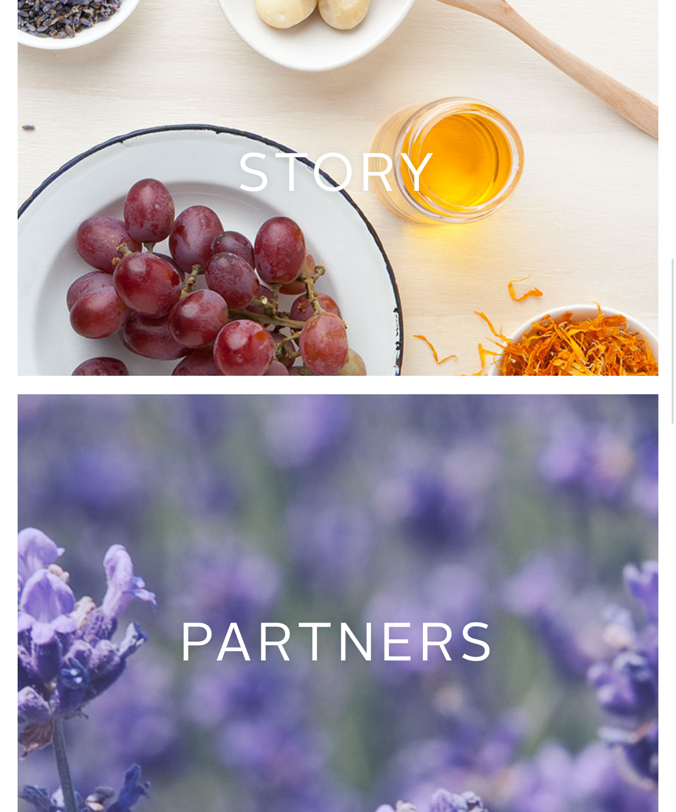
Metta Skincare
I like this one because of the simplicity of it. A navigation bar along the top, and then one larger image with a bit on text on explaining the purpose of the website. I like this use of photography, using the white space in it to place the text there. Moving onto the content pages, the information is displayed very simply with a large amount of space around the content. It makes everything much easier to focus on and view.
http://www.mettaskincare.com/partners/

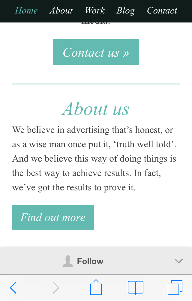
House Creative
I chose this one because of the layout. This website holds a large amount of information but has displayed it in a simple and easy to navigate way, with a lot of large clear links onto other pages. This website also doesn't have much of an emphasis on the navigation. It is only a small bar along the top.
http://www.housecreative.co.uk

Demi Creative
I like this website because it combines simple design and photographic images. It uses different colours to differentiate the pages from one another, and when scrolling down the page, it goes through different tones of that colour, breaking up the information into readable sections. This is a much more interesting way of displaying information than just having it sat on the page all together, it encourages the user to scroll through.
http://demicreative.com

Two Fish Illustration & Design
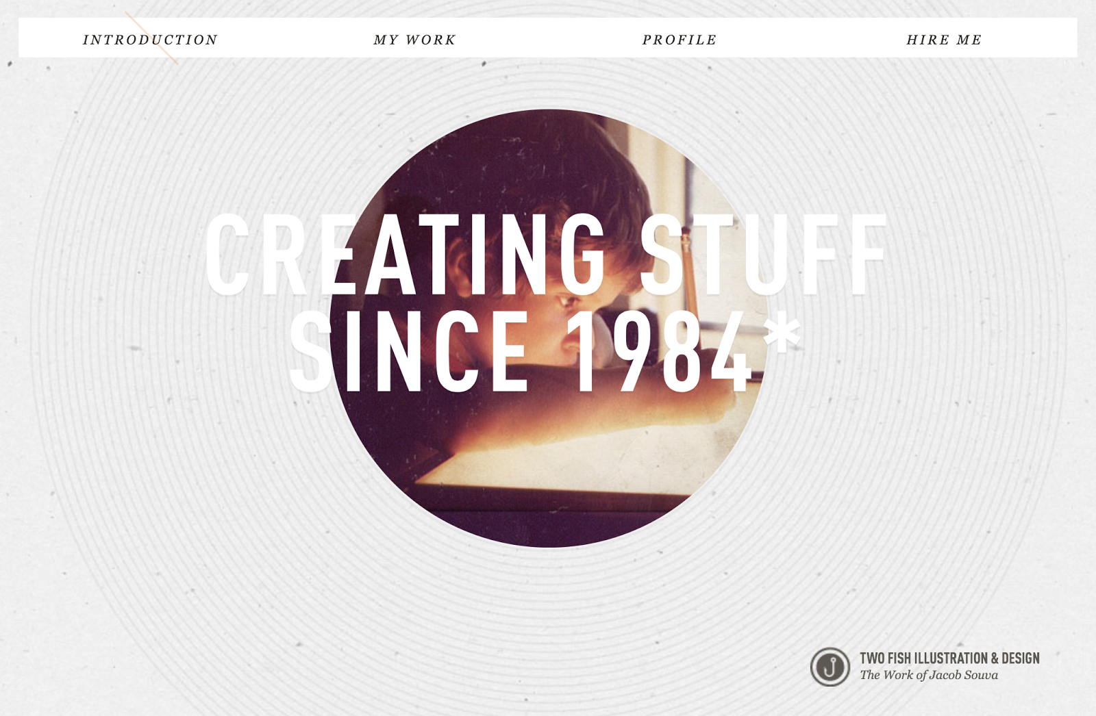
I like this website because of the lack of colour on it. It keeps everything quite monotone, apart from the image which is in colour and stands out against the rest of the page. The main feature of this website that I like is that it is a completely linear website and all the information is on one scrollable page.
 
http://twofishillustration.com

Axeant
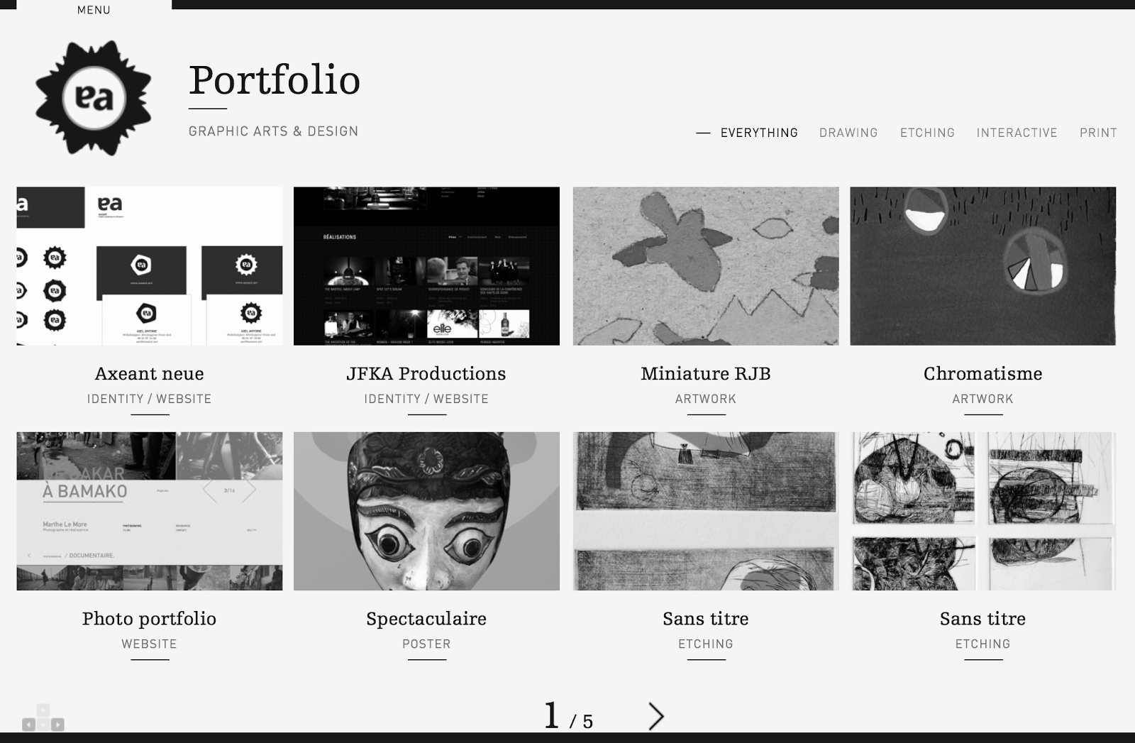
I like this website because of how simple the homepage is. There isn't any noise and each link is given a large amount of space on the page. This website definitely works more for function than form, and doesn't have anything that isn't necessary.
http://www.axeant.net

MediaBoom
This website is a bit showy at first, with a big video introduction, but when looking through the pages I found I did like the overall layout of information. The navigation bar is easy to use, with all the options appearing when a link of hovered over, and a lot of icons around the place relating to different content.
The things I don't like about this website is how long it takes to load. The designer has packed it full with a lot of effects and moving images behind each page which makes it very inconvenient for the user.
http://mediaboom.com

I then looked at what these websites looked like on a phone & tablet to see the difference in design.
Horten Hus
iPhone:
The adaptation of the website to the iPhone screen size is an obvious one, where it has kept the same design features as the website, but displayed them in ways that are much more user-friendly at this screen size. The icons have now become clear buttons and the format has been changed to suit the orientation of the screen.What I like the most about this design is the navigation. I like this on the original website and like the simple way they have adapted it to this screen size. Overall the initial website is designed with easily adaptable content, which has definitely made this much easier for the smaller screen sizes.

iPad:
The iPad site is much the same as the website visually. It is identical, but with this screen size it still works well because of how simple the original design is to begin with.

Metta Skincare
iPhone:
There isn't much change to the website in terms of adapting it to this screen size. The one noticeable different is the top menu bar. On the website there are a number of links, but on this one there is only two. Clicking on the 'menu' brings up the rest of the options for this website. The initial website is quite simple so adapting it to this screen is something that was very easy.
However something I don't like about the design is when it gets down to the picture links. These work ok on a portrait screen, however on a landscape orientation these become as large as the screen and suddenly you only have one link on the page instead of having all three. This seems pointless and an inconvenience to the user as they now have to scroll through to get the next link.

iPad:
The adaptation to the iPad is exactly the same as the iPhone. The only difference is that when in a landscape orientation the website is immediately the original desktop website, with the full navigation restored. Once again I have a problem with the picture links, but this time on the portrait orientation. Like on the iPhone these fill up to the edges of the screen, which isn't really necessary. On the phone as it is much thinner it works ok, but on this screen size it seems pointless, especially when it is a larger size where these can be viewed just as easily at a smaller scale.

House Creative
iPhone:
The adaptation to the phone screen isn't something I am overly impressed with. On a desktop it works well, but at this size, the large heading pushed the rest of the information off the page, which isn't exactly a good use of space. Another issue is the navigation bar on a portrait orientation. The buttons become very small and hard to use without having to zoom in.
The 'work' page works well on a portrait orientation, but on a landscape one it doesn't really because the image is the width of the screen, meaning you can't see all of it without scrolling through it.

iPad:
This iPad version of the website isn't much different from the original, however something that does annoy me is the navigation bar again. While they have the chance to make it larger and easier for a user, they haven't. The text is small and in turn quite hard to use. However the layout of the 'work' page is much better on a landscape orientation than the phone as you can see the full image easily.

Demi Creative
iPhone:
The designer of this website has clearly thought about how it will adapt to a phone screen. Instead of having the title in the navigation bar, it is replaced with a small logo instead, which means the words can be larger and easier to use instead. It is very similar to the original website because it is of a design that can easily be adapted. It works well on a portrait screen, but less so on a landscape one. The information is displayed well on both, but the 'work' links aren't entirely suitable for a landscape page as it only fits barely two at a time.

iPad:
This adaptation is like the desktop website, however slightly changes on the 'work' page with the links, making it much more efficient for use of space and for the user to see everything at once. The website is built in a way of having a few main pages and then a linear system through each of these, making it easy to apply and adapt the content to any screen size, as shown here.

Two Fish Illustration & Design
iPhone:
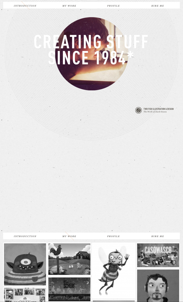
This is a clear example of a website that hasn't been changed it any way to suit the screen size of a phone. It is exactly the same layout as on the desktop, which isn't necessarily a bad thing in some cases, but when it comes to putting the website portrait on a small screen there are some issues. The use of space isn't very good, as shown above. There is a huge gap, which could be easily used up so there could be a clearer and larger navigation bar. Also the way the work is displayed makes it hard for a viewer to see the images at a good quality.

iPad:
On this larger screen size the website works ok, but there is still the issue of the large gap, which could be used for expanding the navigation bar. The website could definitely benefit from being redesigned for a different screen size.

Axeant
iPhone:
This website shows a clear change from the desktop version to the phone version. The layout is different throughout and has been designed to be more useful for the user. The adding of the menu bar makes it especially easy to the user, and the layout for the content is much more driven to a smaller screen.

iPad:
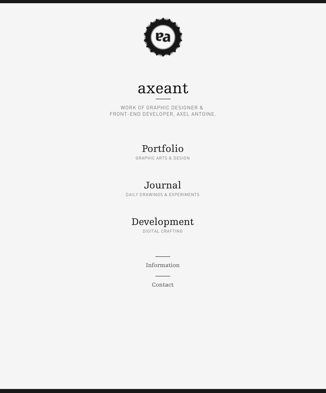
The adaptation to the tablet screen is interesting because it is a mix between the desktop version and the phone version. It shows how a website should be designed for different screen sizes and uses, the desktop with all the bells and whistles, and then that content narrowed down for the tablet, and narrowed down further for a smaller screen.
The menu selection on the landscape orientation is an added feature that isn't on either of the others, showing that there has been some consideration into adding new features and measures to ensure usability is at the easiest it can be.

MediaBoom
iPhone:
I was a bit skeptical as to how this website would adapt to the smaller screen size as it really is a website that goes all out with all the features, with videos and moving images on the background of every page. However I found that this responsive size was much simpler and cut out all of that, just having the base website and the information on it. It worked well at both orientations though I do think the navigation on the portrait orientation could be bigger. But overall it works well and fits to the page nicely.

iPad:
Like the phone screen size this fits nicely to the size and keeps a consistent grid system throughout each of the pages, with each to read information. As the screen is larger the small navigation isn't so much of a problem, but still could be improved for usage.

Looking into the phone/tablet versions of these websites has been helpful as it has shown me the big do's and don't's of designing for different screen sizes. Using the websites on my devices was extremely helpful as well as I was the user of these websites and went through all the pages, noting the problems with each and the inconveniences to me as the user. This helps me as a designer because I can now design around those ideas and try avoid as many of these problems as possible.
The biggest problem I found was the navigation on some of these websites weren't adapted correctly for the screen size. It seems some have been designed depending on the pixel size of the screen instead of the reality of what they would be displayed on, with some of the menu bars being ridiculously small on a phone screen, making them very hard to use without zooming in. Also the use of large images is something to avoid if a user is looking at the website on a small screen at a landscape orientation. Having them fill the width of the screen causes it to be very hard to look at it as a whole, especially without the option to zoom out.
The elements that did work were the websites that made changes to clearly adapt to the screen sizes and had thought about the devices themselves and how they are used. Where the menu bars have been increased in size or turned into buttons rather than words were much easier to use and navigate through the website.

Saturday, 21 December 2013

OUGD504 - Design For Print & Web: Packaging Research

As the main elements of my print media is going to be packaging, I had a look into this area for food, drink & condiments to see what trends were there and what worked and why.

Drop Coffee Roasters
This packaging caught my eye because of the simplicity and the media used. Unlike most coffee bean packaging, tins, this is created using cardboard. The design is simple with little colour used, using the colour of the packaging as a defining feature. The modernist approach of function before form is clear in the artwork design, with no more than the needed information and a lot of space for each piece of information to breath.
http://www.thedieline.com/blog/2013/11/27/drop-coffee-roasters.html?SSScrollPosition=298

La Catedral de Navarra
This is packaging for canned & bottled vegetables. This is very relevant to this brief as the labels are completely typographical. The black label against the bold colours of the contents give an overall striking appearance which really makes them stand out against the typical packaging in this area.

Burger Station
This is redesigned branding & packaging for Burger Station. It is relevant as it has the elements of which I will be creating for this brief. It has a variety of different burger packaging, as well as labels for condiments. This shows that the packaging doesn't need to be something over the top to be noticeable. The packaging is branded with stickers, each which indicate the brand and the contents inside.
http://www.thedieline.com/blog/2013/11/8/burger-station.html?SSScrollPosition=394

Breadshop
This packaging is even more simple than a box, just using tissue paper wrapping & a sticker. Packaging doesn't necessarily have to be a completely perfect net box, it can be as simple as wrapping some tissue paper around the product & using a tie or sticker to hold it together and brand it, and still have it looking sophisticated. Sometimes less is more.
http://naauao.com/Breadshop

Zealong Flavoured Tea
This packaging is interesting as it is made entirely from folding the stock. It is also a different style of packaging from the ones above as it has a lid and a contents holder separate, and uses two different stocks for these. The lids of these packages are all the same stock, but with different coloured stocks for the bottom to differentiate the products.
http://www.thedieline.com/blog/2013/9/16/zealong-flavored-tea.html

Williams-Sonoma BBQ
These are label designs created for sauces. These are interesting as a range because each sauce has it's own identity within the range, with it's own colour scheme and typefaces, making each distinguishable. What joins them together is the containers.
http://www.thedieline.com/blog/2013/9/4/williams-sonoma-bbq.html?SSScrollPosition=295

Crazy Good Bread
This is a completely different take on packaging for a loaf of bread. Instead of using a plastic wrapper or brown paper bag, a cleverly designed card box has been created. It makes the product stand out amongst the others in this industry. The design is simple, but because of how the packaging works and product has been executed, it looks so much more than it actually is.
http://www.thedieline.com/blog/2013/8/28/crazy-good-bread.html?SSScrollPosition=196

Real Food Botanica
This food packaging is made up of standard packages, which are branded by stickers. What's interesting about these is that each sticker is different depending on the packaging & content. These have been created t one contrasting to each of the materials used instead of having one standard sticker. These stickers hold quite a lot of information on them, but is balanced by the plain packaging.
http://www.thedieline.com/blog/2013/7/30/real-food-botanica.html?SSScrollPosition=79

Illegal Burger
This is a range of packaging created for a burger restaurant. What I like about this packaging is that there is a pattern in use in the top of the burger boxes and in the coffee cup holder. Using this really makes these packaging elements stand out against the rest and gives a lot more character instead of just a plain box.
http://isabelarodrigues.org/project-view/illegal-burger/

Meat & Bread
I like this packaging because of the complete simplicity of it. It uses just black on white & vice versa for all branding, and keeps packaging to a minimum. Each product is labeled with the brand logo and the name of the product, with no images or noise.
http://www.thedieline.com/blog/2013/7/22/meat-bread.html?SSScrollPosition=210

Thursday, 12 December 2013

OUGD501 - Lecture 9: What Is Research?

The Age of Enlightenment

  • Process of rationality and reason
  • Enlightenment - period in the 18th C when scientific philosophical thinking made leaps and bounds
  • Secularisation - reason rather than Metaphysics
  • Belief in an unified scientific method
  • Positivism

C.P Snow

  • The two cultures and the scientific revolution - 1959
  • The arts & the sciences were two different agendas - could never fuse together

Positivism

  • Positive outcome - definite outcome - it does something
  • Facts
  • Separation of facts from value (value freedom)
  • Measurement rather than argument
  • The facts speak for themselves
  • Causation
  • Separation and control of variables
  • Rigorous methods
Approaches to research
  • Empiricism - scientific research - setting up an experiment & observing
  • Quantitative research - numbers, charts
  • Qualitative research - opposite side to quantitative - interviews etc
  • Subjectivism
Action research
  • Academic way of planning out & carrying out research - actively taking part
  • Cycle - Researcher enters - Real world takes part in - action in the situation enables - reflection on the involvement leads to - findings/beginning of cycle
Cycle of Synthesis
  • Unification of doing
  • Theory, Action, Reflection
Methodology
  • Method - A way of proceeding about something in systematic or logical manner
  • Methodology - The science of method, employed in a particular activity
  • Some methodologies: Historical, communication, theory etc.
Epistemology
  • Ways of thinking about thinking
  • Ways of thinking, and selecting between different approaches to a subject - knowing the routes and their outcomes & choosing one in particular because of this
The Hermeneutic Circle
  • First grasp - inspection of detail - global inspection - deeper understanding
  • Constant refinement
  • Developed by Heidegger
  • Interpretation is a process designed to clarify an experience and assign meaning to it
  • This is aided by the hermeneutic circle which involves looking at different perspectives on events and relating individual components
  • Ricoeur - anything in the world can be interpreted in three different levels - behind the text, in/through the text & in front of the text

Friday, 6 December 2013

OUGD504 - Design For Print and Web: Restaurant Research

To start this brief off, I looked into restaurant/cafe branding which has been previously done. This is so I have an insight into what exactly has been branded, what products have been created and how designers have integrated the print and web aspects to their briefs.

The first one I looked at was 'Victory', a sandwich bar.
Branded items include:
  • Coffee cups
  • Glasses
  • Bottles
  • Sandwich wrappings
  • Sandwich bags
  • Box packaging
  • Menu
  • Coasters
  • Business cards
  • Exterior Signage
  • Van
The branding has been kept very simple, just black on white/white on black, with one logo made up of two elements, each which are used on their own and together to create the overall branding for this cafe. I like this as it keeps everything simple and doesn't complicate branding and have a number of different symbols/colours over a range of media. Everything is slightly different, but very clearly together.

In regards to the approach of the website, like the printed branding, it is all based on greyscale, just using simple black and white, and a simple layout. In the app, the sandwiches are what are in colour and are made to stand out. The same buttons/links are used on the website and app, keeping a consistency between them. Unlike the branding though, the apps seem a lot less casual and laid back. They have a more formal appearance, whereas the print branding does seem a lot less structured.
My overall feeling on this branding is that I like it because of the simplicity of all the designs and consistency throughout all media. There's nothing overcomplicated about the branding, no cheesy slogans or number of vector images to back up the brand. It's plain and simple and works very well.

The second restaurant I looked into was 'Esplanades', an Italian restaurant. Contrasting to the example above, this brand uses 7 different colours for it's branding and has a very different approach. However, these colours are manly used for text/outlines, he main colour being the stock colours. The media that is branded is different as well. As this is a restaurant and not a takeaway shop, there is no packaging branded, but napkins, pencils and vouchers instead. The branding is very simple, just a simple symbol and the restaurant name underneath, sometimes not even that. 
The website very much represents the brand, keeping in with the simple structured layout and minimal use of the colours. It is one continuous page, which works very well as there isn't a huge amount of information and not really much need for separate pages.
I prefer the approach to this website to the one for 'Victory'. It seems a lot cleaner and fits in with the brand very well, using elements from the printed branding throughout to combine it all together as a full brand identity.
Designer Website
Restaurant Website

The third that I looked into was a restyling and packaging development for a burger restaurant chain 'Burger Station'.
This one particularly interested me as the focus was on the takeaway packaging and this is something that I would like to incorporate into my outcome. In this packaging, sauce packaging was included, which is something that I would definitely like to consider.
Like the previous two examples, the branding once again is very simple. Just black & white again, with only two branding items, the logo and a cow face.
My opinion on this is that I like it because it shows how simple branding can be. Stickers stuck onto different media is all that has been used for this, nothing more, and overall I think it works very effectively and is a change from the perfectly printed media.
http://www.behance.net/gallery/Burger-station/11151923

The fourth restaurant I looked into was 'Pidgin'.
This has quite a big focus on typography, which is definitely helpful for this brief. It shows how typography has already been used in the restaurant environment and shows the difference in amount of typography on different pieces of media. For example, the placemats are covered in a more playful approach to type, whereas the menu is a lot more controlled and structured. I like the creative use of type and signs for the bathroom signs. It is a lot more quirky than the standard symbol.
The website follows the same form of the placemats and becomes the main identity for this restaurant online. It is displayed in quite a creative way compared to other restaurant websites/apps. It keeps in with the form of the identity but still manages to give all the information that is needed. Although the pages are quite cluttered as intended, they still manage to have enough space so it is easy to read.
Overall I like the website branding and restaurant interior branding. I do feel that this could have been utilised more through the remainder of the media, but obviously that wasn't the intention. I have learnt quite a lot from this one visually as it shows how a number of different typefaces can be used on the same media.
http://www.behance.net/gallery/Pidgin/11063687

Thursday, 5 December 2013

OUGD501 - Lecture 8: Subculture and Style

Definition of subculture:
In sociology, anthropology and cultural studies, a subculture is a group of people with a culture which differentiates them from the larger culture to which they belong.
  • An introduction to writings on subculture
  • Skateboarding/parkour and free running/graffiti as a performance of the city
  • the Riot Grrrl movement
  • The portrayal of youth and culture in film & photography
Dogtown & Z Boys (2001)
  • Documentary film mixes original footage and recent interviews
  • History of skateboarding evolves
Skater Peggy Oki
  • Not much difference between the clothing that boys & girls wore - jeans & long sleeved shirts for protection
  • Long hair fashionable for boys as well as girls
Ian Borden 'Performing the City'
  • Urban street skating is more 'political' than 1970's skateboarding's use of found terrains: street skating generates new uses that at once work within an negate the original ones
  • Resistance to commercialisation
South bank closure threat to skates
  • Festival wing under the queen Elizabeth hall - redevelopment
  • Resisted strongly by skaters & bikers - redevelopment of space would remove this area for them
  • Review of the space by the Guardian - computer generated idea
  • Henry Edwards-Wood 'It would be a complete desecration of the entire artistic ethos of the undercroft'

Lords of Dogtown (2005)
  • 'Skateboarders do not so much temporarily escape from the routinised world of school family and social conventions as replace it with a while new way' - Borden, 2001

Parkour/ Free running
  • Parkour - a method of movement focused on moving around obstacles with speed and efficiency
  • Free running - a version of parkour that typically places greater emphasis on acrobatic techniques and self-expression.
Yamakasi (2001)
Jump London (2005)

Nancy McDonald 'The Graffiti Subculture'
  • Here real life and the issues which may divide and influence it, are put on pause. On this liminal terrain you are not, black, white, rich or poor. Unless you are female, you are what you write

Black Graffiti writer, Prime

Miss Van
  • Mcdonald suggest that women come to the subculture laden with the baggage of gender in that her physically and her sexuality
  • Does't play down her female identity and does the opposite
Swoon (US)
  • 'In the meantime there was a lot of attention coming my way for being female, and it just made me feel alienated and objectified, not to mention patronized'
Angela Mc Robbie and Jenny Garber
  • Girl subculture may have become more invisible because o the very term subculture has acquired such strong masculine overtones
  • In postmodern subcultures overly feminine subcultural movements like the Lolita fashion are often assumed to be sexually suspect
  • Motorbike girl - Brigitte Bardot 1960's - suggests sexual deviance which is a fantasy not a reflection of real girls in that subculture at the time
  • Hells Angels - in rockers and motorbike culture girls usually rode pillion - girls were either the girlfriend or the 'mama' figure
Mod girl
  • Mod culture springs from working class teenage consumerism in the 1960's in the UK
  • Teenage girls worked in cities in service industries for example, or in clothing shops where they are encouraged to model the clothing
  • Quadrophenia (1979) - Hebdige outlines there hierarchies within the mod subculture where the face or stylists who made up the original coterie were defined against the unimaginative majority
Hippy girl
  • Subculture arises through universities of the late 60's & 70's
  • Middle class girl therefore has the space to explore subculture for longer before family etc.
  • Space for leisure without work
  • Bad hippy vs good hippy - Janis Joplin vs Peach and 'flower power'
Riot Grrl - mid 1990's
  • Underground punk movement based in Washington DC, Olympia, Oregon etc.
  • Bands - Bikini Kill, Bratmobile, Excuse 17, Heavens to Betsy etc. - Create zines & support network around issues that are specifically female
  • Mount Pleasant Race Riots in 1991 - Documented in zines
What makes a subcultural activity true?
  • Zines revived from 1970's DIY Punk ethic
  • In turn this was influenced by posters & graphic design from Dadaist
  • Raoul Hausmann- Dada - ABCD self portrait (1923-24)
  • Media attention turns to the Grunge Scene - Courtney Love & Hole - style without the subculture - distorts even further as the 90's continue into the more media friendly Spice Girls
Spice Girls
  • Band styling presents a set of visual types that are easily consumable by the target audience
  • There is no empowerment for young women as there is nothing but the reduction of young women to cartoon representations
Dick Hebdige - Subculture: The meaning of Style
  • Subcultures represent noise" interference in the orderly sequence which leads from real events and phenomena to their representations in the media
  • Offence caused by lyrics and behaviour is important as it leads to questions about 'the parent culture'
  • The commodity form - subcultural signs like dress styles and music are turned into mass produced objects - clothing which is ripped as an anarchic anti-fashion statement becomes mass produced with rips as part of the design
  • Zandra Rhodes act white Gold Diamond safety pin brooch - although pink seems to challenge eventually and surprisingly quickly it goes mainstream/high end fashion
  • 21st C demonisation - style in particular provokes a double response. It is alternately celebrated and ridiculous or reviled
  • Bricolage: Edwardian Style - Savile Row - Teddy Boy
  • Roger Mayne - 1956 - Teddy boy culture was an espace from claustrophobia of the family, into the strew.
  • Chris Steele-Perkins 'The Teds' (1979)
  • Racist gives Nazi Salute in London, 1980 - Skinheads
  • Gavin Watson - Skins (1980s) - influenced portrayal of characters in This Is England (2006)
This is England
  • The new kid on the estate transforms into a british skinhead - his dad has been killed in the Falklands War and his new friends become his new family
  • The film explores the differences between the skinhead style and the politics of the National Front skins as they infiltrate the working class estate of the 1980's
  • The subordination on Milky as 'other' by Combo
Post Subcultures
  • In a global society with a rapid proliferation of images, fashions and lifestyles, it is becoming increasingly difficult to pinpoint what a subculture actually means.

Tuesday, 3 December 2013

OUGD504 - Design For Print and Web: Type Research

As the brief I have chosen is typographically based, to get an insight into what I could potentially focus on/use through this brief I revisited type anatomy and type categories.

Type anatomy
Type timeline

Type categories

  • Old Style
  • Old English/Black Letter
  • Modern
  • Block
  • Slab Serif
  • Sans Serif
  • Grunge
  • Scripts
  • Decorative