Friday, 7 November 2014

OUGD601 - Quotes about Typography

No other design discipline requires so much learning and training as fontography, and by no other aspect can amateurs be so easily distinguished from professionals. To be font literate, a designer has to study the history and the principles of font design – Dmitry Kirsanov.

Geometry can produce legible letters but art alone makes them beautiful. Art begins where geometry ends, and imparts to letters a character transcending mere measurement. - Paul Standard.

Calligraphy reveals such different aspects of the human being as moral virtues, personal opinion of the beauty, and also immediate feelings of the minute. It helps leave a large footprint on the sands of time. It is impossible that life processes and phenomena do not influence the artist. - Samvel Vanoyan.

It has to do with ‘mood-setting’ before the message is delivered. Typography is a hidden tool of manipulation within society. All schools should be teaching typography; we should be fundamentally aware of how typographic language is forming out assholes. - Neville Brody.

It is almost impossible to look and read at the same time: they are different actions. - Gerard Unger.

Since typography is a communication method that utilizes a gathering of related subjects and methodologies that includes sociology, linguistics, psychology, aesthetics, and so much more – we aim to educate that there is no single approach within typography that applies to everything. - Shelley Gruendler.

Drawing is what I always loved the most. I discovered drawing type is drawing in a very pure form. Because a type designer does not draw letters. A type designer designs words and words are structures that contain patterns of black and white shapes, form and counterform. It is a game that deals with space and rhythm. Which is precisely what, for me, is the essence of drawing. - Cyrus Highsmith.

As we know a font’s characters are meant to all work with each other. In a logo where we have fixed relationships we can draw the best possible letterform combinations. - Gerard Huerta.

Most people think typography is about fonts. Most designers think typography is about fonts. Typography is more than that, it’s expressing language through type. Placement, composition, typechoice. Information is language. Typography is about language.  The web is language.  - Mark Boulton.

Typography has one plain duty before it and that is to convey information in writing. - Emil Ruder.
Typography needs to be audible. Typography needs to be felt. Typography needs to be experienced. - Helmut Schmid.

Negative space is magical-create it, don’t just fill it up! - Timothy Samara.

For me, typography is a triangular relationship between design idea, typographic elements, and printing technique. - Wolfgang Weingart.

By all means break the rules, and break them beautifully, deliberately and well. That is one of the ends for which they exist. – Robert Bringhurst.

Don’t underestimate [typography’s] importance. The best ideas, the most beautiful imagery, the most harmonious colour combinations will be blighted by inferior typography. So work at it, study it. Look at all those great names in graphic design history; Tschichold, Schleger, Rand, Fletcher, Aicher, Muller-Brockmann; and look at their beautiful type. They understood the need to understand it. - Richard Weston.

Typography is what language looks like. - Ellen Lupton.

There are now about as many different varieties of letters as there are different kinds of fools. - Eric Gill.

Perfect typography is certainly the most elusive of all arts. Sculpture in stone alone comes near it in obstinacy. -  Jan Tschichold.

The most popular typefaces are the easiest to read; their popularity has made them disappear from conscious cognition. It becomes impossible to tell if they are easy to read because they are commonly used, or if they are commonly used because they are easy to read. - Zuzana Licko.

Any good typeface can be completely destroyed when misused or extensively overused. Helvetica seemed to sustain a beating like no other. Still fresh, still popular Helvetica is king. - Alexander Gelman. 

Thursday, 6 November 2014

OUGD601 - Zuzana Licko & Emigre Fonts

Zuzana Licko was mentioned in 'Just My Type' by Simon Garfield, so I decided to research into her work.

Zuzana Licko
http://www.emigre.com/Bios.php?d=10

Zuzana Licko is the co-founder of Emigre, together with her husband Rudy VanderLans.Licko was born in 1961 in Bratislava, Czechoslovakia and emigrated to the U.S. in 1968. She graduated with a degree in Graphic Communications from the University of California at Berkeley in 1984.

Emigre Magazine was founded in 1984 and garnered much critical acclaim when it began to incorporate Licko's digital typeface designs created with the first generation of the Macintosh computer. This exposure of her typefaces in Emigre magazine led to the manufacture of Emigre Fonts, which Emigre now distributes as software, worldwide.


Emigre

http://www.emigre.com/AboutEmigre.php

Emigre, Inc. is a digital type foundry, publisher and distributor of graphic design related software and printed materials based in Northern California.

Founded in 1984, coinciding with the birth of the Macintosh, Emigre was one of the first independent type foundries to establish itself centered on personal computer technology. Emigre holds exclusive license to over 300 original typeface designs created by a roster of contemporary designers. Emigre's full line of typefaces, ornaments and illustrations is available in Type 1 PostScript and TrueType for both the Macintosh and PC.

Emigre is also the publisher of the critically acclaimed design journal Emigre magazine which was published between 1984 and 2005.


An Interview with Zuzana Licko - Exerts
http://www.emigre.com/Licko2.php

In 25 words or less, What is a typeface? A typeface is the ornamental manifestation of the alphabet. If the alphabet conveys words, a typeface conveys their tone, style, and attitude.

How do you get ideas for new typeface designs? Most of my inspiration comes from the particular medium that I'm involved with at the time. I search out a problem that needs to be addressed or a unique result that a production method can yield.My interest in making type was initiated by my need for legible and visually interesting bitmaps for the early Macintosh computer screen and dot matrix printer. After the introduction of high resolution PostScript outline technology, I developed several high resolution designs based upon my earlier bitmaps. These include the  Modula, Matrix, Narly, Citizen and Triplex designs. Recently I have revisited some of these early bitmap ideas with my Base 9 and Base 12 font designs. The Base families offer compatible screen and printer fonts to solve today's dual need of low resolution screen display and high resolution printing with an integrated typeface design.

More recently, my interest in creating somewhat more traditional text faces was a result of Emigre magazine's increased publishing of in-depth articles, which require fonts appropriate for lengthy text setting. My Baskerville revival, named Mrs Eaves, presented me with the opportunity to design some fanciful ligatures which help create visual interest and are reminiscent of customized lettering.

How do you judge the validity of a new or experimental typeface design? Design is about creating something new each time we approach a problem, even if it's the same problem. Over time, different solutions are required to address the same design problem because the context changes over time and results in shifting of meaning. Thus, the "same old solution" tends to become boring over time and leads the audience to lose interest.

In addition, new technologies and environments arise to present new problems for the designer to address. The most successful experimental typeface designs are often those that address the new needs of a new, yet unchartered technology.

What is your opinion about "cut & paste" or modified fonts? The cut & paste phenomenon of font generation has become very popular, mainly because it's a new found toy. Fonts have become popular because suddenly everybody has the capability of installing a custom selection of fonts to their personal computer. With this same computer anyone who chooses to can also install a font making program, and this has resulted in an increased interest in the making of fonts as well. The fact is, however, that most never get beyond tinkering with existing fonts because the design and manufacture of an original typeface is an incredible amount of work, which requires quite a bit of devotion to master. Of course, there is nothing wrong with experimentation and the customizing of fonts for private use, as long as the user has acquired a legal copy of the font they are experimenting with. The problem comes about when such products are distributed without compensation to, and without proper credit to their originators. Improper proliferation of these fonts serves to confuse the already obscure history of type.

Since type design has been a very exclusive field until recently, there is little information available as compared to other design disciplines. Often, people tend to forget that typefaces are in fact designed, and not merely static forms handed down from generation to generation. One of the frustrations is that credits for typefaces are usually missing from design pieces. Although a design project usually credits the work of the graphic designers, art directors, photographers, illustrators and even printers, seldom are the fonts or type designers mentioned, although the typeface(s) used may constitute a great portion of the resulting work.

Are revivals the next trend for serious type designers? I can't speak for all serious type designers, but my own interest for reviving the classics was sparked by two factors; the sophistication of today's personal computer, and the current content of Emigre magazine shifting towards more theory and text.

The original restraints that the personal computer put on type design (which made it so exciting for me in 1984) have disappeared within the standard graphic design environment. Of course they persist in low resolution environments, but the designer's personal computer tools today have plenty of power to render a limitless variety of forms.

The other and more important factor is that my typeface designs remain closely linked to their use in Emigre magazine. Since Emigre magazine currently tends to contain more critical writing and less visual material, it was only natural to develop more text faces, and revivals were a good place to start; a means of getting back to basics.

What are the future trends for type? Information is increasingly being stored, accessed and displayed in digital form. Thus, on-screen design has regained importance for multimedia CDs, electronic bulletin boards and the World Wide Web. Screen display is no longer a temporary analogy for the final printed piece; it has become the final method of viewing much of our information. This presents the challenge of addressing the coarse resolution of the common computer screen.

Meanwhile, the primary function of type remains communication and communication is becoming a basic need in our culture. In order to understand one another, human beings require an order to information; from the layout of the page to the shape of the letters, to the grammar of the text. The cut & paste "destroyed" typefaces and typography, popularized as the "grunge" movement, do not communicate much more than the image of destruction, and I believe this to be a reflection of our society's desperation about the vast technological changes which are taking away our familiar comforts of more traditional means of communication. As efficient exchange of information becomes a requirement in tomorrow's information age, it stands to reason that a sophisticated, highly ordered means of typographic expression will be adopted instead.

Wednesday, 5 November 2014

OUGD601 - Gutenberg & The Gutenberg Press

Johannes Gutenberg was born 1395, in Mainz, Germany. He started experimenting with printing by 1438. He obtained backing in 1450 from the financier Johann Fust, whose impatience and other factors led to Gutenberg's loss of his establishment to Fust in 1455. Gutenberg's masterpiece, and the first book ever printed from movable type, is the “Forty-Two-Line” Bible, completed no later than 1455.

Video:


In 1455, there were no printing presses in Europe. By 1500, presses were operating in 245 cities, from Stockholm to Palermo. Before 1455, there were no printed texts in Europe. By 1500, over 20 million books had been printed – one book for every five people living in Western Europe. No previous invention in human history had spread so far, so fast.


References:
http://www.fonts.com/content/learning/fontology/level-4/influential-personalities/gutenbergs-invention

Monday, 3 November 2014

OUGD601 - The Vignelli Cannon

Vignelli, M (2010) ‘The Vignelli Canon’, Switzerland: Lars Müller Publishing

Below are page scans and a number of quotations which are interesting/relate to my subjects of typography/advertising.


‘Appropriateness directs us to the right kid of media, the right kind of materials, the right kind of scale, the right kind of expression, color and texture.’

‘Appropriateness transcends any issue of style - there are many ways of solving a problem, many ways of doing, but the relevant thing is that, no matter what, the solution must be appropriate.’


‘We like typography that transcends subjectivity and searches for objective values, a typography that is beyond time - that doesn’t follow trends, that reflects its content in an appropriate manner.’


'Context and appropriateness are consequential conditions and both are an integral part of the creative process, intangible functions of which could not be denied to the object in question with failing its purpose.'

'Failure to consider it will result in a meaningless exercise, or at best, in a futile expression of the ego, definitely not a professional solution to a problem.'


'However there are two basic kinds of marketing" one, to satisfy people's needs: the other, to satisfy people's wants. While the first could make great contributions to society, the second exploits society to the benefit of manufacturers. o protect their investments, industry has developed a theory of marketing aimed at reducing risk as much as possible by asking people what they want rather than what they need.'


'I still believe that most typefaces are designed for commercial reasons, just to make money or for identity purposes. In reality the number of good typefaces is rather limited and most of the new ones are elaborations on pre-existing faces.'

'One of the most important elements in typography is scale and size relationship. Naturally there are many ways of understanding and expressing typography.'


'One of the most exciting elements of typography for me is the contrast of scale on a printed page. I love the play between a very large type size for headlines versus a much smaller type size for the body text'

'Another element is the relationship among type sizes in the same printed page. Our first rule is to stick to one or two type sizes at most. If necessary, there are other devices such as bold, light, roman and italic to differentiate different parts of a text, but even there, stick to the minimum. Type weights can be used to great advantage when dedicated to a specific function, rather than be used for colour purposes of even worse and phonetic analogy.'

OUGD601 - Type Classification

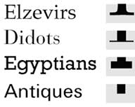
The classification of type is the way in which typefaces are categorised. A classification system can be helpful in identifying, choosing and combining typefaces.

Over the past century, quite a few classification systems have been proposed. Most are generally believed to be subjective and incomplete, and many of them use the same terms for similar but slightly different classes. The impossibility of a truly complete classification system has led many people to dismiss any attempt to classify typefaces — there are simply too many variables to make anything close to a practical, comprehensive system. Essentially, classification describes typefaces; it does not define them. It’s not inflexible, and is more of an aid than a rule.


The first classification system was proposed by Francis Thibaudeau in 1921. His system was based on categorising the serifs of the letters.

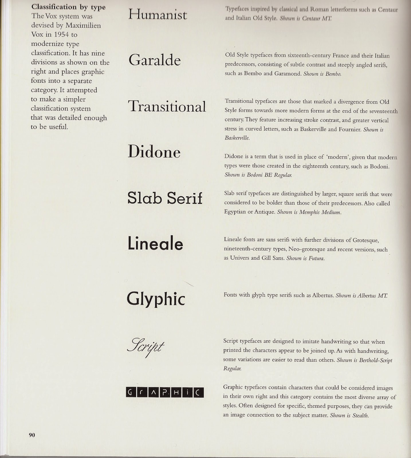
The primary “official” classification system currently is the Vox-ATypI system. Originally put together in 1954 by Maxmilien Vox.


These 9 categories are then split down into further divisions to account for the variety in characteristics.

Ambrose, G. and Harris, P. (2011 [2006]) ‘The Fundamentals of Typography’, 2nd Edition, Switzerland: AVA Publishing SA

The Vox system was adopted in 1962 by the Association Typographique Internationale (ATypI), which made a minor change at the 2010 conference to include Gaelic as an extra category. It classifies typefaces in 11 general categories, with some subdivision. 


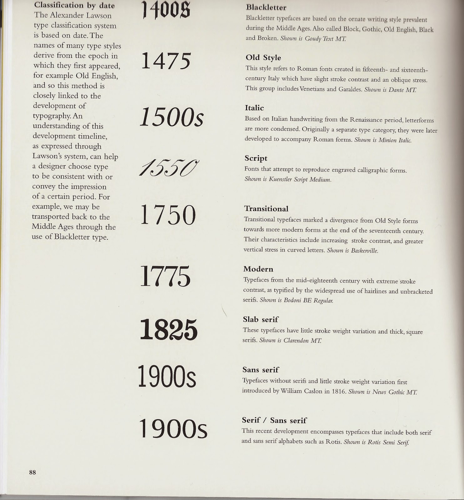
Another way in classifying type is by date, a system created by Alexander Lawson.

Ambrose, G. and Harris, P. (2011 [2006]) ‘The Fundamentals of Typography’, 2nd Edition, Switzerland: AVA Publishing SA


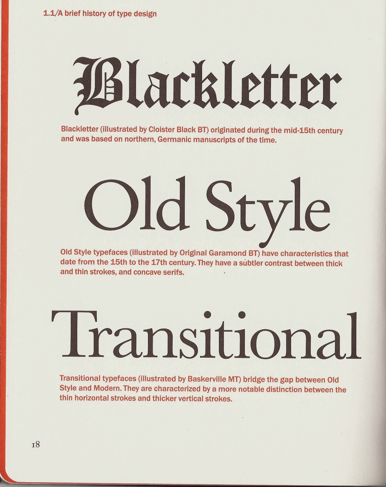
A more general way in classifying type is by overall characteristics. Instead of going a detailed at the Vox system, this follows date and style, grouping them very generally in six categories.

 Williams, J. (2012) ‘Type Matters’, London: Merrell Publishers Limited


From these different classification systems they all are very similar in the categories, and an overall and general classification system can be created in: Blackletter, Old Style, Transitional, Modern, Slab Serif, Sans Serif & Graphic.

References:
http://www.fonts.com/content/learning/fontology/level-1/type-anatomy/type-classifications
http://www.designhistory.org/Type_milestones_pages/TypeClassifications.html
http://www.smashingmagazine.com/2013/04/17/making-sense-type-classification-part-1/

Saturday, 1 November 2014

OUGD601 - Origins of Typography

In understanding typography, the origins of it must be researched as it shows the original context as to why it was created and how this has developed to what it is today.

Previously I created a brief around the origins and evolution of the alphabet, which is obviously very strongly linked to typography. I looked back at the research I compiled at the time and cut it down to the important bits that are relatable to my subject now.

Links to blog posts:


Origins - Sumerian & Cuneiform

There are only five completely independent writing systems that have been produced in history. Sumerian, Egyptian, Harappan, Mayan & Chinese. Of these five, the only one still used in the modern day is Chinese. The oldest is believed to be the Sumerian.

There are a number of types of writing systems. These are dependent on the way they represent their underlying languages.
  • Logographic
  • Logophonetic
  • Syllabic
  • Consonantal Alphabet (Abjad)
  • Syllabic Alphabet (Abugida)
  • Segmental Alphabet

The Sumerians were one of the earliest urban societies to emerge in the world, in Southern Mesopotamia more than 5000 years ago. They developed a writing system whose wedge-shaped strokes would influence the style of scripts in the same geographical area for the next 3000 years. Eventually, all of these diverse writing systems, which encompass both logophonetic, consonantal alphabetic, and syllabic systems, became known as cuneiform.


Cuneiform is one of the earliest known systems of writing, distinguished by it's wedge-shaped marks.
It emerged in Sumer in the 4th millennium BC. It began as a series of pictographs. The original Sumarian script was adapted for the writing of eight languages and inspired two languages.

Evolution of the cuneiform:

The original direction of writing was from top to bottom, but for reasons unknown, it changed to left-to-right. This also affected the orientation of the signs by rotating all of them 90° counterclockwise. 

Another change in this early system involved the "style" of the signs. The early signs were more "linear" in that the strokes making up the signs were lines and curves. But starting after 3000 BCE these strokes started to evolve into wedges.

By 2800 BCE the writing system started to exhibit use of phonetic elements due to the large amount of words that sounded similar.


References:

Friday, 31 October 2014

OUGD601 - Project Rationale

Subject
Typography & Advertising

Question
Is Typography more powerful than Image in Advertising?

Chapter Plan
Chapter 1 - Typography: The Basics and History
Origins of Type & initial uses
Gutenberg & the Gutenberg Press
Type Classification
Hierarchy - weighting, style, colour etc.

Chapter 2 - Typography and Advertising
Initial use of type in advertising
Typography use today in advertising
Sans serif vs Hand drawn type
Packard's 'eight hidden needs' of advertising
Tone of voice & the message

Chapter 3 - Case Study: McDonalds
Progression of advert designs
Comparison of 3/4 through the time
Tone of voice - masking of a large corporation
Move to hand drawn type - why & how
Packard's hidden needs

Things to consider
Examples to use & when
Sans serif vs hand drawn type - choosing one sans serif to focus on
Main text for each of the chapters to refer to
Imagery to collect

Initial Sources
Ambrose, G. and Harris, P. (2011 [2006]) ‘The Fundamentals of Typography’, 2nd Edition, Switzerland: AVA Publishing SA

Carter, R. and Day, B. and Meggs, P. (2012) ‘Typographic Design: Form and Communication’, New Jersey: John Wiley & Sons, Inc.

Garfield, S. (2011 [2010]) ‘Just My Type: A book about fonts’, 2nd Edition, London: Profile Books

Heller, S. and Ilic, M. (2012) ‘Stop, Think, Go, Do: How Typography & Graphic Design Influence Behaviour’, Massachusetts: Rockport Publishers

Hollis, R. (2011 [1994]) ‘Graphic Design, A Concise History’, London: Thames & Hudson

Jury, D. (2006) ‘What Is Typography?’, Switzerland: RotoVision SA

Lupton, E. (2010 [2004]) ‘Thinking With Type’, 2nd Edition, New York: Princeton Architectural Press

Perry, M. (2007) ‘Hand Job: A Catalog of Type’, New York: Princeton Architectural Press

Vignelli, M (2010) ‘The Vignelli Canon’, Switzerland: Lars Müller Publishing

Practical Direction
To create one advertisement for McDonalds & variating the typography on a number of versions depending on what has been found in the essay.