Monday, 5 January 2015

OUGD601 - Practical: Design Development

Following the initial design decisions I made, I set about creating the document to start to put the poster together. This would give me a much clearer idea of how the content worked together and what needed to be changed.

I started by creating a rough document on Illustrator. This meant that I could edit the text layout and design at the same time instead of having to go between Illustrator and InDesign every time. It also means that when I'm happy with a layout I can copy and paste it into InDesign and then create the design with this as a guide.

I decided on an A4 size to start with. Posters are often in this format, so it means I can just scale it up to a larger size in InDesign later on.

I started with the chalkboard background and placed the burger over the top. I had decided on the format of having the heading at the top, then the image, then the body copy. The logo would be in the top left hand corner like in all recent McDonald's advertisements. I wanted to keep the poster as simple as possible because the main focus is on the typography. Also, the majority of McDonald's ads have always been quite simple in design. I didn't want to add anything which could be distracting from the main purpose of the poster.


I added the logo to the top left corner, leaving a space between it and the edge, just like their current ads, fitting with their brand guidelines.


I then added the body copy below. I decided on starting with the Slab Serif poster. (Poster #5).


As well as the body copy, I added a McDonald's copyright sign to the central bottom. This gives the authenticity of it being a McDonald's ad. To do this, I had to move both the image and body copy higher up the document.


At this point I am slightly concerned with the space on the poster, especially as the body copy is so close to the bottom of the page and the burger. To try counter this, I made the body copy slightly smaller, putting it to the width of the burger and freeing up a bit more space.


I am happy with the progress of the poster, however at this point I don't think that there is quite enough space on the poster to fit all elements comfortably. With this in mind I decided to make the poster longer so that I could fit a good sized heading to match the prominence of the image.

I started with a simple design for the heading, with the words at an even width. I added a drop shadow to the heading so it would fit in with the drop shadow of the image, giving that overall appearance of having a bit of height and not being a completely flat design. I also made the burger slightly smaller to balance the distance between each of the elements on the page.


I then played around with the size of the type and placement of all the elements on the page.


The image below is the overall design that I like. The logo is at a good place in terms on it looks purposely away from the edge of the page, but there is enough room between it and the heading.


The heading still needed work on because I was unhappy with the layout of it. While I like each word on its own line, I don't like that there's not much of a difference between each of these, and a bit of hierarchy will benefit the poster. I decided on having the 'big' at the same size, and making the other text smaller, accentuating the 'big'.

Once happy with this design, I applied it to the six other headings for the other posters.

Headings:


Looking at the six like this, there are clear differences and similarities immediately which are points I think will be picked up in the response part to this brief.

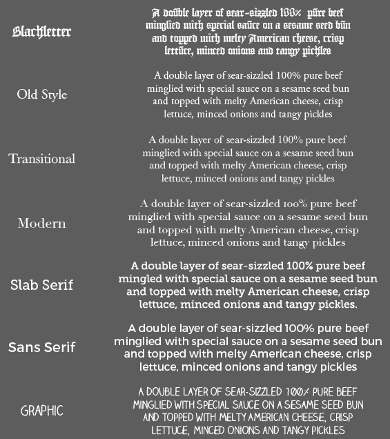
Something that is very obvious is the legibility of the Blackletter font. It is pretty unclear, however to keep this as authentic and fair as possible, the typeface must be used as it is a clear reflection of actual blackletter type.

The Old Style and Transitional typefaces are very similar. This is a little bit concerning, however wasn't a surprise given that Transitional is essentially a revised Old Style.

I went through the headings and kerned them appropriately.

Adding the new heading to the poster:


At this point I printed out a copy of the poster to see how well it worked when printed as it always looks different physically to what it looks like on screen.

Overall I am happy with the design, however there was a bit of an issue in the fact that the right hand edges of the burger didn't really fit well against the background. While it's not hugely noticeable, I would like to experiment with this and try see if I can come up with something which disguises this a bit better. The problem is that it was originally against a white background, and fits against this seamlessly, but now I have put it against a dark background.

I tried adding a bit of a white flare behind it, adding a bit more of an illustrative feel to the poster. I tried a couple of different variations of this, varying in the subtlety of this.


I decided against this idea as I wasn't confident in the use of it. I felt that it didn't add anything to the design and did sort of take away from the professionalism of the design.

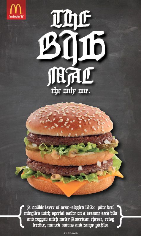
I decided that the way the poster was before was clean, clear and simple, and would work with the best. However, I did feel that he poster was lacking something so thought about how I could add a bit more character to the design. I experimented with the idea of adding brackets around the body copy. I felt that the body copy didn't have much of a presence on the page, and something could be added to make it a bit more noticeable.


I liked the way the brackets work on the page and think it balances the design out in terms of what the viewer will look at first. It gives the body copy a bit more presence on the page.

Happy with this design, I took this into InDesign, and created the six posters.

At this point I am really happy with the way these posters have turned out. They all work well and all the content fits on the pages well.

The next step to take is to create the final poster using hand drawn type.

OUGD601 - New McDonalds Campaign

Today McDonald's brought out a new advertising campaign around the return of the 'McRib' which is around for a limited time of 5 weeks.

Printed Ad:


Web Ad:

As well as these two ads there is a large poster in the same style as the printed ad, situated on bus stops and outdoor advertisements.

While the typography is not hand drawn, it is experimental in the use of 3D effects and the wood style. It shows that something quite simple can be eye catching.

Friday, 2 January 2015

OUGD601 - Practical: Initial Decisions

I started the posters by collecting the imagery and text that I would need. With the idea of printing these posters out to at least A2 size, the imagery had to be of a good quality and high pixelation, at least 3000px in width otherwise it would become too blurry at this large size.

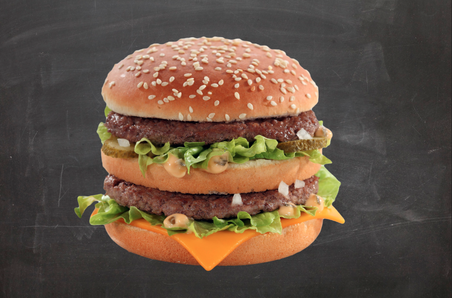
Luckily I was able to find an extremely high quality image of a big mac, which was already at 300 dpi, meaning it was perfect for printing at a large scale. The only thing it needed was editing to take away the background.

Image:

The image looks like it's from a photoshoot and looks professional, so that is a really good start for the poster in looking like an actual design McDonald's would have. For this project to work, the poster must look as realistic as possible.

I started by editing away the background so the burger could move freely and be over any colour background. The colours and brightness didn't need changing at all because clearly the initial photoshoot had good lighting.

Edited Image:

Once happy with the cleanness of the editing, I set about finding a background for the poster. A lot of McDonald's advertisements are either on a white or red background, however I think something a bit more interesting will work better. Their more recent advertisements involve chalkboard (McCafe advertisements), and I really like the idea behind this as it gives texture and doesn't make the ad look flat. It will hopefully make the burger look like it has a place as well instead of just being stuck there.

I found an high quality image of a chalkboard online, big enough for print.


I then placed the burger over the top of it to see how it would work.


I like the contrast between the burger and the chalkboard, however the image does look like it's stuck on. This is obviously to do with the fact that there are no shadows or tonal difference in the background around the burger.

To try and counter this and make it look a bit more purposeful, I tried adding a drop shadow to the burger.


I played around with this tool until I found something I was happy with. The first attempt was a bit too thick and noticeable, where I really wanted something quite subtle, but clear at the same time.


Following this I went onto the McDonald's website to see what information I could gather about the big mac. I looked on both the American and British sites, which did differ in information and overall style.


I liked the way the American website spoke about the product. The British one is not as playful in description, and I think this would work well on the poster. I also liked the 'There is only one.' It seems like quite a good tag line, however I do want to change it a bit so it's not a direct copy.

Following this I started on creating the type for each of the posters. I started by going through the seven classifications and choosing typefaces which suited each of the classifications well.

Typefaces chosen:
  • Blackletter - Gutenberg 1454 replica 
  • Old Style - Garamond
  • Transitional - Baskerville
  • Modern - Didot
  • Slab Serif - Museo Slab
  • Sans Serif - Montserrat
  • Graphic - Claire's Hand

At this point I had made a few decisions on the heading and tag line. I had decided on the heading being very simple, with 'The Big Mac' as the main heading, and 'the only one.' as a tag line. This enforces the name immediately, and the idea of it being the only product of its kind, which McDonald's have always pushed.

Hierarchy is something I will have to take into consideration when doing the headings. I will have to decide what I want to be accentuated and what I will want a bit smaller.

I started by applying these typefaces to the body copy. I decided on a four lined layout, keeping it condensed but also readable in the line lengths. I decided against justifying the lines because I think the shape of the text works well and works better than it would with the justification. It also allows each typeface to act in the way it was designed for, not to space further apart than intended.


A this point I am happy with the progress I have made in terms of the typography and finding a suitable image. I was very lucky to find such a high quality image that will print well at large sizes. I think that the typefaces chosen show each of the classifications off well and show contrast.

The next step is to work these elements together on a document and also create the hand rendered type for the 'Graphic' classification poster.

Friday, 12 December 2014

OUGD601 - McDonald's Case Study Focus

For my case study in my essay, I need to focus down the collections on McDonald's advertisements to a few that I can reference and show the change in typography.

Below are the four images I have chosen to do this.

1969


2009


2014


Reasoning
In comparing the use of typography, an early McDonald's ad and a very recent ad much be used as these show the full extent of the change in appearance and typography. The two ads from 2009 are important as this is the year where typography changed drastically for he brand. The first image shows the classic McDonald's style which had become well known at the time, and the second image shows the drastic change to something a bit more experimental, which shows that the brand were looking at other options typographically. It is at this point where McDonald's also starts to play more on the playful and fun side to their brand, using more puns/playful language.

Wednesday, 10 December 2014

OUGD601 - Typographer Interviews

To get more variety in quotes and references for this project and my essay, I decided to look for some interviews with typographers. My main focus was to find some interviews with hand drawn typographers, however any other points of views will be good to collect as well.

Below are a collection of extracts from interviews which are relatable to my chosen subject.


Truth Founder, Darren Scott Interview - September 19th 2014


Link: http://www.truth-creative.co.uk/news/19/9/2014/truth-founder-darren-scott-interview


Can you discuss your typographic heroes, in terms of the work that inspires you, both historically and contemporarily and the inspiration this has on your own practice?Firstly I think it is really important to have heroes, someone that inspires you to achieve more and want to be better. My heroes were always typographers and type designers, from the age of 15, when I first saw Neville Brody’s work for Face Magazine. It made me realise that type could be illustrative and decorative and communicate a whole lot more than what the words were actually saying, and also that typography was about controlling how messages were read and controlling the emotion behind the narrative. Brody’s work was always so decorative and impactful, it pushed the layout to it’s limit. This then led me to the work of Jan Tschichold, then Constructivism, Dada and the Bauhaus.

What gives you the greatest pleasure in type design?

The greatest pleasure I take from designing fonts is firstly the achievement of working out what is essentially solving a great big puzzle, but then seeing how people interpret it and the context in which they use it. Only by drawing type yourself do you really understand the skill and craft required to create a perfect character shape, like the New Baskerville 2 or the Gill Sans lowercase g, things of such beauty, an impossible dream. I once spent a day redrawing the Pistilli ampersand just to walk in his shoes and understand the process and level of craftsmanship that went into producing such a seductive character. I remember I blogged about the whole experience and a young American Designer contacted me to ask if I would send her the artwork to have tattooed on her back. I did, and she did!

Why is type design still relevant?
Of all the design crafts typography has to be the most important. As a designer, it is the most powerful tool at your disposal and one you will use every day of your life. The ability to set type and control the connotations of the message is to control the minds of the reader. An appropriately chosen typeface can make copy appear sad, happy, aggressive, exciting, modern or traditional – it has that power. When used effectively it is without doubt the most powerful communication tool available to a designer. That is why in my opinion the most influential designers in history were also typographers or type designers.


The Sharpie Blog, Dan Cassaro - January 20th 2012


What inspires you and your work? Powerful rock and roll music, old train cars, Dads, the bric-a-brac section at the thrift store and various other ephemera. I think it’s important to try and pull from things that go deeper than a aesthetic level. Bruce Springsteen’s music is good because it sounds great and is fun to sing along to but there is something happening on a much more visceral level. I think it’s good to try to create work from that angle instead of just trying to make visually pleasing images. You don’t want to be making graphic design elevator music you know? 

How would you describe your style?I don’t know, this is hard. As a designer I’d like to think that style is adapted and applied depending on the project. The illustrator part of me definitely has a common thread that runs through all my work though. I’ve been thinking that “clumsy modernism” is a pretty good way of explaining what I’d like to achieve with my work. I like the economy and boldness of modernism but all the pretentiousness surrounding it makes me want to barf a little. I want my work to be succinct but just “off” enough to give it charm and approachability. I spent a lot of time in college learning how to kern a headline and now I feel like maybe I’ll earned the right to intentionally UN-kern it. A little wonk goes a long way. 


Your designs are have a cool edginess to them; how do you come up with new ideas?I try to stay open to things just happening. Too many people treat design like an assembly line and it makes for a lot of visually acceptable, but flaccid design. I’d like to treat it more like an adventure, more like fine art. I don’t stay too married to the sketches that I do (if I sketch at all) and that lets me discover new ways of working. I like having that moment when you discover that you can create something that you didn’t know you were capable of before and have it happen almost by accident. My end results often looks very different from my original intentions. That system isn’t really conducive to the standard system of client approvals but it’s a very exciting way to work. Adventure!


How do you use Sharpie markers in your work? Favorite Sharpie? Why?I do a lot of my pen work and doodling with Sharpe Fine Point. I usually like using cheap paper and letting the ink pool up in the edges and bleed a bit. It’s nice to take those drawings that show a human hand and bring them into the computer and add that dimension. Using pen on paper helps keep me tied to the physical which is something I never want to lose touch with. I used Sharpie paint markers for the mural at the Ace Hotel. It was all kind of fancy type work so I wanted to keep the line work loose and fun. I made sure to only use really wide tip pens for this to keep myself from getting too fussy. 


FRANK, Sean Williams - October 14 2013


Link: http://www.frank151.com/news/talking-typography-an-interview-with-sean-williams.html


The photographs you take are quite simple and natural in comparison to your more tactile designs. Do you approach them as separate entities or are they intertwined?
I think I take different approaches to my photography and design. With photography I can only plan so much in advance, and when on a shoot I tend to go with the flow and go with my gut for what feels right. For my type designs I’d say half of my time is spent on the planning before I even start designing. I work on the stencil until I’m pleased with it and then move on to where I think the best place for each word would be and how they’ll fit together. Only then do I allow myself to start the final design artwork.


For those reading who are unfamiliar, do you mind telling us a bit about typography and how you use it to make these awesome portraits?
Good typography is the technique of arranging type to be aesthetically pleasing. In my typographic portraits I hand draw the type in such a way that the words come together to form portraits. I manually distort each letter to fit the space I need it to fill. The funny thing is that I’ve studied and currently work a lot with type, but it wasn’t until I began these illustrative designs that I began to truly appreciate typography.


Typography is used in comic books, graphic design, and graffiti—where do you see typography heading as a craft?
I think typography is always evolving and being reinterpreted through art. Whether it’s hand drawn, letterpress, or done on a computer, there are infinite ways to express the same character. And with the combination of video, type becomes dynamic with infographics being a trend lately. I expect artists and designers to continually experiment and push the limits of typography, and I’m positive it will be around for a long time. Although I’m an art director, you still need words!


Nate Williams, An interview with Nate Williams


Link: http://www.n8w.com/wp/927


What makes you choose to draw your type by hand?Hand rendering gives a word a tone, it tells the viewer how to interpret it on a subliminal level.  It’s like music in a horror movie, you might not notice the music, but it makes the scene much more convincing and sets the tone on a subliminal visceral level. When I was a child I had learning disability, a form of dyslexia.  When I read  my eyes would jump all over the page so instead of seeing what the letters represented, I would just see a mix of weird forms and shapes.  I thought of letters as objects rather than what they represented.

When you are hand drawing type, do you think about drawing the word itself, or do you articulate individual letters?I would say “words” for the most part. Most of my hand lettering is part of a bigger family. I think if I focused on making each letter very unique, it would be almost too stylized and distracting, but there are always exceptions.


When drawing a word, is the meaning and context always important, or just how it looks?Both … sometimes the word can look conceptually like something the word is about .. and other times it just sets a mood …  how to interpret the word, happy, sad, energetic, etc.

How important to you is the interplay of text and image?Very important, I like mixing lettering with imagery. I think they balance each other out, because imagery is very organic and letter forms are very mechanical so it provides a nice contrast.  Both, Imagery and text, can provide information the other cannot.

Do you think fonts are improved if they are hand drawn?It all depends what your objectives are, there isn’t one solution for everything.

Why is there more hand lettering in design today?Probably because it’s a response to the high-tech boom in the 90’s where everything was slick and highly polished. Now the pendulum has swung the other way. Eventually it will return to the middle and both the  “high-tech” look and “hand drawn” look will just be another tool for designers and illustrators to achieve specific objectives. As the world becomes smaller because of globalization, people crave things and experiences that are not from a template.. things that make them feel like their life is special and they are a unique … I think that is why the following are on the rise.. hand drawn type, non chain restaurants, limited edition silkscreens  local beers, DIY,  local coffee shops, handmade books, self published music/writing, etc ..


Canali, Job Wouters


Link: http://www.canali.com/en/ledizione/200-steps/job-wouters-interview


‘I suppose the thing I like most about handwriting is the universal quality of it. Obviously, everyone writes. So everyone can relate to a well-written piece. When you see some beautiful calligraphy done well – especially if it is done live – you can connect’. 


‘In calligraphy there is always a tension between expression and control. These are the two forces that look like they’re opposite but in a sense they are not. They join along as partners in a good piece of work’. 


‘A specific material or tool can often become the source of inspiration. At one point I realized that traditional graphic designers use fonts… They’re quoting someone else’s work… I thought, I want to regain this sort of control. I want to own everything that I make. I wanted to draw everything. But then to have the same amount of freedom or communication possibilities as a regular designer, I needed to train my hand in all these different directions, and the more directions I could do, the more powerful I could be’. 


 ‘People always say “Oh, handwork is so good because it’s imperfect.” But the thing is that most craftsmen strive for perfection. I’m not aiming for faults, but of course they’re part of the work. It’s more a matter of control. At one point I realized I could control brushes and paint and the analogue tools way better than the digital counterparts. So although I grew up with the computer, and am very happy using it, for the actual making of something, I can do it far better by hand’. 


Design.org, Simon Walker - October 24/25 2011


Links:

http://design.org/blog/designer-interview-hand-letterer-simon-walker-part-i
http://design.org/blog/designer-interview-hand-letterer-simon-walker-part-ii

What advice would you give designers who are interested in incorporating more lettering into their design work?
Not to be intimidated and expect quick results, but to just start doing it. One of the best ways to become acquainted with letters and how they truly work is to try and re-create them yourself. You'll notice things about the interactions between the parts of individual letterforms you never really noticed before. Use existing fonts as a guide and study what makes them work, too: how does the "c" relate to the "e"? Are all the ascenders and descenders consistent, or do they vary? Which rules can you break to get more interesting results?

It may take time - I've a long way to go myself, and am really just an amateur myself when it comes to true font creation - but it is a skill I think most designers can learn if it truly is their passion. You'll probably get better advice from a better, more seasoned type designer, but that's how it's been working out for me so far.

Saturday, 6 December 2014

OUGD601 - Alison Carmichael

Link: http://alisoncarmichael.com

London based hand lettering artist, Alison Carmichael studied Graphic Design at Ravensbourne college of design and has been working commercially for about 15 years winning many industry accolades.

Selection of work:

Sky Arts HD - 2014

Type Treatment

KFC - 2014

Renault - 2009

McDonalds - 2013

McDonalds - 2014

Friday, 5 December 2014

OUGD601 - Practical: Initial Ideas

The basis of my practical project is to see people's reactions to different typefaces used on the same advertisement. This is to see if the move to hand drawn typography and personalisation is doing the brands any favours in gaining an audience or if it is all just theoretical.

From the essay, I have decided to move forward with using the seven general type classifications discussed: Blackletter, Old Style, Transitional, Modern, Slab Serif, Sans Serif & Graphic. - With 'Graphic' being the hand drawn type style.

Working from the case study focussed on in my essay I have decided on creating posters for the McDonald's product 'The Big Mac'. This is because when looking over the advertisements they have, this product has not actually had an advertisement created with their new style of typography.

I looked over the previous McDonald's ads to get an idea of the layout that they use, and overall they are very standard in their approach, with type either above, below, over and to the side of a product, with the main focus on the product.

I drew out a few different layout ideas of how I could go about this, with varying orientations.


The whole point is to see if the type changes the tone of voice of the ad/the consumers view of the ad, so to keep it fair, I decided that the product must be clearly seen, so not underneath the text or half off the document.

I also think that the more simple designs are better, with each element having it's clear place on the page.