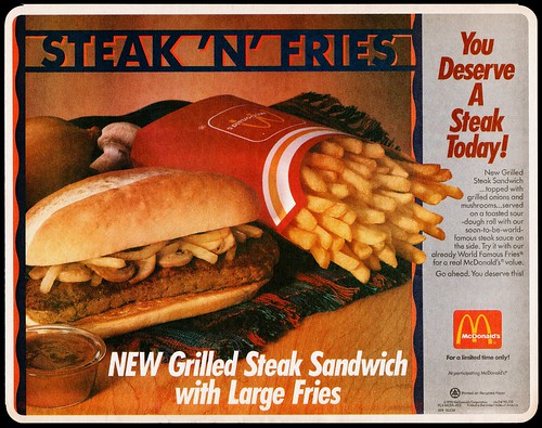
A collection of McDonald's Ads dating back to 1964, showing the progression in the use of typography.
- The ads show a clear progression in the style of typography, with 2009 as a pivotal year in experimentation.
- The use of people in the ads stopped by the 1990's, focussing on the product and typography instead.
- The layout is consistently changing, with each decade having a signature style.
- Now each product has its own layout and typographic design - as shown with the McFlurry Ads & Morning Breakfast Ads.
- Typography has moved from structured to much more free and fun, with a hand rendered style being consistent since 2011.
1969
1971
1979
1980
1990
2009
2010
2011
2012
2013
2014
Sources


No comments:
Post a Comment