Showing posts with label Design For Web. Show all posts

Saturday, 9 November 2013

OUGD504 - Design For Web Further Research

After deciding on the main areas I will be looking into, I researched into them and took away the research which I felt was appropriate and concise.

Sumerian
3300 BCE to 100 CE
The Sumerians were one of the earliest urban societies to emerge in the world. Like all inventions, writing emerged because there was a need for it.
This advance allowed news and ideas to be carried to distant places without having to rely on a messenger's memory. It was developed as record-keeping, commercial transactions or for administration. There are also texts that served as "copy books" for the education of future scribes.
The Sumerian writing system was adopted and modified by others. In this way, Sumerian was used continually until the 1st century CE, making it one of the longest used writing system in history.

Phoenician
1100 BCE to 300 CE
The Phoenician script is important as many modern scripts can be traced through it. Arabic, Hebrew, Latin, and Greek scripts are all descended from Phoenician. 
Phoenician is a "consonantal alphabet", and only contains letters representing consonants. It was the first widely used script in which one sound was represented by one symbol. Its simplicity allowed it to be used in multiple languages, as well as allowing common people to learn how to write. 
This upset the long-standing status of writing systems only being learned and employed by members of the royal and religious hierarchies of society, who used writing as an instrument of power to control access to information by the larger population.

Greek
700 BCE to 100 CE
The Greeks were the first Europeans to learn to write with an alphabet, and from them alphabetic writing spread to the rest of Europe, eventually leading down to all modern European alphabets. There were many variants of the early Greek alphabet, each suited to a local dialect.
Early Greek was written right-to-left. 
However, eventually its direction changed to "ox-turning", where the direction of writing changes every line. Starting on the right of the writing surface and writing to the left, and when the end is reached, the direction is reversed and writing goes towards the right. The orientation of the letter themselves is dependent on the direction of writing as well.
Greek letters were also used to denote numbers as well. The Greek alphabet is still a living writing system in Greece as well as Greek communities around the world.

Latin
700 BCE to Present
The Romans brought their alphabet to wherever they went. Because of the prestige of Roman culture, many non-Roman nations embraced Latin for court use, and adopted the Latin alphabet to write their own language. 
Western European nations all wrote using the Latin alphabet, and with European imperialism in the last 500 years, the Latin alphabet is probably the most used writing system in the world.
Slowly the Latin alphabet became increasingly standardised. Writing direction settled on left-to-right.
The letters Y and Z were added for to write Greeks loan words during the early 1st century BCE. With these two additions, the Latin alphabet was nearly identical to most Western European alphabets. During the middle ages, new letters were created by slightly modifying an existing letter. 

Now
By 1011, a formal list of the Old English alphabet was made and included all of our present letters except J, U and W. The ampersand and five uniquely English letters, designated ond, wynn, thorn, eth and ash, were included.
With the introduction of the printing press to Great Britain in the mid 15th century by William Caxton, English became more standardised and modern English appeared. In the mid-16th century, V and U were split into two letters, with U becoming the vowel, and V, the consonant. In 1604, Robert Cawdrey published the first English dictionary, and about this time, J was added to create the modern English alphabet we know today.

In the 15th and 16th centuries, the first type designers of Latin typefaces used Carolingian minuscules as models for the “lowercase” letters. This has continued into the 21st with no further evolution.

Wednesday, 6 November 2013

OUGD504 - Design For Web Type History Research

For the content of my website I have chosen to look into the history of the alphabet/writing systems and do an evolution from the first alphabet through to our current one. To be able to do this well I need a good understanding into the history of type and writing in general. I started by looking at the alphabets in general, with their different characteristics and styles, before narrowing it down to what I wanted to look into.
  • There are only five completely independent writing systems that have been produced in history. Sumerian, Egyptian, Harappan, Mayan & Chinese. 
  • Of these five, the only one still used in the modern day is Chinese.
  • The oldest is believed to be the Sumerian.
There are a number of types of writing systems. These are dependent on the way they represent their underlying languages.
  • Logographic
  • Logophonetic
  • Syllabic
  • Consonantal Alphabet (Abjad)
  • Syllabic Alphabet (Abugida)
  • Segmental Alphabet
Logographic
Logophonetic
Syllabic
Consonantal Alphabet
Syllabic Alphabet

Segmental Alphabet

After going through these different writing systems, I have decided to go with Sumerian and Cuneiform as this is the oldest recorded writing system.
  • Cuneiform is one of the earliest known systems of writing, distinguished by it's wedge-shaped marks.
  • It emerged in Sumer in the 4th millennium BC.
  • It began as a series of pictographs.
  • In the 3rd millennium these pictographs were simplified and became more abstract.
  • The original Sumarian script was adapted for the writing of eight languages and inspired two languages.
Development of SAG 'head' over two millennia:

Phonogram: a symbol representing a vocal sound.
Logograms: a sign or character used to represent a word or phrase
Determinatives: a thing that determines or decides something.

Types of Cuneiform
Sumarian

  • The Sumerians were one of the earliest urban societies to emerge in the world, in Southern Mesopotamia more than 5000 years ago. They developed a writing system whose wedge-shaped strokes would influence the style of scripts in the same geographical area for the next 3000 years. Eventually, all of these diverse writing systems, which encompass both logophonetic, consonantal alphabetic, and syllabic systems, became known as cuneiform.
  • The original direction of writing was from top to bottom, but for reasons unknown, it changed to left-to-right. This also affected the orientation of the signs by rotating all of them 90° counterclockwise. Another change in this early system involved the "style" of the signs. The early signs were more "linear" in that the strokes making up the signs were lines and curves. But starting after 3000 BCE these strokes started to evolve into wedges.
  • By 2800 BCE the writing system started to exhibit use of phonetic elements due to the large amount of words that sounded similar.

  • There where many words that have similar meaning but vastly different sounds are written with the same sign. For example, the word zu "tooth", ka "mouth", and gu"voice" are all written with the sign for gu3 "voice".

  • In addition to use of phonetic signs to spell out new words, new signs were created by adding graphic elements to an existing sign or combining two existing signs. The additional graphic element could be geometric patterns without any meaning, or could be another cuneiform sign.

Akkadian

  • While the cuneiform writing system was created and used at first only by the Sumerian, it did not take long before neighboring groups adopted it for their own use. By 2500 BCE, the Akkadians starting using cuneiform to write their own language. 
  • Sumerian and Akkadian are vastly different languages. Sumerian is a more agglutinative language, where phonetically unchanging words and particles are joined together to form phrases with increasingly complex meaning. Akkadian, however, is infectional, meaning that the basic form of a word, called a root, can be modified in a myriad of ways to create words of related but different meanings.


Hittite

  • Hittite adopted theAkkadian cuneiform to write their language. Approximately 375 cuneiform signs were adopted from Akkadian cuneiform. As in Akkadian, signs can be roughly categorized into phonograms, logograms, and determinatives.
  • Phonograms are signs used for their phonetic values. They can be a single vowel, a consonant followed by a vowel, or a vowel followed by a consonant.
  • In addition to phonograms, Hittite also employed a number of logograms. Many phonograms also serve as logograms, and many logograms have multiple meanings as well.
  • Quite often logograms are accompanied by phonetic complements, phonograms that serve to disambiguate the reading of logograms and/or to explicitly write out inflectional ending of the word.


Ugaritic

  • The Ugaritic script was really one of a kind, for it was a cuneiform alphabet. Clay tablets written in Ugaritic provided the first evidence of the "modern" ordering of letters, which in Ugaritic went like 'a, b, g, and so on, that eventually gave the order of letters in the Greek and Roman abecedaries.

Old Persian

  • Early in the history of the dynasty, a syllabic script to write the Old Persian language was developed. This script was not a direct descendent of the Sumerian and Akkadian systems, because even though the physical appearance of Old Persian signs are Cuneiform, or in the shape of wedges, the actual shape of the signs do not correspond to signs in older systems with similar phonetic values. Old Persian only kept the cuneiform appearance of its characters simply out of tradition, and the actual shape of the signs were completely original.
  • Old Persian is classified as a syllabic script.
  • These are the logograms used in Old Persian.

  • A slanted vertical wedge is used as the separator between words.

Friday, 1 November 2013

OUGD504 - Design For Web: Web Standards Research

Research for web designing
Web standard fonts
The fonts that are most safe to use are:
  • Arial / Helvetica
  • Times New Roman / Times
  • Courier New / Courier
Other options that usually work cross-platform are:
  • Palatino
  • Garamond
  • Bookman
  • Avant Garde
Fonts that work on Windows and MacOS are:
  • Verdana
  • Georgia
  • Comic Sans MS
  • Trebuchet MS
  • Arial Black
  • Impact

Image formats

Web-safe colours
Colours may be specified as an RGB triplet or in hexadecimal format.A hex triplet is a six-digit, three-byte hexadecimal number used in HTML, CSS, SVG, and other computing applications, to represent colors. 
The bytes represent the red, green and blue components of the colour. 
One byte represents a number in the range 00 to FF (in hexadecimal notation), or 0 to 255 in decimal notation. This represents the least (0) to the most (255) intensity of each of the color components. Thus web colors specify colors in the Truecolour (24-bit RGB) color scheme. 
The hex triplet is formed by concatenating three bytes in hexadecimal notation, in the following order:
Byte 1: red value (colour type red)
Byte 2: green value (colour type green)
Byte 3: blue value (colour type blue)
For example, consider the color where the red/green/blue values are decimal numbers: red=36, green=104, blue=160 (a greyish-blue color). 
The decimal numbers 36, 104 and 160 are equivalent to the hexadecimal numbers 24, 68 and A0 respectively. 
The hex triplet is obtained by concatenating the 6 hexadecimal digits together, 2468A0 in this example.
Note that if any one of the three colour values is less than 16 (decimal) or 10 (hex), it must be represented with a leading zero so that the triplet always has exactly six digits. 
For example, the decimal triplet 4, 8, 16 would be represented by the hex digits 04, 08, 10, forming the hex triplet 040810.
The number of colours that can be represented by this system is 2563 or 224 = 16,777,216.

Screen sizes
iPad screen sizes:
 iPhone screen sizes:
Standard computer screen sizes:
2880 X 1800
2560 X 1600
2560 X 1440
1920 X 1080
1680 X 1050
1440 X 900
1280 X 800 
1152 X 720
1024 X 640 
800 X 600

Web image formats
  • The PNG, JPEG, and GIF formats are most often used to display images on the Internet.
JPEG
  • JPEG (Joint Photographic Experts Group) is a compression method 
  • The JPEG/JFIF filename extension is JPG or JPEG. 
  • Nearly every digital camera can save images in the JPEG/JFIF format, which supports 8-bit grayscale images and 24-bit color images (8 bits each for red, green, and blue). 
  • JPEG applies lossy compression to images, which can result in a significant reduction of the file size. 
  • The amount of compression can be specified, and the amount of compression affects the visual quality of the result. When not too great, the compression does not noticeably detract from the image's quality, but JPEG files suffer generational degradation when repeatedly edited and saved. (JPEG also provides lossless image storage, but the lossless version is not widely supported.)
GIF
  • GIF (Graphics Interchange Format) is limited to an 8-bit palette, or 256 colors. 
  • This makes the GIF format suitable for storing graphics with relatively few colors such as simple diagrams, shapes, logos and cartoon style images. 
  • The GIF format supports animation and is still widely used to provide image animation effects. 
  • It also uses a lossless compression that is more effective when large areas have a single color, and ineffective for detailed images or dithered images.
PNG
  • The PNG (Portable Network Graphics) file format was created as the free, open-source successor to GIF. 
  • The PNG file format supports 8 bit paletted images (with optional transparency for all palette colors) and 24 bit truecolor (16 million colors) or 48 bit truecolor with and without alpha channel - while GIF supports only 256 colors and a single transparent colour. 
  • Compared to JPEG, PNG excels when the image has large, uniformly coloured areas. 
  • PNG provides a patent-free replacement for GIF and can also replace many common uses of TIFF. I
  • ndexed-color, grayscale, and truecolor images are supported, plus an optional alpha channel.
  • PNG is designed to work well in online viewing applications like web browsers so it is fully streamable with a progressive display option. 


Hosting fees
A web hosting service is a type of Internet hosting service that allows individuals and organizations to make their website accessible via the World Wide Web. Web hosts are companies that provide space on a server owned or leased for use by clients, as well as providing Internet connectivity, typically in a data centre. Web hosts can also provide data center space and connectivity to the Internet for other servers located in their data centre.

Types of hosting:
Free web hosting service
  • Offered by different companies with limited services, sometimes supported by advertisements, and often limited when compared to paid hosting.
Shared web hosting service 
  • One's website is placed on the same server as many other sites, ranging from a few to hundreds or thousands. 
  • Typically, all domains may share a common pool of server resources. 
  • The features available with this type of service can be quite basic and not flexible in terms of software and updates. Resellers often sell shared web hosting and web companies often have reseller accounts to provide hosting for clients.
Reseller web hosting 
  • Allows clients to become web hosts themselves. 
  • Resellers could function, for individual domains, under any combination of these listed types of hosting, depending on who they are affiliated with as a reseller. 
  • Many resellers provide a nearly identical service to their provider's shared hosting plan and provide the technical support themselves.
Virtual Dedicated Server
  • This divides server resources into virtual servers, where resources can be allocated in a way that does not directly reflect the underlying hardware. 
  • The users may have root access to their own virtual space. 
  • Customers are sometimes responsible for patching and maintaining the server.
Dedicated hosting service 
  • The user gets his or her own Web server and gains full control over it 
  • However, the user typically does not own the server.
Managed hosting service
  • The user gets his or her own Web server but is not allowed full control over it.
  • However, they are allowed to manage their data via FTP or other remote management tools. 
  • The user is disallowed full control so that the provider can guarantee quality of service by not allowing the user to modify the server. 
  • The user typically does not own the server. The server is leased to the client.

Colocation web hosting service
  • Similar to the dedicated web hosting service, but the user owns the colo server.
  • The hosting company provides physical space that the server takes up and takes care of the server.
  • This is the most powerful and expensive type of web hosting service. 
  • In most cases, the colocation provider may provide little to no support directly for their client's machine, providing only the electrical, Internet access, and storage facilities for the server. 
  • In most cases for colo, the client would have his own administrator visit the data center on site to do any hardware upgrades or changes. 
Cloud hosting
  • A new type of hosting platform that allows customers powerful, scalable and reliable hosting based on clustered load-balanced servers and utility billing. 
  • A cloud hosted website may be more reliable than alternatives since other computers in the cloud can compensate when a single piece of hardware goes down.
  • Cloud hosting also allows providers to charge users only for resources consumed by the user, rather than a flat fee for the amount the user expects they will use, or a fixed cost upfront hardware investment. 
Clustered hosting
having multiple servers hosting the same content for better resource utilisation  
Clustered Servers are a perfect solution for high-availability dedicated hosting, or creating a scalable web hosting solution. 
A cluster may separate web serving from database hosting capability. (Usually Web hosts use Clustered Hosting for their Shared hosting plans, as there are multiple benefits to the mass managing of clients).

Grid hosting
  • This form of distributed hosting is when a server cluster acts like a grid and is composed of multiple nodes.
Home server
  • Usually a single machine placed in a private residence can be used to host one or more web sites from a usually consumer-grade broadband connection.
An example of hosting costs:

Tuesday, 29 October 2013

OUGD504 - Design For Web - Study Task 4/Website Layout Research

The audience that I am working to is designers/people who are interested in my topic of hand drawn type.
I spoke to a number of people on what they would expect to find on a website of this topic and what they would like to see/how they would like it to work.
Their needs:
  • Visual images
  • Context & reason behind the work/what it is for
  • A variety of different designers, work & situations for the work
  • Easy to navigate website with clear links/buttons
  • Clear layout if content is large - gridded systems - no cluttering
  • Sub-categories
  • Creative use of hand drawn type throughout the website itself
  • Not just an archive - some personality/potential blog updating with new additions of work
  • Links to works origin
  • Videos of work in motion
  • Comments from the designers themselves
  • Simple colour scheme so it doesn't draw away from the content
  • Type web animations
  • Responsive design for phones/tablets

I then looked into websites which incorporated hand drawn type into their websites to see how well it all worked
Overall there is a mixture to the approach of using hand drawn type. Some use it for headings/navigation, others use it for body text and the overall tone of voice for the whole website. It all depends on the content and the message that they want to put across.
My opinion is that using hand drawn type on websites makes the page a lot more relaxed and playful than using digital typefaces. It gives the website a personality, and this is something that I would like to convey when designing my website.
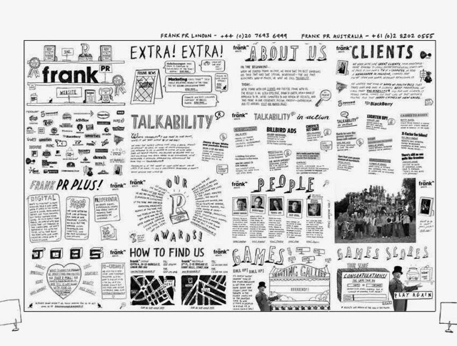
The first website design has the most personality to it as it is for a specific designer who is obviously interested in combing digital and hand-drawn elements. The use of icons for the links gives a bit of quirkiness as well. The whole layout of this website is almost like the designer drew it out in hand and scanned it in. This makes it stand out in this subject area compared to the others below it.
The last website design is using hand drawn type and design as a way to appeal to the users of this website. It is for yoga, and the general idea of people who do yoga is that those people are interested in natural, ethical products and things in the world. The design for this website attracts a completely different audience to the first website design, which shows the huge variety of tones of voice and audience that this aesthetic can give.
After looking at these, I looked into websites that I personally found appealing, forgetting all about the hand drawn type element and just looking at the general design decisions that I like visually.

I then looked into some websites that I found visually appealing.
I found that the websites I liked the most are the ones which are simple and very clear, with large images and with a set colour throughout the website. I like the websites which have a grid of images or articles as pages I find this way of navigation more interactive for the user.
The websites that I prefer are the ones with the larger navigation bars at the top. Each button is given a large amount of space, and all of these seem to just have one large image below it for the rest of the page. These layouts are simple, but very effective because of how visually bold they are.
These are all generally the complete opposite to the website designs incorporating hand drawn type. Those websites have a lot less structure and limitations on their designs, whereas these ones are built through the same wireframes for each page and a consistency.

I the tried find websites which had a simple, clean layout, but also incorporated hand drawn elements, whether it be type or image. I found that the majority of the ones with what I was looking for had a very similar style, a large image of hand-drawn/hand rendered work, and a simple sans serif navigation bar/buttons along the top.
I also found this article which talks about hand drawing style in web design: http://www.smashingmagazine.com/2008/01/03/hand-drawing-style-in-modern-web-design/
Although these websites do incorporate both elements, the clean simple design & hand drawn design, I do find that these don't appeal to me as much as either of the other two kinds I have been looking at. It seems that there hasn't been much of an advance in the way of incorporating the two together to create a website. This is something that I could definitely explore while doing this brief.

As part of the brief we have to consider how our websites will look on a tablet or phone, so I looked at some responsive websites, which change completely when put onto one of these devices. This will give me an insight into some of the features and designs which are consistent throughout the websites when they are put onto a smaller screen. These websites onto tablets/phones are also working on the fact that they will be touchscreen based media, so I will need to take into account the usability and size of each section/buttons through the designs.

Responsive websites
As part of the brief we have to consider the layout for the website in the different formats it could come in, for example a phone or tablet. I looked into responsive designed websites to see how they translate from the original computer screen design to one for the mobile or tablet.
As the phone and tablet formats are touch based instead of a mouse, the websites designs need to be made in a way which makes interactivity as easy as possible. Looking through the examples I found, a lot of them were either scroll down type of tap a button. The layouts are much more simple and more about the content than the overall aesthetic of the website, just having a few key points to show what website it is. 
On a computer screen, a lot more information can be seen at once so the designer has a lot of leeway in terms of the visuals. On a phone screen, it is much more limited and needs to be as easy to use as possible. 
The websites have been stripped down to their simplest form, just including the title and a small navigation bar before going into the content, text or image based. The majority of the computer websites have a homepage which is only the size of the screen, however on the mobile designs, these are made to be scrollable or are condensed down to fit onto the smaller screen.
Visually, I think that the dieline works best as a responsive website. It doesn't change the aesthetics much in terms of the content used and style in which it is all set out. It is all very clear and have a focus on the images instead of having a lot of menu bars like other responsive apps.