Monday, 11 November 2013

OUGD501 - Seminar 5: First Things First Manifesto

First Things First Manifesto - 2000
To find the key differences between this & the 1964 manifesto

Differences:
In the first manifesto there is a definite point on wanting to stop designing for consumerism and consumerist needs, and make design for more meaningful causes.
In the 2000 manifesto the point is still there showing not much has changed over 40 years.
More urgent - different tone of voice
Context - global consumer system
Aimed at a wider audience
Focuses of social effect - the dumbing down of society
Politicalisation
A challenge to the consumer system
Some of the products have an ethical problem - credit card - debt etc - SUV - fumes & environment
Design activism

First things first ( revisited) - Rick Poynor
Ken Garland - CND Campaigner
Commercial design is political
Supporting the status quo
Style over substance - people care more about the visuals than the message
Designers feel that politics is not their concern

Michael Beirut - Ten Foot Notes to a Manifesto
Criticism of the 2000 manifesto
Signatures are graphic 'cultural workers'
Designers as exploited class
Consumer culture
What do we do instead?
No clear good cause
No clear choices
Replacing manipulation for consumerism with mass manipulation of political causes

First things first 1964
Context - boom - height of consumer civil rights protest - anti-war demos
Ken Garland - designer and activist
Against design for trivial purposes
For design for society
For design with a purpose
Proposing a reversal of priorities

Task
Write a critical discussion on the First Things First Manifesto.
Triangulated discussion based on two works of design.

Unethical design - Burger King Ad:
Ethical design - Amnesty International Ad:

The way designers use their talents has been a large debate for decades now. While a designer must make a living, comments have been made on how the designer does this happily when their talents are being wasted on large scale consumerist advertising campaigns for clients who only have an interest in making money and gaining customers. Three authors who have comments on this are Garland (1964), Poynor (2000) and Beirut (2007).

With references to the two images above, what is classed as an 'unethical' advertisement is a ad campaign for fast food chain Burger King. This is because unethical design is classed as design which fuels the purpose and needs of the clients and does not help the greater good of the world or change the world in a positive way. This ad by Burger King reflects that as it is a ploy by the company to get more customers, giving them a temptation that they won't say no to, when in reality, there are millions of people in the world who are starving, and nothing is being said. This is essentially the consumerist culture; more for less, no questions asked, no meaning. Garland comments on the use of designer talent in the 'First Things First Manifesto' written in 1964. He states, "By far the greatest effort of those working in the advertising industry are wasted on these trivial purposes, which contribute little or nothing to our national prosperity".
This is further backed up by Rick Poynor in 'First Things First (Revisited)' (2000). In this he comments on how this way of life for designers and the world has become the normal. "For many young designers emerging from design schools in the 1990's, they now appear to be one and the same. Obsessed with how cool an ad looks, rather than with what it is really saying, or the meaning of the context in which it says it, these designers seriously seem to believe that formal innovations alone are somehow able to effect progressive change in the nature and content of the message communicated". The third author, Michael Beirut, comments on this from the point of view of how the designers have got to this stage; "Ad agencies have treated designers as stylists for hire, ready to put the latest gloss on the sales pitch". These three points work together cohesively to show a timeline of how the designers of today are working; advertisers see designers as someone to make something look good, designers want and need to make a living so take the jobs even if unethical, and now young designers see this work and think it is the right thing to be doing.

In contrast to this way of designing, visual communication is the simplest form of communication in the modern day and should be used for good and meaningful causes. Even if this does involve an advertising campaign, there are campaigns that are there selling meaningful messages. For example, the Amnesty International poster above is obviously something that has had a lot of money spent on it, but unlike product advertising, there is no lie, manipulation or deception in the design. It is truthful and meaningful. It connects to viewers because it sees the poster from their point of view. With the words 'It's not happening here, but it is happening now', it hits on the viewers state of mind that because it's not happening where they are, they just become consciously ignorant to it and gloss over it. 
While there is a greater demand for pointless advertising campaigns, ethical campaigns like this are the ones that designers should have the choice to do. Using their talents for something with a purpose and something that is lasting is much more of a fulfilling job. Garland comments on this, "We do not advocate the abolition of high pressure consumer advertising: this is not feasible. Not do we want to take any of the fun out from life. But we are proposing a reversal of priorities in favour of the more useful and more lasting forms of communication". He states that while it is wrong to thing these advertising campaigns are good, there is a need for the designer to do them to make a living. If a designer were to just devote their entire career to doing ethical design, it would be a very hard career to be had. Beirut makes an interesting comment in "The greatest designers have always found ways to align the aims of their corporate clients with their own personal interests, and, ultimately, with the public good". In a way he is backing up what Garland is saying, and providing a sort of solution in saying that because designers get the control of the design elements in these advertisements, they can turn this in their favour and be ethical, while staying in the consumerist corporate side of the world. He is saying that while a designer may not have a choice in where the work is done, there is a chance to turn this work in their favour. This is also commented upon by Poynor, "Even now, at this late hour, in a culture of rampant commodification, with all its blindspots, distortion, pressures, obsessions , and craziness, it's possible for visual communicators to discover alternative ways of operating in design'.

In comparing the two posters, the fact that designers created both of them shows exactly how misconstrued the line between designer and advertiser has become. While designers are constantly battling to be able to design something meaningful, at the same time, they are all taking money from collaborating in a corporate campaign. Poynor says "At root, it's about democracy", meaning that there has to be a balance between ethical and unethical designs that a designer does. Without this, a designer has not got much hope of making a living if they are so against unethical design. All three authors hit on the points that while it is not what designers want to do, it is what they must do to keep surviving in the world. If they do not do it, someone else will take their place as the consumerist culture is so large now. While ethical design is a lot more meaningful and is memorable, this is only because of all of the unethical design that is around. One ethically driven poster surrounded by a hundred unethical posters is surely more powerful than if every poster was ethically driven.

Saturday, 9 November 2013

OUGD504 - Design For Print: Flow Chart & Information Design research

After deciding on the direction of my project, I looked into the areas of flowcharts used in design and information graphics in general to help give me an insight into how things are displayed and how I could apply some of this to my own designs.

Flow Chart
For flowcharts, the example below is the most interesting one I found. Flow charts aren't used often in design by the looks of things, more designers seem to be using information graphics as a whole and doing a variety of different things on one page/publication instead of using flow charts. The flow charts that were used were just for their thoughts and for conceptual ideas, not for the final outcomes.
Those that did use flow charts are using a variety of images/text to illustrate the steps instead of using just text, which is what I want to do.
The example below was used for packaging and was the closest example to what I wanted to do with my flow charts.
These are much smaller than the ones that I will create, with less options/questions. I like the minimal use of colour on this and how simple everything is, with a clear start and finish.
http://www.behance.net/gallery/Feeling-the-Flow-chart/11281127

Infographics
For an example of infographics I chose the following book as it has a number of different ways to display information in and interesting and sometimes illustrative way.
I prefer the ones which are primarily text based in this book as the ones which are image based are completely about the image and haven't got much thought into the text elements in it.
http://www.behance.net/gallery/Guidebook-to-Sustainia/7153661

OUGD504 - Design For Web Further Research

After deciding on the main areas I will be looking into, I researched into them and took away the research which I felt was appropriate and concise.

Sumerian
3300 BCE to 100 CE
The Sumerians were one of the earliest urban societies to emerge in the world. Like all inventions, writing emerged because there was a need for it.
This advance allowed news and ideas to be carried to distant places without having to rely on a messenger's memory. It was developed as record-keeping, commercial transactions or for administration. There are also texts that served as "copy books" for the education of future scribes.
The Sumerian writing system was adopted and modified by others. In this way, Sumerian was used continually until the 1st century CE, making it one of the longest used writing system in history.

Phoenician
1100 BCE to 300 CE
The Phoenician script is important as many modern scripts can be traced through it. Arabic, Hebrew, Latin, and Greek scripts are all descended from Phoenician. 
Phoenician is a "consonantal alphabet", and only contains letters representing consonants. It was the first widely used script in which one sound was represented by one symbol. Its simplicity allowed it to be used in multiple languages, as well as allowing common people to learn how to write. 
This upset the long-standing status of writing systems only being learned and employed by members of the royal and religious hierarchies of society, who used writing as an instrument of power to control access to information by the larger population.

Greek
700 BCE to 100 CE
The Greeks were the first Europeans to learn to write with an alphabet, and from them alphabetic writing spread to the rest of Europe, eventually leading down to all modern European alphabets. There were many variants of the early Greek alphabet, each suited to a local dialect.
Early Greek was written right-to-left. 
However, eventually its direction changed to "ox-turning", where the direction of writing changes every line. Starting on the right of the writing surface and writing to the left, and when the end is reached, the direction is reversed and writing goes towards the right. The orientation of the letter themselves is dependent on the direction of writing as well.
Greek letters were also used to denote numbers as well. The Greek alphabet is still a living writing system in Greece as well as Greek communities around the world.

Latin
700 BCE to Present
The Romans brought their alphabet to wherever they went. Because of the prestige of Roman culture, many non-Roman nations embraced Latin for court use, and adopted the Latin alphabet to write their own language. 
Western European nations all wrote using the Latin alphabet, and with European imperialism in the last 500 years, the Latin alphabet is probably the most used writing system in the world.
Slowly the Latin alphabet became increasingly standardised. Writing direction settled on left-to-right.
The letters Y and Z were added for to write Greeks loan words during the early 1st century BCE. With these two additions, the Latin alphabet was nearly identical to most Western European alphabets. During the middle ages, new letters were created by slightly modifying an existing letter. 

Now
By 1011, a formal list of the Old English alphabet was made and included all of our present letters except J, U and W. The ampersand and five uniquely English letters, designated ond, wynn, thorn, eth and ash, were included.
With the introduction of the printing press to Great Britain in the mid 15th century by William Caxton, English became more standardised and modern English appeared. In the mid-16th century, V and U were split into two letters, with U becoming the vowel, and V, the consonant. In 1604, Robert Cawdrey published the first English dictionary, and about this time, J was added to create the modern English alphabet we know today.

In the 15th and 16th centuries, the first type designers of Latin typefaces used Carolingian minuscules as models for the “lowercase” letters. This has continued into the 21st with no further evolution.

Thursday, 7 November 2013

OUGD501 - Lecture 4: Cities & Film


  • The city in modernism
  • The beginnings of an urban sociology
  • The city as public and private space
  • The city in postmodernism
  • The relation of the individual to the crowd in the city
Georg Simmel (1858 -1918)
  • German sociologist
  • Write 'Metropolis and Mental Life' in 1903
  • Dresden Exhibiton - Simmel is asked to lecture on the role of intellectual life in the city but instead reverses the idea and writes about the effect of the city on the individual
  • Urban sociology - the resistance of the individual to being levelled, swallowed up in the social-technological mechanism.
Architect Louis Sullivan (1856 - 1924)
  • Creator of the modern skyscraper
  • An influential architect and critic of the Chicago School
  • Mentor to Frank Lloyd Wright
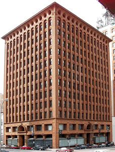
  • Guaranty Building was built in 1894 by Adler & Sullivan in Buffalo NY]
  • Carson Pririe Scott store in Chicago (1904) - Skyscrapers represent the upwardly mobile city of business opportunity - Fire cleared buildings in Chicago in 1871 and made way for Louis Sullivan new aspirational buildings
Manhatta (1921)
  • Fordism - Coined by Antonio Gramsci in his essay 'Americanism & Fordism' (1934)
  • 'the eponymous manufacturing system designed to spew out standardised, low-cost goods and afford its workers decent enough wages to buy them' (De Grazia:2005:4)
  • Also explored in 'Modern Times' (1936) Charlie Chaplin
  • 'In handicrafts and manufacture, the workman makes use of a tool, in the factory, the machine makes use of him' (Marx cited in Adamson 2010 p75)
  • Stock market crash of 1929 - factories close and unemployment foes up dramatically - leads to the great depression
  • Maragret Bourke-White
Man with a Movie Camera (1929)
Flaneur
  • The term flaneur comes from the French noun which has the basinal meaning of 'stroller', 'lounger'
  • Charles Boudelaire
  • The 19th century Boudelaire proposes a version of the flaneur that of 'a person who walks the city in order to experience it' - Art should capture this
  • Walter Benjamin - Adopts the concept of the urban observer as an analytical tool and as a lifestyle as soon in his writings
Photographer as flaneur
  • Susan Sontag - The photographer is an armed version of the solitary walker reconnoitring, stalks, cruising the organ inferno, the voyeuristic stroller who discovered the city as a landscape of voluptuous extremes.
  • Daido Moriyama (1970's) Skinjuku district of Tokyo - influenced by William Klein's work
Flaneuse
  • The invisible Flaneuse. Women and the literature of modernity
  • Janet Wolff
  • The literature of modernity, describing the fleeting, anonymous, ephemeral encounters of life in the metropolis, mainly accounts for the experiences of men.
  • Susan Buck-Morss - The Dialectics of Seeing: Walter Benjamin and the Arcades Project
  • Arbus - Woman at a couter smoking NYC (1962)
  • Hopper - Automat (1927)
  • Sophie Calle 'Suite Venitienne' (1980)
  • Venice - city as a labyrinth of streets and alleyways in which you can get lost but at the same time will always end up where you begin
  • 'Don't look Now' (1973) Nicolas Roeg
  • The Detective (1980) - wants to provide photographic evidence of her existence - his photos are notes on her are displayed next to her photos and notes about him - set in Paris
  • Cindy Sherman Untitled Film Stills (1977-80)
  • Here is New York book/exhibition
  • Weegee (Arthur Felig) - press photographer in the 1930's/40's - signature style is photographing emergencies in the city
  • The Naked City - book of Weegee's images (1945) - develops into a film (1948)
  • LA Noire (2011) - the first video game to be shown at the Tribecca Film Festival - Incorporates 'Motion Scan', where actors are recorded by 32 surrounding cameras to capture facial expressions from every angle. The technology is central to the games interrogation mechanic, as players must use the suspects reactions to questioning to huge whoever they are lying or not.
  • Cities of the future/past - Fritz Lang 'Metropolis' (1929)
  • Ridley Scott 'Bladerunner' (1982/2019) LA
  • Lorca di Corcia 'Heads' (2001) NY - investigates idea of the individual and the relation to the crowd
  • Public/Private - lawsuit against Corcia
  • Walker Evans 'Many are called' (1938) - concealed camera
Post Modern City/Bonadventure Hotel
Postmodern city in photography
  • Joel Meyerowitz - 'Broadway and West 46th Street NY' (1976)
  • 9/11 Citizen journalism: the end of the flaneur?
  • Liz Wells says that phrase is first seen in the article by Stuart Allen 'Online News: Journalism and the internet' (2006) - Discusses the 7/7 London bombings and the immediacy of the mobile phone images which recorded the even as commuters travel to work - online within hours
  • Thomas Ruff
  • Surveillance City - Liz Wells - everything is recorded

Wednesday, 6 November 2013

OUGD504 - Design For Web Type History Research

For the content of my website I have chosen to look into the history of the alphabet/writing systems and do an evolution from the first alphabet through to our current one. To be able to do this well I need a good understanding into the history of type and writing in general. I started by looking at the alphabets in general, with their different characteristics and styles, before narrowing it down to what I wanted to look into.
  • There are only five completely independent writing systems that have been produced in history. Sumerian, Egyptian, Harappan, Mayan & Chinese. 
  • Of these five, the only one still used in the modern day is Chinese.
  • The oldest is believed to be the Sumerian.
There are a number of types of writing systems. These are dependent on the way they represent their underlying languages.
  • Logographic
  • Logophonetic
  • Syllabic
  • Consonantal Alphabet (Abjad)
  • Syllabic Alphabet (Abugida)
  • Segmental Alphabet
Logographic
Logophonetic
Syllabic
Consonantal Alphabet
Syllabic Alphabet

Segmental Alphabet

After going through these different writing systems, I have decided to go with Sumerian and Cuneiform as this is the oldest recorded writing system.
  • Cuneiform is one of the earliest known systems of writing, distinguished by it's wedge-shaped marks.
  • It emerged in Sumer in the 4th millennium BC.
  • It began as a series of pictographs.
  • In the 3rd millennium these pictographs were simplified and became more abstract.
  • The original Sumarian script was adapted for the writing of eight languages and inspired two languages.
Development of SAG 'head' over two millennia:

Phonogram: a symbol representing a vocal sound.
Logograms: a sign or character used to represent a word or phrase
Determinatives: a thing that determines or decides something.

Types of Cuneiform
Sumarian

  • The Sumerians were one of the earliest urban societies to emerge in the world, in Southern Mesopotamia more than 5000 years ago. They developed a writing system whose wedge-shaped strokes would influence the style of scripts in the same geographical area for the next 3000 years. Eventually, all of these diverse writing systems, which encompass both logophonetic, consonantal alphabetic, and syllabic systems, became known as cuneiform.
  • The original direction of writing was from top to bottom, but for reasons unknown, it changed to left-to-right. This also affected the orientation of the signs by rotating all of them 90° counterclockwise. Another change in this early system involved the "style" of the signs. The early signs were more "linear" in that the strokes making up the signs were lines and curves. But starting after 3000 BCE these strokes started to evolve into wedges.
  • By 2800 BCE the writing system started to exhibit use of phonetic elements due to the large amount of words that sounded similar.

  • There where many words that have similar meaning but vastly different sounds are written with the same sign. For example, the word zu "tooth", ka "mouth", and gu"voice" are all written with the sign for gu3 "voice".

  • In addition to use of phonetic signs to spell out new words, new signs were created by adding graphic elements to an existing sign or combining two existing signs. The additional graphic element could be geometric patterns without any meaning, or could be another cuneiform sign.

Akkadian

  • While the cuneiform writing system was created and used at first only by the Sumerian, it did not take long before neighboring groups adopted it for their own use. By 2500 BCE, the Akkadians starting using cuneiform to write their own language. 
  • Sumerian and Akkadian are vastly different languages. Sumerian is a more agglutinative language, where phonetically unchanging words and particles are joined together to form phrases with increasingly complex meaning. Akkadian, however, is infectional, meaning that the basic form of a word, called a root, can be modified in a myriad of ways to create words of related but different meanings.


Hittite

  • Hittite adopted theAkkadian cuneiform to write their language. Approximately 375 cuneiform signs were adopted from Akkadian cuneiform. As in Akkadian, signs can be roughly categorized into phonograms, logograms, and determinatives.
  • Phonograms are signs used for their phonetic values. They can be a single vowel, a consonant followed by a vowel, or a vowel followed by a consonant.
  • In addition to phonograms, Hittite also employed a number of logograms. Many phonograms also serve as logograms, and many logograms have multiple meanings as well.
  • Quite often logograms are accompanied by phonetic complements, phonograms that serve to disambiguate the reading of logograms and/or to explicitly write out inflectional ending of the word.


Ugaritic

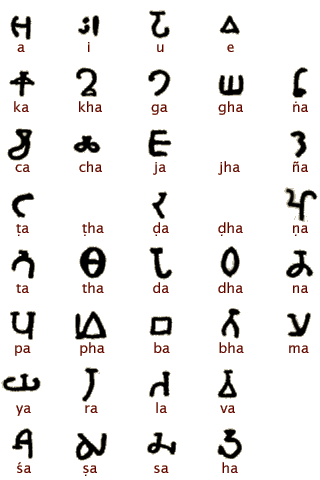
  • The Ugaritic script was really one of a kind, for it was a cuneiform alphabet. Clay tablets written in Ugaritic provided the first evidence of the "modern" ordering of letters, which in Ugaritic went like 'a, b, g, and so on, that eventually gave the order of letters in the Greek and Roman abecedaries.

Old Persian

  • Early in the history of the dynasty, a syllabic script to write the Old Persian language was developed. This script was not a direct descendent of the Sumerian and Akkadian systems, because even though the physical appearance of Old Persian signs are Cuneiform, or in the shape of wedges, the actual shape of the signs do not correspond to signs in older systems with similar phonetic values. Old Persian only kept the cuneiform appearance of its characters simply out of tradition, and the actual shape of the signs were completely original.
  • Old Persian is classified as a syllabic script.
  • These are the logograms used in Old Persian.

  • A slanted vertical wedge is used as the separator between words.

Monday, 4 November 2013

OUGD501 - Seminar 4: The Gaze & The Media

  • Vouyerism (Freud) - sexual desire
  • Visual Culture (Art & Media)
  • Looking is not neutral
  • 'Men act, women appear' (Berger) - visual representation is skewed
  • Men - the purpose, power
  • Women - the object - objectified by men
  • 'Vanity' (Membling) - you can look at the woman because she is looking at herself in the mirror. - a man is going to own this so it's a male fantasy.
  • In art - most artists were men - art was brought by men - men are the ones with the power
  • Economic and material power translates to power over others
  • To make a man feel more confident in their sexuality & power - to own a 'woman' - fantasy - never argues back etc
  • Created image for yourself and other men & called it Vanity - to laugh at women for being concerned about how they look
  • 'Birth of Venus' (Cabanel) - was the most popular painting at the Napolionic Salon when displayed - fantasy piece - dog is mans best friend
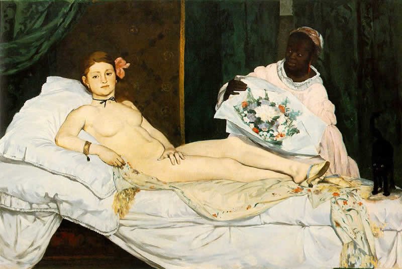
  • 'Olympia' (Monet) - caused scandal at the same show - more of a reality - a painting of a prostitute - challenge to the world views - black cat symbolises independence - the gaze is met showing she is a subject too, not just an object
  • Venus & Olympia - Goddesses of love
  • Tradition of power in art which is disguised - sleazy - objectification of women - pigeon holing women into the way they should act etc.
  • Modern perfume ads - women shows as sexually available
  • Process of women to exist in a consumer culture is to fulfil the typical image men have created for them and always maintaining that - the success of a woman is judged down to if she has a man and has been desired.
  • Kenneth Clark - difference between naked and nude - nude is 'art'
  • Berger says naked is to be yourself and to be nude is to be looked at by & not noticed subjectively
  • We tend to look at other people as an object
  • Women are constantly an objectification of men
  • Women's sense of self becomes closer to this than their sense of self
Task: Write an analysis of an image showing woman subjectivity and the system of power relations. Use 5 quotes from 'The Look' by Coward, R. (Approx 500 words)


The image above is a poster advertisement produced for fashion and perfume retailer Paco Rabanne, advertising a fragrance for men. ‘In this culture, the look is largely controlled by men’ (Coward, 2000, p33). This is clear in this image because of the obvious subjectivity of the woman. The image of the women fits the stereotype of many women in mens fragrance advertisements. She is seen as the object, while the male is seen as the subject and the one with all the power, with the woman there for his pleasure.

As this is an advertisement aimed at men, there needs to be a reason for them to want to buy the product, and this reason is made by the position of the woman in the image. She is positioned behind him, an arm wrapped around him, and looking at him. This implies that she is literally hanging onto his every word and action and completely submissive to him. Like Coward says, ‘The saturation of society with images of women has nothing to do with men’s natural appreciation of objective beauty, their aesthetic appreciation, and everything to do with an obsessive recording and use of women’s images in ways which make men comfortable. Clearly this comfort is connected with feeling secure or powerful.’ (Coward, 2000, p34). 

In comparison to the woman’s position, the man is stood confidently, and with a hand in his pocket to even look smug. His raised hand is in the position of clicking, implying that the woman is there by a click of his finger. These subtle visuals will relate completely to the male viewer, who will subconscious see this and see that this is his desire, to have a woman there at the click of a finger. ‘Entertainment as we know it is crucially predicated on a masculine investigation of women, and a circulation of women’s images for men’ (Coward, 2000, p33). The woman is the object and in the image to show the viewer what they can ‘get’ with this fragrance. It gives a man a false sense of security in their masculinity and power over women. The way the woman is looking at the man instead of the camera implies that she is ‘his’ and won’t challenge anything he says or does. ‘The ability to scrutinise is premised on power. Indeed the look confers power; women’s inability to return such a critical and aggressive look is a sign of subordination, of being the recipients of another’s assessment’ (Coward, 2000, p33-34).

The woman is coated in gold paint, which instantly relates to the need for the finer things in life. It suggests that this woman is as good to a man as gold would be, that she would bring wealth in their confidence and masculinity like gold would in financial wealth. It is perhaps argued that this image is showing a woman as something that men worship and appreciate, however the overall use of the woman in the image does not support that view. Coward says, ‘Men defend their scrutiny of women in terms of the aesthetic appeal of women. But this so-called aesthetic appreciation of women is nothing less than a decided preference for a ‘distanced’ view of the female body’ (Coward, 2000, pg 34). This is definitely the case in this image. The man is seen as the desired life for the male viewer, with a ‘perfect’ woman in his life who will not question a thing and will let him be the leader, the one with the power. 

Friday, 1 November 2013

OUGD504 - Design For Print: Commercial Costings

Costings at LCA
The print room prices

Digital print room prices
General costings

Digital Printing vs. Offset Printing


  • A digital printing workflow has several advantages over offset printing in terms of cost. 
  • Digital prepress costs are usually lower than conventional prepress because the digital workflow eliminates many of the manual operations of conventional prepress. 
  • With digital printing, there is no need for steps such as process photography, manual stripping, and platemaking, although preparing print applications on the computer and processing them through the RIP may still be time consuming.
  • In terms of print output for the shortest runs, digital printing has a definite advantage over offset printing because there is no extensive setup required in preparing the press for the print run. 
  • Conventional offset presses require a lengthy makeready time, which adds a considerable cost to the total price of a short run application, therefore the cost per piece is much higher for the smallest print runs. 
  • When using offset printing, as the quantity increases, the price per piece decreases. When the quantity is large enough, the price per piece is lower than a digitally printed job of the same quantity.
  • The point at which it becomes more cost effective to use the traditional offset printing process may vary substantially, depending upon the application.
  • When determining a cutoff level in which digital printing is a better choice than offset, you must consider the type of application that is being printed. 
  • Except for the smallest press runs, it is difficult to compete with offset printing costs when, for example, the job is a static, single sided document, in a quantity of 1,000 or more. 
  • If the application is a multiple page, full-colour report or brochure, in a quantity of 500 or less, then digital printing is often the best choice
  • A premium is usually charged for digitally printed variable data applications. The simplest applications are often priced 25% higher than conventionally printed jobs. Complex digitally printed variable data jobs are often 50% more expensive than conventionally printed jobs.
  • If a finishing mistake occurs on a small quantity of pieces contained in a static application, there is usually enough of an overrun so that a reprint is not necessary.
  • With a digital workflow, document files can be sent anywhere in the world to be printed near the location where the application is needed. Transferring files saves time and reduces the cost of shipping because the application is printed near the point of distribution.

http://digitalprintingtips.com/printing-tips/t--543/digital-printing-vs.-offset-printing-costs.asp

With digital printing, there is usually a one-off set up fee and then the cost of printing each copy depends on the length of the book. So if a book is 150 pages long, it might cost £3.50 a copy to print.That’s excellent! So you can sell your book at £6.99 and make a profit? Well, yes and no... you can sell the book direct to people through a your web site, by hand or perhaps through a local shop, but try
and sell it through a bookshop and you’ll get a shock. Bookshops make their money by taking a percentage of your cover price, often as much as 60%. So suddenly your £3.50 per copy print price doesn’t look so healthy. Sell at a 50% discount to a shop and you’ll only just break even.
Litho is far better if you want to get more books at a smaller unit cost. The downside is that you have to make a larger investment to do so
.


Lithographic press (litho)

Printing hasn’t really changed a great deal since Gutenburg gave us the printing press in 1468. Technology has allowed modern printing presses to produce millions of copies of a page in a single day, but the principle of applying pressure to an inked surface resting upon paper, thereby transferring an offset of an image, remains the same.
These days a printer creates a set of ‘plates’ which are used to press the image onto paper. There are initial costs involved in creating the plates and setting up the press. This means a litho job can be expensive and take time, but for large print runs it remains the most efficient process and also boasts superior quality and finish.
Pros

  • Most cost effective for large print runs (500+)
  • Unrivalled print quality
  • Most flexible in terms of printing stock, inks and finishes
  • Can print up to A1 size
Cons
  • Long turn around time
  • Expensive for short print runs
Digital print press
Digital print presses are essentially very big and very fast colour laser printers. They can handle some heavier papers and cards but offer nowhere near as much flexibility as litho print. Digital is good because it is instant. Jobs can be turned around in a day if need be and there are no setup costs which means you pay for what you print.
These days the top of the range digital print presses offer very high quality - almost comparable to a litho print job. However, not all printers have the latest top of the range digital presses. In fact unless you are very lucky, digital will give you a noticeable drop in print quality and colour will almost certainly not match.
Pros

  • Most cost effective for small print runs
  • Print on demand
  • Very fast turnaround times
Cons
  • Noticeable drop in print quality
  • Less flexibility than litho print
  • Can only print up to A3 size
  • Other print processes
Large format inkjet
This is an excellent solution for printing things like one-off exhibition banners and translucent window graphics. However, large format printing can be expensive.

Screen printing
Screen printing is a highly versatile printing technique. It can be used to print on all sorts of materials from plastic to metals to cotton t-shirts, and many methods can be used to print special colours such as metallic colours or suedes or glosses. 

Links to offers for printing
£14 per printing session
£25.50 per printing session
Options:
Examples of quotes
Hardcover book quote - expensive

Hardcover book quote - cheap

Softcover book quote - expensive
Softcover book quote - cheap