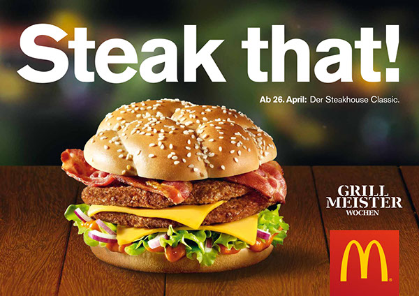
Fast Food - Burger King Vs. McDonalds
Burger King:
McDonalds:
The main point that I want to look at in this case study would be how McDonalds has changed its approach to advertisements recently, whereas Burger King are consistent in their use of image and type. Obviously they are both fast food companies, and the main way up to now in gaining customers is showing images of the food. However I think the way that McDonalds is recreating its image by changing the advertisements to include clever and personalised typography is definitely something to explore.
Case study 2
How the context can be changed by the typography - Amnesty International Vs. Tv Shows
The main point of this case study would be to look at the way text can change the context of an advertisement. With the way tv shows are advertised these days, it mirrors the way in which brands such as Amnesty International promote their services. This plays on the idea that the image can be in any context, for a meaningful cause or for something for entertainment purposes.

No comments:
Post a Comment