Montagü
The designer of this website has created it in a format that can be replicated easily onto any sized screen as it works in squares/rectangles to built the page up. Throughout the different responses each is maintaining very clear grid lines and not straying from these. This design also means that no gutters are needed between sections.
I like this design because of how striking each page is. The concept behind the design is very simple, but uses bold images and white content boxes to contrast against one another and create a very clean, professional looking website.


Oyler Market Barbecue & Brewery
The branding of this restaurant is all monotone, and this is reflected through the website design. There is a mix of photographs, vectors and technical drawn elements, particularly in the phone App design. Everything is centralised and the information displayed is only the necessary information.
I like this website design because of it's simplicity. The background is simple a photograph, and then the content boxes/content appears over the top. It is clearly a website built for it's purpose and not to have all the bells and whistles. The monotone also works well, especially when the information is in the white writing over dark images.


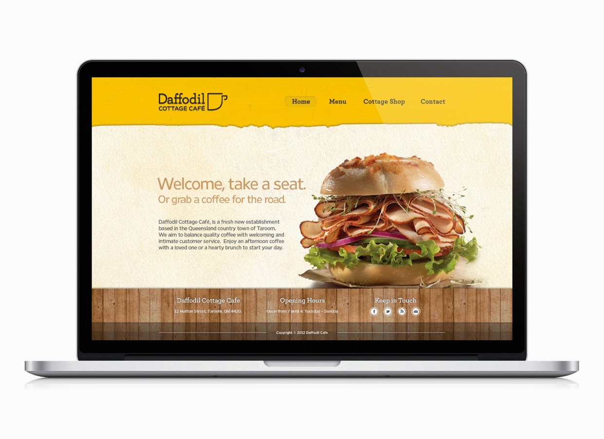
Daffodil Cottage Cafe
The design for this website is different from the two above because it is built to look a lot more homely and welcoming than them. There is still a clear grid to the way these pages have been built, but the content within the pages is what is making it a lot more of a clean design. The App has an interesting idea where users can take photos of their purchases, so this is one of the better parts of the design.
I am not too keen on this website because I prefer the more professional and striking ones, but it does show how a more relaxed and laid back approach to a website.


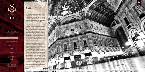
Savini Gusto
This design of website reflects the professionalism of the restaurant itself. It is structured in a clear way and keeps the same format for every page, just the content box spreading across depending on the page. The deep red of the navigation bar makes it obvious to the viewer that this is the most important element on the page, and makes it stand out against the content and background images.
I like the initial first page, however I'm not a huge fan of the content moving out from the side. In this instance it does work because of the context, but I would prefer the information to be central.


Common Man
This is the homepage for the Common Man restaurant. It has a very simple layout, which works very well because of the contrast of the text to the images, and then the images to the background. It is all central and all fits onto one page so there is no scrolling necessary.
I like the way the rollover buttons work, changing colour dramatically and bringing that image to the forefront of the website against the brown. I like these buttons in general as not many websites use images like this for the links.

Tequila Grill
Once again this website uses images as the background to the pages. The navigation bar on this website is fixed and in the orange, which stands out against any of the images used in the background. The way the logo has been incorporated into the bar makes the whole website look very fluent as none of it looks just cut and paste.
Overall I'm not too keen on the website, however I do like the way the headings have been put onto the pages, with the bold white around them to make them stand out. I also like the way the navigation bar has been put together to work with the rest of the page.


Mundo Cafe & Bakery
This website works on a clear grid system with all the content centralised on every device is it used on. The colours used are quite earthy and natural as it is for a cafe & bakery. It reflects the quality of the products served.
I like the simplicity of the layout and how drawn images and photographs are incorporated into the design to create a very clean and professional, but contemporary website design.

After this I started looking into some websites which had elements that I found visually appealing.
Horten Hus
I like the general layout of this website. There's a lot of space and everything isn't crammed in small spaces close together. It works to a clear grid system and doesn't have so much information on each page. I also like the way the navigation works on this website, with an initial four icons and then the larger navigation bar which opens when clicked on. It is all very clean and simply laid out so it is very easy to navigate and look around.


Metta Skincare
I like this one because of the simplicity of it. A navigation bar along the top, and then one larger image with a bit on text on explaining the purpose of the website. I like this use of photography, using the white space in it to place the text there. Moving onto the content pages, the information is displayed very simply with a large amount of space around the content. It makes everything much easier to focus on and view.


House Creative
I chose this one because of the layout. This website holds a large amount of information but has displayed it in a simple and easy to navigate way, with a lot of large clear links onto other pages. This website also doesn't have much of an emphasis on the navigation. It is only a small bar along the top.


Demi Creative
I like this website because it combines simple design and photographic images. It uses different colours to differentiate the pages from one another, and when scrolling down the page, it goes through different tones of that colour, breaking up the information into readable sections. This is a much more interesting way of displaying information than just having it sat on the page all together, it encourages the user to scroll through.


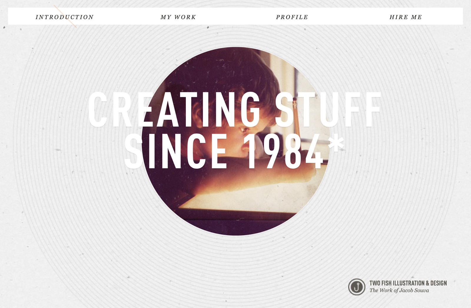
Two Fish Illustration & Design
I like this website because of the lack of colour on it. It keeps everything quite monotone, apart from the image which is in colour and stands out against the rest of the page. The main feature of this website that I like is that it is a completely linear website and all the information is on one scrollable page.


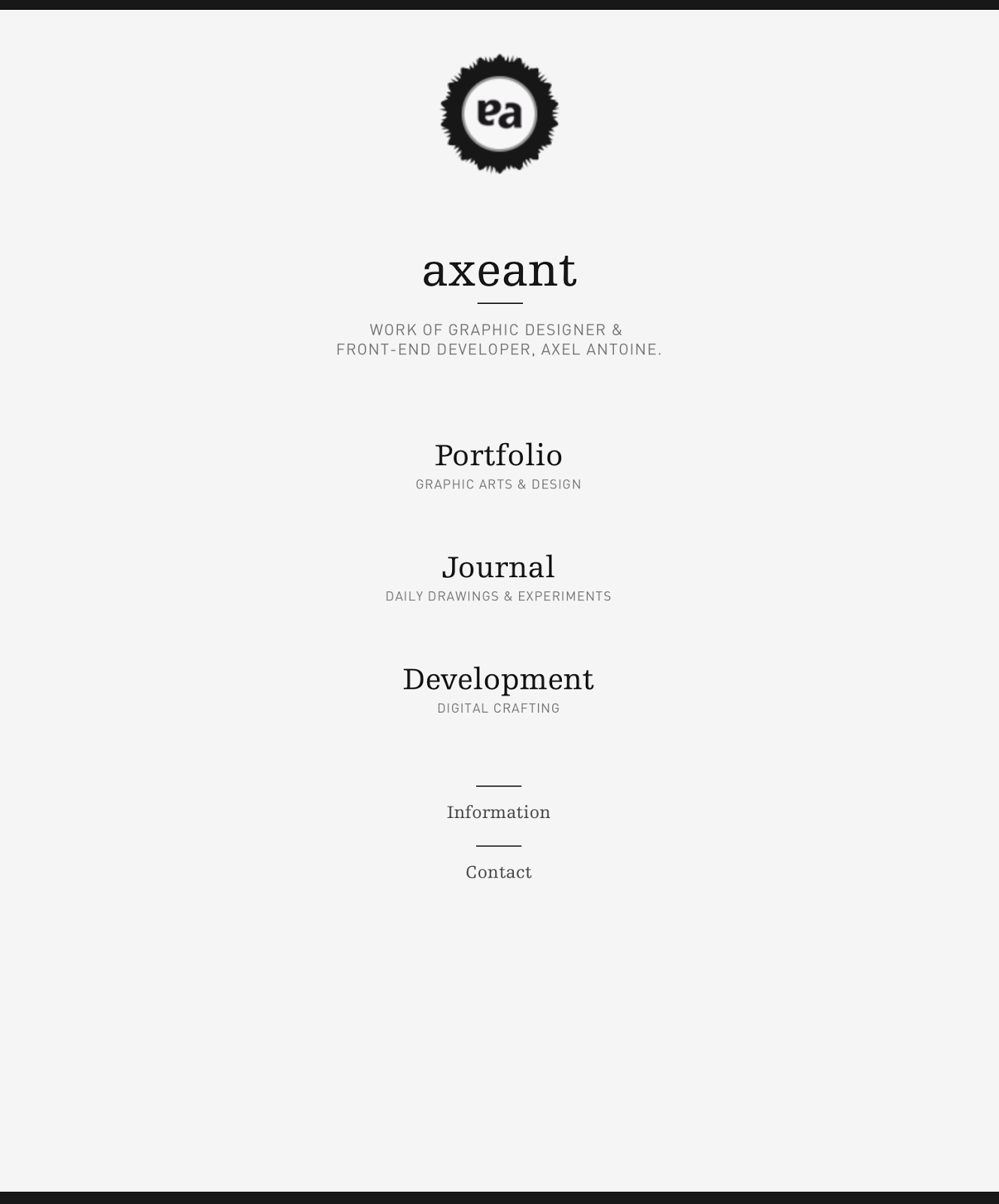
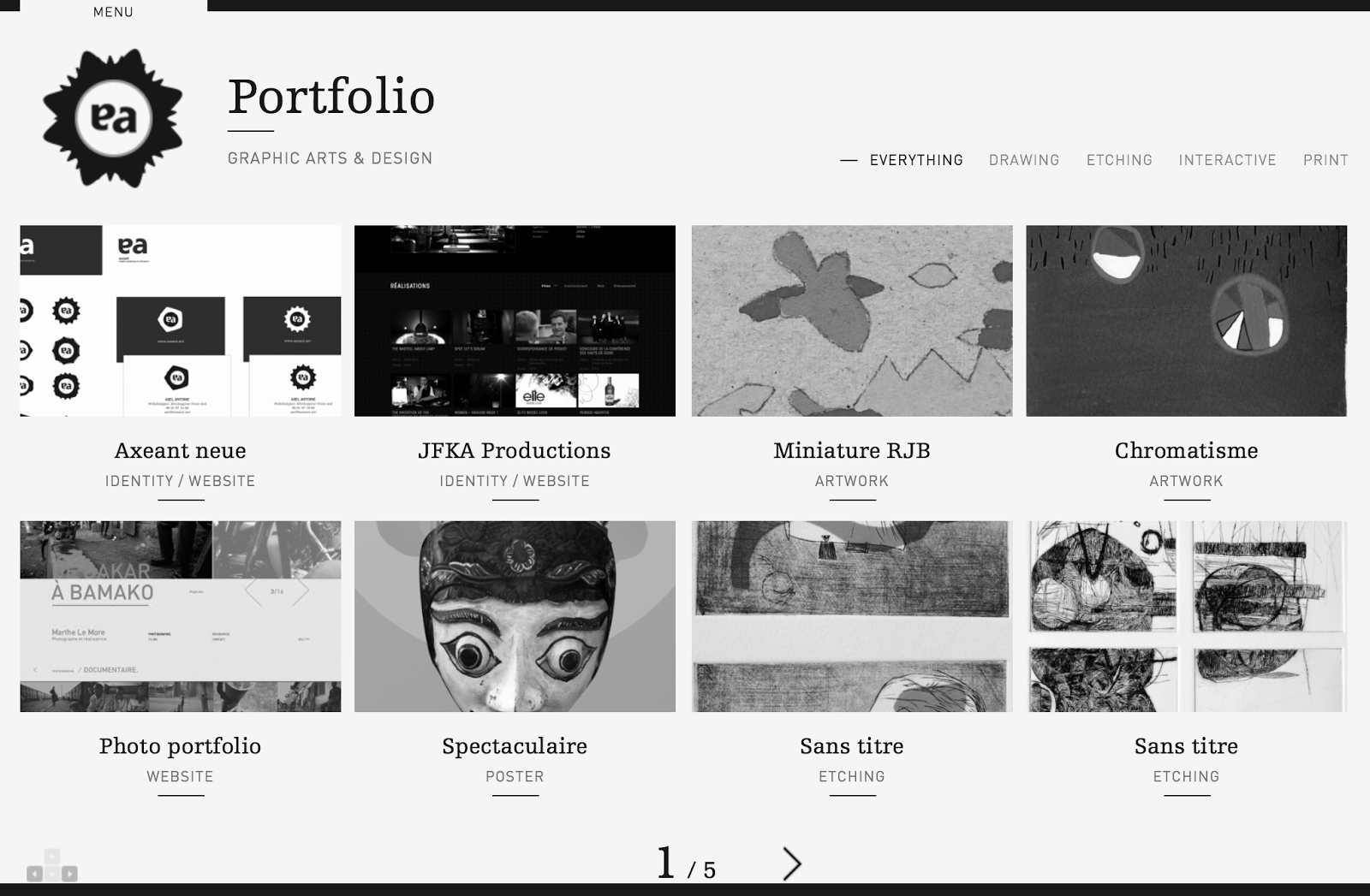
Axeant
I like this website because of how simple the homepage is. There isn't any noise and each link is given a large amount of space on the page. This website definitely works more for function than form, and doesn't have anything that isn't necessary.


MediaBoom
This website is a bit showy at first, with a big video introduction, but when looking through the pages I found I did like the overall layout of information. The navigation bar is easy to use, with all the options appearing when a link of hovered over, and a lot of icons around the place relating to different content.
The things I don't like about this website is how long it takes to load. The designer has packed it full with a lot of effects and moving images behind each page which makes it very inconvenient for the user.


I then looked at what these websites looked like on a phone & tablet to see the difference in design.
Horten Hus
iPhone:


The adaptation of the website to the iPhone screen size is an obvious one, where it has kept the same design features as the website, but displayed them in ways that are much more user-friendly at this screen size. The icons have now become clear buttons and the format has been changed to suit the orientation of the screen.What I like the most about this design is the navigation. I like this on the original website and like the simple way they have adapted it to this screen size. Overall the initial website is designed with easily adaptable content, which has definitely made this much easier for the smaller screen sizes.


The iPad site is much the same as the website visually. It is identical, but with this screen size it still works well because of how simple the original design is to begin with.
Metta Skincare
iPhone:


There isn't much change to the website in terms of adapting it to this screen size. The one noticeable different is the top menu bar. On the website there are a number of links, but on this one there is only two. Clicking on the 'menu' brings up the rest of the options for this website. The initial website is quite simple so adapting it to this screen is something that was very easy.
However something I don't like about the design is when it gets down to the picture links. These work ok on a portrait screen, however on a landscape orientation these become as large as the screen and suddenly you only have one link on the page instead of having all three. This seems pointless and an inconvenience to the user as they now have to scroll through to get the next link.
iPad:


House Creative
iPhone:


The adaptation to the phone screen isn't something I am overly impressed with. On a desktop it works well, but at this size, the large heading pushed the rest of the information off the page, which isn't exactly a good use of space. Another issue is the navigation bar on a portrait orientation. The buttons become very small and hard to use without having to zoom in.
The 'work' page works well on a portrait orientation, but on a landscape one it doesn't really because the image is the width of the screen, meaning you can't see all of it without scrolling through it.
iPad:


This iPad version of the website isn't much different from the original, however something that does annoy me is the navigation bar again. While they have the chance to make it larger and easier for a user, they haven't. The text is small and in turn quite hard to use. However the layout of the 'work' page is much better on a landscape orientation than the phone as you can see the full image easily.
Demi Creative
iPhone:


iPad:


This adaptation is like the desktop website, however slightly changes on the 'work' page with the links, making it much more efficient for use of space and for the user to see everything at once. The website is built in a way of having a few main pages and then a linear system through each of these, making it easy to apply and adapt the content to any screen size, as shown here.
Two Fish Illustration & Design
iPhone:
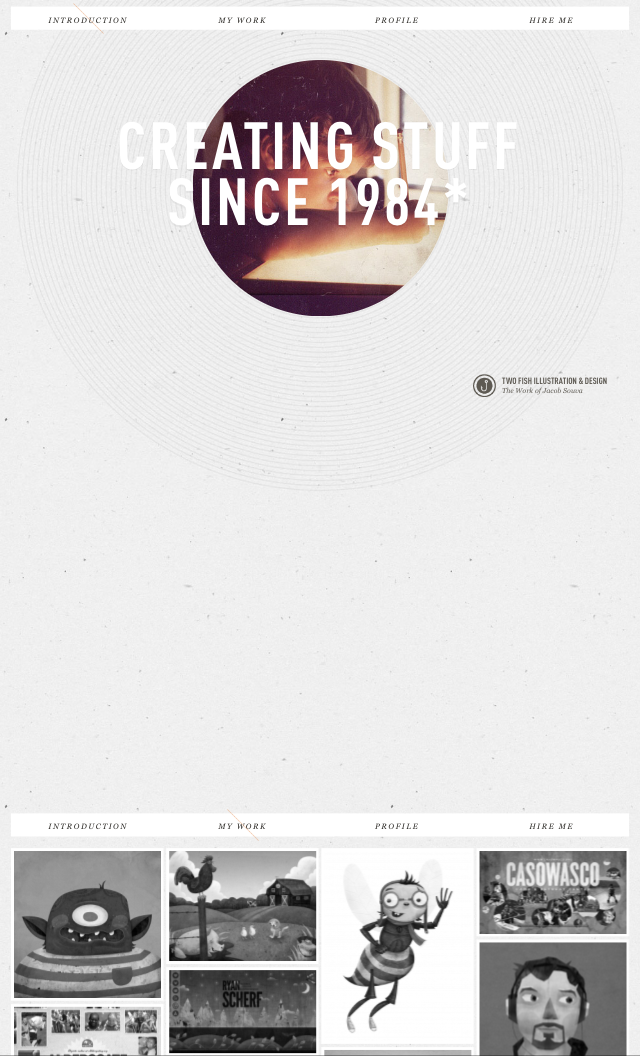


This is a clear example of a website that hasn't been changed it any way to suit the screen size of a phone. It is exactly the same layout as on the desktop, which isn't necessarily a bad thing in some cases, but when it comes to putting the website portrait on a small screen there are some issues. The use of space isn't very good, as shown above. There is a huge gap, which could be easily used up so there could be a clearer and larger navigation bar. Also the way the work is displayed makes it hard for a viewer to see the images at a good quality.
iPad:


On this larger screen size the website works ok, but there is still the issue of the large gap, which could be used for expanding the navigation bar. The website could definitely benefit from being redesigned for a different screen size.
Axeant
iPhone:


This website shows a clear change from the desktop version to the phone version. The layout is different throughout and has been designed to be more useful for the user. The adding of the menu bar makes it especially easy to the user, and the layout for the content is much more driven to a smaller screen.
iPad:


The adaptation to the tablet screen is interesting because it is a mix between the desktop version and the phone version. It shows how a website should be designed for different screen sizes and uses, the desktop with all the bells and whistles, and then that content narrowed down for the tablet, and narrowed down further for a smaller screen.
The menu selection on the landscape orientation is an added feature that isn't on either of the others, showing that there has been some consideration into adding new features and measures to ensure usability is at the easiest it can be.
MediaBoom
iPhone:


iPad:


Looking into the phone/tablet versions of these websites has been helpful as it has shown me the big do's and don't's of designing for different screen sizes. Using the websites on my devices was extremely helpful as well as I was the user of these websites and went through all the pages, noting the problems with each and the inconveniences to me as the user. This helps me as a designer because I can now design around those ideas and try avoid as many of these problems as possible.
The biggest problem I found was the navigation on some of these websites weren't adapted correctly for the screen size. It seems some have been designed depending on the pixel size of the screen instead of the reality of what they would be displayed on, with some of the menu bars being ridiculously small on a phone screen, making them very hard to use without zooming in. Also the use of large images is something to avoid if a user is looking at the website on a small screen at a landscape orientation. Having them fill the width of the screen causes it to be very hard to look at it as a whole, especially without the option to zoom out.
The elements that did work were the websites that made changes to clearly adapt to the screen sizes and had thought about the devices themselves and how they are used. Where the menu bars have been increased in size or turned into buttons rather than words were much easier to use and navigate through the website.