To start this brief off, I looked into restaurant/cafe branding which has been previously done. This is so I have an insight into what exactly has been branded, what products have been created and how designers have integrated the print and web aspects to their briefs.
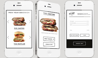
The first one I looked at was 'Victory', a sandwich bar.
Branded items include:
- Coffee cups
- Glasses
- Bottles
- Sandwich wrappings
- Sandwich bags
- Box packaging
- Menu
- Coasters
- Business cards
- Exterior Signage
- Van
The branding has been kept very simple, just black on white/white on black, with one logo made up of two elements, each which are used on their own and together to create the overall branding for this cafe. I like this as it keeps everything simple and doesn't complicate branding and have a number of different symbols/colours over a range of media. Everything is slightly different, but very clearly together.
In regards to the approach of the website, like the printed branding, it is all based on greyscale, just using simple black and white, and a simple layout. In the app, the sandwiches are what are in colour and are made to stand out. The same buttons/links are used on the website and app, keeping a consistency between them. Unlike the branding though, the apps seem a lot less casual and laid back. They have a more formal appearance, whereas the print branding does seem a lot less structured.
My overall feeling on this branding is that I like it because of the simplicity of all the designs and consistency throughout all media. There's nothing overcomplicated about the branding, no cheesy slogans or number of vector images to back up the brand. It's plain and simple and works very well.
The second restaurant I looked into was 'Esplanades', an Italian restaurant. Contrasting to the example above, this brand uses 7 different colours for it's branding and has a very different approach. However, these colours are manly used for text/outlines, he main colour being the stock colours. The media that is branded is different as well. As this is a restaurant and not a takeaway shop, there is no packaging branded, but napkins, pencils and vouchers instead. The branding is very simple, just a simple symbol and the restaurant name underneath, sometimes not even that.
The website very much represents the brand, keeping in with the simple structured layout and minimal use of the colours. It is one continuous page, which works very well as there isn't a huge amount of information and not really much need for separate pages.I prefer the approach to this website to the one for 'Victory'. It seems a lot cleaner and fits in with the brand very well, using elements from the printed branding throughout to combine it all together as a full brand identity.
Designer Website
Restaurant Website
The third that I looked into was a restyling and packaging development for a burger restaurant chain 'Burger Station'.
This one particularly interested me as the focus was on the takeaway packaging and this is something that I would like to incorporate into my outcome. In this packaging, sauce packaging was included, which is something that I would definitely like to consider.
Like the previous two examples, the branding once again is very simple. Just black & white again, with only two branding items, the logo and a cow face.
My opinion on this is that I like it because it shows how simple branding can be. Stickers stuck onto different media is all that has been used for this, nothing more, and overall I think it works very effectively and is a change from the perfectly printed media.
http://www.behance.net/gallery/Burger-station/11151923
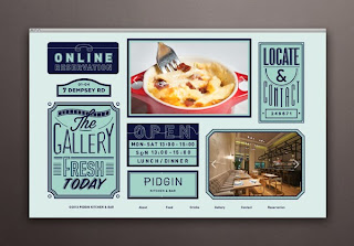
The fourth restaurant I looked into was 'Pidgin'.
This has quite a big focus on typography, which is definitely helpful for this brief. It shows how typography has already been used in the restaurant environment and shows the difference in amount of typography on different pieces of media. For example, the placemats are covered in a more playful approach to type, whereas the menu is a lot more controlled and structured. I like the creative use of type and signs for the bathroom signs. It is a lot more quirky than the standard symbol.
The website follows the same form of the placemats and becomes the main identity for this restaurant online. It is displayed in quite a creative way compared to other restaurant websites/apps. It keeps in with the form of the identity but still manages to give all the information that is needed. Although the pages are quite cluttered as intended, they still manage to have enough space so it is easy to read.
Overall I like the website branding and restaurant interior branding. I do feel that this could have been utilised more through the remainder of the media, but obviously that wasn't the intention. I have learnt quite a lot from this one visually as it shows how a number of different typefaces can be used on the same media.http://www.behance.net/gallery/Pidgin/11063687


No comments:
Post a Comment