For my info-pack I want some packaging to join every design piece together and make it clearly part of the same information pack. Before designing this I looked into different packaged packs.
This first one has three different types of packaging. These are simple and are made to look like they are going to be posted obviously.
I like these because of the simplicity of them. It shows how little that needs to be done to join products together in a pack.
This one was interesting as the packaging formats and designs were different, but they all have one sticker on that joins them together. It shows that the packaging doesn't need to be identical on all of them to make them obvious that they are from the same pack.
I particularly like the quality of this packaging. It is of a high quality and finish and looks very professional.
This packaging is for a book. This is done in a way that makes book packaging interesting and shows that it doesn't have to be so simple. This packaging shows that packaging doesn't just need to be something to hold the product, it can be a product within itself.
This one I found interesting because of how the packages all fit together to create a shape. This makes packaging more exciting than just holding the products and adds to the visual identity.
When I chose the Domino's brief, the first thing I did was look into the brand and the pre-existing advertising campaigns.
Domino’s story began with the opening of its first store in 1960 called “DomiNick’s.” Five years later, the company was renamed Domino’s Pizza, Inc., opening its first franchise location in 1967. Today, Domino’s has nearly 10,000 locations worldwide and $6.9 billion in annual sales.
The first thing I looked into was the rebranding that Domino's introduced in 2012. Their aim was to have a more memorable logo and consistent style throughout their brand. A lot of the Domino's takeaways will be franchises with their own local advertising which may all be inconsistent. Domino's issued brand guidelines, from logo styles to typefaces to use and how to use them, meaning there will be consistency through every country. This creates a much stronger brand image.
Original Logo:
Although the original logo is memorable, it has been used since the name Domino's Pizza was established in 1965. To keep competing with the newer and more contemporary pizza chains the revamp was necessary to bring the brand up to date.
New Logo:
Domino's aim was to make a logo which was memorable without the use of type. As the original logo was so well known, Domino's didn't go too far away from this, just taking away the unnecessary elements and creating a much stronger, simpler logo.
There are three variations of the logo:
From these guidelines it is clear that Domino's wants to solidify the domino on it's own as the main brand identity, however when more branding is required they do have the name as well. They have dropped the 'Pizza' and changed the typeface to something a bit more individual.
In terms on appearance, Domino's is very patriotic to America. With this being it's heritage, the colours red, white & blue are the only allowed colours in advertisements now (plus photographs). This has been very clear through previous advertisements:
Domino's has been continuously building as a brand and has adapted a certain quirky and humorous tone of voice to the way it is put across to customers. They are informal, witty and friendly in advertisements, giving the viewers/customers a sense of friendliness and home comfort.
A lot of the printed advertisements have been from before the rebrand. A lot of the focus for Domino's advertising is now on the television or the internet because of the new technologies that around.
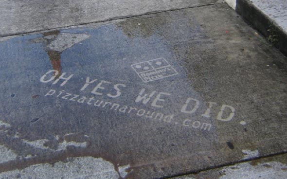
One of the main campaigns Domino's has done in recent years is the 'Oh Yes We Did' campaign. This was in response to a large survey Domino's conducted, asking customers to give honest feedback on how to improve their products.
With this campaign, Domino's essentially started their rebranding shift. This is where they started changing their ethos and products for the better, updating recipes and listening to what the customers wanted and what they thought was wrong with the products.
Domino's has always prided itself on being all hand-made pizzas and fresh takeaways, however it was getting a bit of a reputation for being a lot more expensive than it was worth. To compete with other pizza takeaways they had to improve their services.
One part of this campaign was to make it personal to some of the customers who gave feedback, involving them in the campaign publicly. The following image shows one ad where this is happening:
By aiming it at a number of individuals it is really quite a risky thing to do in advertisements, however it is clear that Domino's values its customers and wants to keep the current customers happy instead of just focussing on getting new customers.
In terms of their most recent campaign, it has been purely tv advertisement. The 'Greatness from Domino's' is aimed to show Domino's quirky & fun side in an effort to get more customers. It's once again taking inspiration from America and the Wild West, making it look like the delivery guy is on a horse.
After this I looked into the ordering options they have, starting with their website. The British and American websites are very different, with a clear amount of time difference spent on designing these. This reflects Domino's primary market, which is predominantly the US, however the homepage for the UK site does show deals, so it does as it needs to.
At this point I had collected enough secondary resources to look over the designs and see exactly what Domino's design is all about. I also referred to the Brand guidelines that have been specified for this brief (Shown on Design Practice).
The only colours used are red, blue and white - their specified colours, and the only colours that I am allowed to use in the brief (black can be used for a monotone logo if needed). The only typefaces I am allowed to use are the ones specified, and these are used across all of their recent advertising, especially the Trade Gothic No.20.
They like the use of banners and effects on the type to make it more visually interesting than just typed out. They like the use of lines, stars and anything which is visually striking. They like big and bold, meaning this isn't a brief where I can shy away from this. The designs I do must reflect this bold personality that Domino's have built up. They like the use of photographs of their products, and layering text over the top in boxes or banners. Overall the designs are quite simple and advertisements seem to be lead primarily by the photographic images, with the text as a bit of context.
I then moved on to looking at the takeaway order App that is available from Dominos.
In the launch for this App they had the 'On The Go' campaign, as shown below.
Working on the idea of Google Maps & the pinpointing system, it replaces the pins with pizza slices, showing that wherever you are, you can order pizza.
App:
This App is clearly designed for functional use and doesn't really have much of a correspondence to the overall look of Domino's. Due to it being on a mobile phone screen, there isn't much room for their usual designs which would be used. It is purely about giving the user the easiest experience possible for use.
I then started looking into the advertisements Domino's already had for Two For Tuesdays and the advertisements by competitors.
the indexical qualities of photography in rendering truth
photographic manipulation and the documentation of truth
censorship in advertising
censorship in art and photography
Ansel Adams
Moonrise Hernandes New Mexico, c.1941-2
Moon over Half Dome, 1960
Aspens
Exposed photo negatives for different amount of times to get different effects - makes the images look like they are taken at different times of year/day etc.
Pravda
Five years before coming to power in 1917 October revolution, the soviets established the newspaper Pravda.
One sided truth
One side that the government wants you to see
Digital
Photoshop makes it easy for anyone to manipulate photos
People making fake advertising playing on images - 9/11 images
Kate Winslet on cover of GQ magazine - legs elongated in photoshop
Is the representation of truth an important factor? Can you manipulate to sell?
Iraq war - two images combined to create one image - not representing the truth - can combine different images to change the message
Robert Capa
Robert Capa is a pseudo name - built up an identity
Death of a Loyalist Soldier, 1936 - is this the point of moment of death or is it set up? Does it matter?
'At the time (WWII), I fervently believed just about everything I was exposed to in school and in the media. For example, I knew that all Germans were evil and that all Japanese were sneaky and treacherous, while all white Americans were clean cut'
Jean Baudrillard
Simulacra and Simulations, 1981
It is a reflection of a basic reality
It masks and perverts a basic reality
It makes the absence of a basic reality
It bears no relation to any reality whatever
The Gulf War Did not Take Place, 1995 - It is a masquerade of information
Caused a lot of offence to people who had relatives who died in the Gulf War - they mistook his comments as saying the war never happened without reading the book
Peter Turnley, The Unseen Gulf War, 2002
There was censorship in the first gulf war
Photographers in the first war were controlled by the US forces and had restrictions on what they could photograph & represent
'The mile of death' - on the last day of the war - no photographs were published at the time
Ken Jareke
Iraqi Soldier, 1991 - image was put in newspapers - one of the first truly shocking images captured in colour and put in the newspaper - british press was criticised for it - depicted a gruesome reality
Do you want an accurate gruesome truth?
An-My Le, Small Wars
An-My Le, 29 Palms: Mechanised Attack
An-My Le, Small Wars
Censorship in Advertising
To ban or cut portions (a film, letter or publication)
Morals & Ethics
Cadbury's Flake, 1969 - played on sexual ambiguity - a questions of other connotations to it - does it say more about the certain individuals or a universal?
United Colors of Benetton adverts, 1992 - stereotypical uses shocking adverts - racism & religion
Opium advertisement, Stephen Meisel, 2000 - most complained about advert in five years (2001) - sexually suggestive and likely to cause 'serious or widespread offence' thereby breaking the British codes of advertising and sales promotion.
Agnolo Bronzino, Venus Cupid, Folly & Time, 1545 - as a mythological subject does that make it acceptable?
Does painting make certain types of scenes more acceptable than photographs?
Balthus, The Golden Years, 1945 & Therese Dreaming, 1938 - represents an uncomfortable ground
Andy Earl recreated Manet's 'Dejeuner sir l'Herbe' with Bow Wow Wow record cover, 1980
Does a piece of fine art photography change the way we view it from commercial photography?
Amy Adler
The Folly of Defining 'Serious' Art
Professor of Law at NY University
'An irreconcilable conflict between legal rules and artistic practice'
'The requirement that protected artworks have 'serious artistic value' is the very thing contemporary art and postmodernism itself attempt to defy'
The Miller Test - 1973 - asks three questions to determine if a piece of work is seen as obscene
Obscenity Law
To protect art whilst prohibiting trash
The dividing line between speech and non-speech
The dividing line between prison and freedom
Sally Mann
Candy Cigarette, 1989
Immediate Family, 1984-92
Tierney Gearon
Untitled, 2001
News of the world - upper crust art lovers are paying £5 a head to ogle degrading snaps of children plastered across the walls of Britain's art galleries
Nan Goldin, Klara and Edda Belly-dancing, 1998
Richard Prince, Spiritual American, 1983
Richard Prince, Spiritual American IV, 2005
Final thoughts
Just how much should we believe the truth represented in the media?
Should we be protected from it?
Is the manipulation of the truth fair game in a capitalist consumer society?
Could art sit outside the censorship laws?
Who should be protected, artist, viewer or subject?
The process of transformation of local or regional phenomena into global ones. It can be described as a process by which the people of the world are unified into a single society and function together. This process is a combination of economic, technological, sociocultural and political forces.
Capitalist
The elimination of state enforced restrictions on exchanges across borders and the increasingly integrated and complex global system of production and exchange that has emerged as a result.
Covering a wide range of distinct politics, economical, and cultural trends, the term globalisation has quickly become one of the most fashionable buzzwords of contemporary political and academic debate.
In popular discourse, globalisation often functions as little more than a synonym for one or more of the following phenomena: the pursuit of classical liberal policies in the world economy, the growing dominance of western forms of political, cultural, technological.
If we are talking about the cultural, we are concerned with the symbolic construction, articulation, and dissemination of meaning.
George Ritzer coin the term 'McDonaldization' to describe the wide-ranging socioculture processes by which the principles of the fast-food restaurant are coming to dominate more and more sectors of American society as well as the rest of the world.
Marshall McLuhan
'Today, are more than a century of electric technology, we have extended our central nervous system in a global embrace, abolishing both space and time as far as our planet is concerned' (1964: p3)
Rapidity of Communication echoes the senses
We can experience instantly the effects of our actions on a global scale
Global Village Thesis - 'As electrically constructed, the globe is no more than a village. Electric speed at brining all social and political functions together in a sudden implosion has heightened human awareness of responsibility to an intense degree' (1964: p5)
This global embrace has not happened - almost desensitised
McLuhan says: We live mythically and integrally...In the electrical age, when our central nervous system is technologically extended to involve in the whole of mankind in us.
Centripetal forces
Bringing the world together in a uniform global society
Centrifugal forces
Tearing the world apart in tribal wars
Three problems of Globalisation
Sovereignty
Challenges to the idea of the nation-state
Accountability
Transnational forces & organisation: who controls them?
Identity
Who are we? Nation, group, community
Multi-national businesses can act outside of the control of the government - laws may be passed in one country but not apply in other countries.
'Does globalisation make people around the world more alike or more different?...A group of commentators we might call 'pessimistic hyperglobalisers' argue in favour of the former. They suggest that we are not moving towards a cultural rainbow that reflects the diversity of the worlds existing cultures. Rather we are witnessing the rise of an increasingly homogenised popular culture underwritten by a Western culture' (1964)
Global Imperialism
If the global village is run with a certain set of values then it would not be so much an integrated community as a assimilation of one
Rigging the 'free market' - media conglomerates operate as oligopolies (giant clusters of businesses in the control of one central business/individual)
Effectively around 5 or 6 multinational oligopolies are controlling the worlds media, all of which are American.
One company controls the cultural output of a percentage of the worlds media, e.g. Time Warner
Focus their attention on the areas where they can make the most money - e.g. concerns for North America instead of concerns for Africa shown in the media/magazines - the values of american capitalism are spread
US media power can be thought of as a new form of imperialism
Local cultures destroyed in this process and new forms of cultural dependency shaped, mirroring old school colonialism
Schiller - dominance of the US driven commercial media forces US model of broadcasting onto the rest of the world but also inculcates US style consumerism in societies that can ill afford it.
E.g. Big Brother - repackaged commodities to different markets to make money
Chomsky & Herman (1998) 'Manufacturing Consent'
Argues that the entire media system can be thought of as propaganda for the western life - constant lesson that it is the way of life etc.
5 basic filters
Ownership
Funding
Sourcing
Flak
Anti Communist ideology
All combine to make a propaganda for the western world
Ownership
Rupert Murdoch, selected media interests
News of the World
The Sun
The Sunday Times
The Times
NY Post
BSkyB
Fox TV
Sourcing
The stuff that is reported is the stuff that is only allowed to be
Political input
Funding
They are there as businesses - advertisers will withdraw their money if certain stories are printed in the media outlet
All bias and representative of big businesses
Flak
US based Global Climate Coalition
Compromising fossil fuel and automobile companies such as Exxon, Texaco and Ford. The GCC was started up by Beurson-Marsteller, one of the world's largest public relation companies, to rubbish the credibility of climate scientists and 'scare stories' about global warming
Flak is characterised by concerted and intentional efforts to manage public information
Al Gore, (2006) 'An Inconvenient Truth' dir. Davis Guggenheim
The media is a powerful way of influencing the consciousness
Retreat of Glaciers
Since 1880 temp of the rise
Keeling of CO2
Messages
The way to save the planet is to release CO2
Plant more vegetations
Try to be CO2 neutral
Recycle
Buy a hybrid car
Encourage everyone you know to watch the film
Buy more stuff - more money for the big businesses
'Flat Earthers' - denying global warming
Jim Inhofe
Nigel Lawson
Sustainability
'Sustainable development is the development that meets the needs of the present without compromising the ability of future generations to meet their own needs' Brundtland Commission, 1987, 'Our Common Future'
Needs (Particularly of the worlds poor)
Limitations of technology
Erin Balser, 'Capital Accumilation, Sustainability and Hamilton, Ontario: How technology and capitalism can misappropriate the idea of sustainability'
BIOX Biofuel plant, Canada
Alternate clean fuel
Renewable
More expensive to produce
Not a model thats going to interest large oil companies as there isn't as much profit in it
Situated in the poorest area of Ontario, Hamilton
Negative social and environmental outcomes
Greenwashing
Exploiting the fact that everyone is concerned about environmental destruction
Companies create 'green' products
Make everything eco friendly
People buy the products because they feel they are saving the planet
'Most things are not designed for the needs of the people but for the needs of the manufacturers to sell to people' Papanek, 1983, p46.
Frustration that talented designers were wasting their talents flogging pointless products
Waste of designers in a capitalist society
Produced in a 'boom' time for consumerism
Unethical to waste talent in pointless products
Replaced by First things First manifesto2000 - Adbusters
Republish and update
Tone of voice changes - much more critical
Advertising gets a lot more criticism
Accusing you of being involved in a meaningless consumer system - complicit in a system of global exploitation
Affecting the way people interact with people and feel about themselves
By who's standards do you decide what design work is worthy to be ethical?
If you work to advertise, market or brand companies that make any sort of consumer item, you are somehow being unethical
Should be using talents to stop consumerism and 'start a revolution'
The original 22 who signed the first manifesto - the majority were famous and had a large wealth - it's easy to sign something ethical when you have the luxury of choosing who you work for - an unfair judgement to look down your nose at everyone - Ken Garland, Milton Glaser, Rick Poyner, Kalle Lasn
To be an ethical designer - aim to use your talents to do more with your life
Culture Jamming/Mem warfare - Adbusters & Kalle Lasn
"A meme is a unit of information that leaps from brain to brain to brain. Memes compete with one another for replication, and are passed down through a population much the same way genes pass though a species. Potent memes can changes minds, alter behaviour, catalyse collective mind shifts, and transform cultures. Which is why meme warfare has become the geopolitical battle of our information age. Whoever has the memes has the power"
Victor Papanek
'Design for the real world' (1971)
Makes the argument that most design was wasteful, a lot of design was exploitative & harmed the world - behind this book is a cry for ethics
Wants people to use their skills to do something more important
"Most things are designed not for the needs of the people but for the needs of manufacturers to sell to people" (Papaneck, 1983:46)
Papanek Beer Can Automobile Car Bumper (1971) - he thinks people are ignoring design solutions for the profit
He thinks the designers just tinker with the top of the problem - making them look better/more desirable instead of actually sorting the problem
Design for benefitting all
How do we determine what is good?
Way of working in the capitalist system being ethical or unethical
Ethical Theories
Subjective relativism - there is no universal normal norms of right and wrong - all persons decide right and wrong for themselves
Cultural relativism - the ethical teary that what's right to wrong depends on place and/or time
Divine Command Theory - good actions are aligned with the will of God - Bad actions are contrary to the will of God - The holy book helps make the decision
Kantianism
Immanuel Kant (1724 - 1804) a German philosopher
People's will should be based on moral rules
Therefore its important that our actions are based on appropriate moral rules
To determine when a moral rule is appropriate Kant proposed two Categorical Imperatives
Two formulations of the Categorical Imperatives
Act only from moral rules that you can at the same time universalise - if you act on a moral rule that would cause problems if everyone followed it then your actions are not moral
Act so that you always treat both yourself and other people as ends in themselves, and never only as a means to an end - If you use people for your own benefit that is not moral
Utilitarianism
John Stuart Mill
Utilitarianism
Principle of utility - an action is right to the extent that it increases the total happiness of the affected parties - an action is wrong to the extent that it decreases the total happiness of the affected parties - happiness may have many definitions such as: adverting, benefit, good, or pleasure
Rules based on the principle of utility - a rule is right to the extent that it increases the total happiness of the affected parties - the greatest happiness principle is applied to moral rules
Similar to Kantianism - both pertain to rules - but Kantianism uses the categorical imperative to decide which rues to follow
An agreement between individuals held together by common interest
Avoids society degenerating into the 'state of nature' or the 'war of all' (Hobbes)
"Morality consists in the set of rules, governing how people are to treat one another, that rational people will agree to accept, for their mutual benefit, on the condition that others follow those rules as well"
We trade some of our liberty for a stable society
Criteria for a workable ethical theory?
Moral decisions and rules
Based of logical reasoning
Come from facts and commonly held or shared values
With a focus on Stock, Substrate & 'special' print finishes find as many variants as possible for each of the following areas of design:
Branding & Identity
Packaging & Promotion
Publishing & Editorial
Information & Way Finding
Branding & Identity
This business card uses embossing to add to the branding. Using this instead of printing ink gives the holder some texture and gives the card a more visually interesting appearance.
The embossing on this is a contrast from the one above as it is used for detail instead of information. It is used instead of having a background image/decoration, and makes a more interesting business card.
This business card shows the benefits of duplexing cards. It gives more options for the designer to use, and as shown here, the card has been die cut, but it doesn't affect the design on the back. The strong use of colour also stands out against the black making it all very visually appealing.
This is an unusual stock choice for a business card as it is die cut metal. This makes for an individual design which won't be forgotten quickly. It also shows that no colour actually needs to be used, that the stock itself can be the business card, not the ink on it.
The foiling on this makes it stand out against the white stock and makes it a generally interesting business card to look at. It is something different, and with the simple text makes it very clear and clean design. http://www.behance.net/gallery/Latest-Self-Promotion/13181685
These business cards are made from thick card, and show the benefits of this. With thick card, colouring the edges is a lot more noticeable and makes it a much more interesting piece of design than it would be without it.
Embossing on packaging isn't something that is generally seen, so the way it is used on here is interesting. It adds a texture to it, all to make it more appealing to the customer. The simple and consistent embossed design makes it look very clean and sophisticated. http://www.behance.net/gallery/The-Tea-Collection/10565181
Die cutting in packaging like this is quite uncommon. It adds a bit of personality to the packaging and product as a whole. The bold colours against the white work well in making this an attractive product to look at. http://www.behance.net/gallery/Thompson-Tea-Coffee-Packaging/12379867
Like the packaging above, this uses bold colours against white to create eye catching products, for a generally dull subject area. These designs are contemporary and give a bit of colour to the subject area. http://www.behance.net/gallery/Epson-Ink-Cartridge-Packaging/5586145
The die cutting used on this packaging makes a change from the standard beer bottle packaging. It gives a bit more of a brand and personality, making the packaging part of the product instead of just the holder. http://www.behance.net/gallery/The-Mythical-Brewing-Co/12935779
The stock used for the labels on this product is recycled offset paper. This shows a clear interest in sustainable design and the environment, especially using it for something as classy and expensive as this product. http://www.behance.net/gallery/Hrsz-737/8079491
The labels & packaging for these wine products uses a mixture of spot varnishing & Foiling. Foiling for the main diamond, and spot varnish for the triangles behind. This makes for a classy, clean and sophisticated design. http://www.pseftogas.com/portfolio/adamantinos-wine/
Publishing & Editorial
The use of emboss on the hardcover makes for an interesting cover. The use of this is much more interesting than typical hardcover books and distinguishes it. http://heydays.no/project/heydays/
The use of embossing for detail on this publication reinforces the attempt at making it a classy publication. It balances out the gold print well and makes for an interesting pice of design. http://www.blow.hk/?p=2106
The stock used for this publication is newsprint, so that it appears like a broadsheet. The stock is quite a cheap one, but countered with the bold colours it works very well and has a contemporary design feel to it. http://www.iwantdesign.com/
In contrast to the publication above, die cutting has been used throughout this publication as the basis of displaying the starting page to each section. Using this process over coloured stock makes these pages stand out and be eye-catching to the viewer. http://www.lujiani.com/portfolio/4532/
This publication uses black foiling on black paper. It makes for an interesting quality added to the publication which wouldn't be achieved if it was just printed on in ink. http://www.behance.net/gallery/City-investment-collateral/10161559 Information & Way Finding
The emboss added to this design is small detail which makes the overall design much more interesting. Without it, it would just be a black card with gold writing, but the attention to detail with this embossing adds more of a complete look. http://www.mariancourie.com/?projects=nespresso-emboss-invitation
Many information & way finding systems aren't created using simply paper, with them all looking for a more innovative way of presenting the data. However, using paper isn't necessarily a bad thing as this information booklet shows. It allows for a large amount of space to be filled without taking up much room at all. http://www.behance.net/gallery/Atlas-of-the-World-Wide-Web/9927611
The brown card used in this makes the design seem organic and more considered than if it was just printed on white stock. The brown makes it relatable to the content in which it is using, showing it is a carefully considered element of the design. http://www.behance.net/gallery/Join-us-in-the-Woods/7175353
The die cut of this information booklet adds an interesting element to the piece. It gives the front cover another layer and instantly makes it more interactive for the viewer. The strong contrast of colours also makes it stand out. http://www.behance.net/gallery/Exploring-Singapore/8325667
The use of metal isn't one often used for displays such as this. It makes an industrial look for the designs, but with the modern design it makes it contemporary at the same time. It contrasts well against the dark background and makes for an interesting piece of design. http://www.blow.hk/?p=2524