Wednesday 30 January 2013

OUGD405 - Postcard Research

For the postcards, I wanted to keep it simple but interesting, so initially I looked into postcard designs.

Of the ones I looked at, most of them are not relevant to what I have to do for the brief, as they are clearly made using vector art and Illustrator. As I will be working with photographs, I started to look at postcards that are completely photography, and photography in general.
I primarily looked at the link below, and photographs throughout the whole website.


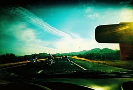
I also looked at this link below and became particularly interested in the way the images fade out around the outside.


After I had changed my mind about the original five I created, I decided to base the new five on the image style as I saw above.
Examples of Lomography:

OUGD401 - Lecture Notes: Photograph as Document

  • Killburn - 1848 - documenting a social event - protest
  • 'Window to the past'
  • Photographer is an invisible observer - not commenting, just documenting
  • 'How the other half live' - Jacob Riss 1890
  • Lewis Hine - 1908 - his work makes changes to the law - especially children - reports conditions - doesn't try shock the viewer
  • Margeret Bourke-White - 1937
  • Not subjective - should be objective - photography was trusted to be this
  • Sharecropper home - dramatic creative - very directive - contrast
  • Russel Lee - 1939 - Interior of a black farmers home - less composition - no human presence - recording - no manipulation
  • Dorothea Lange - Migrant Mother - 1936 - manipulation of the viewer - image becomes more important than poverty & the people
  • Her other images provide some context & conditions
  • Walker Evans - 1936
  • Modernism style of photography
  • Bill Brandt - 1937 - UK - work class life
  • Robert Frank - 1958 - Travels through America & photographs - redefinition of document - uses titles to contradict image - 'Parade' - shows observers, not the parade.
  • William Klein - 1954/55 - Acknowledgement of the photographer - known for use of blur - 'Dame in Brooklyn'
  • Magnum group - founded in 1947 by Cartier-Bresson & Capa - ethos of documenting the world - not fixed nationally.
  • The decisive moment - photography achieves its highest distinction
  • Document & War - Robert Capa - The falling soldier 1936 - Normandy France 1945
  • Robert Haeberle - 1969
  • George Rodger
  • Hung Cogut - 1972
  • Lee Miller
  • William Neidich - 1989 - purposely constructed
  • Edward Curtis
  • Rodger - More document in the middle of a wrestling competition
  • Bruno Barney - 1972
  • Jeremy Dour - 2001 - Reconstructs history in present day with people who originally took part - preserving the memory of political struggle

Friday 25 January 2013

OUGD405 - Research, Collect, Communicate Research

Initial Research
The research topic I was given was: Thomas Edison
  • Edison is the fourth most prolific inventor in history, holding 1,093 US patents in his name, as well as many patents in the United Kingdom, France, and Germany. 
  • He is credited with numerous inventions that contributed to mass communication and, in particular, telecommunications. These included a stock ticker, a mechanical vote recorder, a battery for an electric car, electrical power, recorded music and motion pictures.


Invention Designs

From the initial research I have decided to look into two inventions primarily - the Mimeograph and the Kinetograph. These are the two that have stood out the most to me as they are in the areas of media that I enjoy the most - Print & Film.

Mimeograph - 1890:


  • The stencil duplicator, or Mimeograph machine is a low-cost printing press that works by forcing ink through a stencil onto paper.
  • It was common technology in printing in small quantities, as in office work, class room materials and bulletins.
  • Widespread & cheap.
  • Gradually replaced by more modern technology - the photocopier in the late 1960's.


Kinetograph - 1891:


Printing
  • I started by looking into the history of printing and collecting a couple of infographics and looking at which types of print were the main big happenings in the timeline. I looked into each of the printing styles, and decided to focus on a couple which interested me the most/were significant.


Woodblock Printing - 200 A.D
  • Woodblock printing was the first ever type of printing, originating in China and the Far East. It is a simple process of cutting out where the negative space will be, so the ink will create the pattern when pushed onto the surface.


Flexography - 1890
  • Flexography is a form of printing process which utilizes a flexible relief plate. 
  • It is essentially a modern version of letterpress which can be used for printing on almost any type of substrate, including plastic, metallic films, cellophane, and paper. 
  • It is widely used for printing on the non-porous substrates required for various types of food packaging.
  • It is also well suited for printing large areas of solid colour.
Flexography plate


Screen Printing - 1907
  • Screen printing is a printing technique that uses a woven mesh to support an ink-blocking stencil. The attached stencil forms open areas of mesh that transfer ink or other printable materials which can be pressed through the mesh as a sharp-edged image onto a substrate.
  • Credit is generally given to the artist Andy Warhol for popularising screen printing identified as serigraphy, in the United States. Warhol is particularly identified with his 1962 depiction of actress Marilyn Monroe screen printed in garish colours
  • .
  • Screen printing lends itself well to printing on canvas. Andy Warhol, Rob Ryan, Blexbolex, Arthur Okamura, Robert Rauschenberg, Roy Lichtenstein, Harry Gottlieb, and many other artists have used screen printing as an expression of creativity and artistic vision.
  • It is also known as silkscreen, serigraphy, and serigraph printing.

Warhol
Lichtenstein
Rauschenberg
Ben Allen

  • While looking at screen printing on Mike Perry's website, I came across this book that he made, a catalog of screen printing.
  • After looking through it, it gave me a huge variety of screen printing used in graphic design, and shows how the skill can be utilised in a much more stylised and systematic way than used by the artists above.
  • From the book I took out a couple of designers that particularly interested me: Aesthetic Apparatus & Cody Hudson. I also chose these two because the way they used the process is completely different from one another. Hudson works mainly with shapes and lines, where as Aesthetic Apparatus uses layers to create the image.

Mike Perry

Aesthetic Apparatus

Cody Hudson

Alan Kitching


3D Printing - 1986
  • Additive manufacturing or 3D printing is a process of making three dimensional solid objects from a digital model
  • 3D printing is achieved using additive processes, where an object is created by laying down successive layers of material.
  • 3D printing is considered distinct from traditional machining techniques (subtractive processes) which mostly rely on the removal of material by methods such as cutting and drilling. 
  • 3D printing is usually performed by a materials printer using digital technology. 
  • Since the start of the twenty-first century there has been a large growth in the sales of these machines, and their price has dropped substantially.
  • The technology is used in jewellery, footwear, industrial design, architecture, engineering and construction, automotive, aerospace, dental and medical industries, education, geographic information systems, civil engineering, and many other fields.


Printing in the environment
  • I looked into how printing was used in everyday life in innovative ways to promote/inform. I started by looking at shop windows and seeing how they used print within the displays.
  • One of the most innovative prints I came across was the advertising of the Batman movie. It uses a well known idea from the movies to make it noticeable, and is placed on the spotlights along a whole street.


Film
  • The core UK film industry now contributes approximately £4.3 billion per year to the UK economy – up by 50% since 2000, when the UK Film Council was created;
  • In 2009 UK films took 7% of the global box office and 17% of the UK box office; Independent UK films took an 8.2% share of the UK box office, the highest figure of the last decade;
  • UK film grossed $2 billion at the worldwide box office last year;
  • UK box-office takings are at record-breaking levels, worth £944 million in the UK in 2009, up 62% from 2000;
  • The overall territory box office gross for the UK and the Republic of Ireland exceeded £1 billion for the first time in 2009;
  • UK Film Council investments in British films have been hugely successful – for every £1 we have invested, £5 has been generated at the box office;
  • Over 173.5 million people went to the cinema in the UK in 2009 – up 31 million from 2000, the highest since 2002 and the second highest since 1971;
  • The UK has more digital cinemas than any other European country – 365 and counting;
  • Overall UK audiences had a far greater choice of films in 2009 – 503 films were released, 31% more than a decade ago;
  • The UK film industry directly provides jobs for almost 44,000 people, with extended employment impact of 95,000 jobs;
  • The film industry earns over £1.3 billion in export income from film rights and film production services;
  • In 2009 alone, British films and talent scooped 36 awards. 
Movie Posters
  • I looked into Saul Bass as the posters he created for films are very much like they had been produced from screen printing, so it fit in well with the research I had been doing.
  • I find that the posters he created all have a style, but are all very interesting and individual in the way they represent the films. 
  • Instead of actual shots of the actors/movie scenes, they are block colours and looked hand drawn, which gives the thought that they have had a lot more thought put into them, and anyone can look at them and know exactly what is what.
Saul Bass


Contemporary

  • From the research into Bass, I looked at current film posters, and found that they are all pretty much the same, in the fact they have the main image of the main actor, and the title in an appropriate place. It almost makes them look unconsidered and done quickly. Although on their own they might look good and effective, when put together you can clearly see there is no differentiation between them at all really. 
  • None of them are really that individual, apart from a couple (Jurassic Park & Cold Souls). They all have their own 'artistic qualities' in colour changes/tints etc, but they are all essentially the same mock up, which really takes away the individuality of each film.


  • I found four contemporary posters which go against the style of the ones above, and are a lot more individual and certainly get the movie tone across a lot more than the ones above, even though they're simple/block colours.


Facts & Figures
Top Grossing
Top Franchise Grossing

http://www.bbc.co.uk/news/entertainment-arts-19623067

After Crit Research


Once we had the group crit for our research we were given the brief. From my research I must now focus down and do one of the three:

  • Publication & Promotion
  • Product & Packaging
  • Product & Distribution

I started by deciding to stick with the research on film and create something to do with this rather than do something primarily about print. I started to look at magazines and layout as I think a publication will be best suited to my research.

I started by looking at the magazines available for the iPad to do with film:


Looking through them, there were only a few that were primarily about film, and even then, only a couple were actual full magazines. quite a few were just a few pages long with a couple of interviews with the actors/directors, and not completely about the films themselves.

I started to look at the layout of the magazines instead as the content wasn't particularly important to me research at this point. I looked at two iPad magazines - Empire & Picturehouse Reccomends. They both had a similar article on the same film 'Life of Pi', so I took the layout of both to compare.

Picturehouse Recommends:

 Empire:

They both have very similar layouts, with very little colour aside from the images. They're very simple layouts which are easy to read. The Picturehouse Recommends is more user friendly as the text is a lot more spread out/in smaller chunks and columns.

I also looked at spreads from Ray Gun & The Face.

Ray Gun:

 The Face:

Raygun covers:

Magazine Layouts:


Initial Ideas:
  • Leaflet
  • Magazine
  • Book
My initial idea before this research was to recreate some of the movie posters in the same sort of style of Saul Bass in not having realistic images or a very typical approach of just the main character and the title - rather something else related to the film. I would also like to incorporate the posters into the overall style of the magazine instead of them sticking out. I want a more integrated approach so they don't just look randomly placed throughout the publication.
When thinking about the style that Bass worked in, it doesn't really relate to the work which I had in mind - Carson & Ray gun etc. I have found these as a good source of influence and ideas as to how layout can be innovative in a magazine publication even though the shape & size is limited.

Creative movie poster:


Remade posters:


Film websites: