Thursday 29 November 2012

OUGD401 - Lecture Notes: A History of Typography


  • Eric Gill - Gill Sans

  • Typography exists in the intersection of visual & verbal communication

  • Form of meta-communication - system which frames another system
  • Paralinguistic
  • Kinesics - The emphasis

  • Type of classification
  • Humanist
  • Old style
  • Transitional
  • Modern
  • Slab serif (egyptian)
  • Sans serf

  • Age of print began in 1450's - Guttenberg press invented - moveable type & mass production

  • Most letters come from roman encryption's 

  • Guttenberg gothic script - first read on press - replaced by humanist typefaces - cross bar on 'e' slightly angled e - supposed to reflect handwriting

  • Geoffrey Tory - thought type should relate to human proportions & size
  • Nicolas Jenson - Centaur based on humanist

  • Venice - introduction of typography as a discipline - old style - refined versions of humanist design - Garamond

  • William Caslon - 18th C
  • John Baskeville - Baskerville  late 18th C

  • Move away from calligraphy

  • Modern typefaces - 1784 Didot - used in fashion
  • Bodani
  • High Contract
  • Abrupt Serifs

  • Victorian era - introduction of slab serifs - reference to oriental etc - nothing to do with egyptian type
  • for mass production
  • for posters - bold etc
  • Fat face - hyper-bold typestyle

  • Sans serif - Akzinden Grotesk - international - modern, progressive, not historical

  • Times new roman - 1932 - Stanley Morison
  • Fraktur - 1850 - 1941
  • Cooper black - 1921
  • Helvetica - 1957 - Max Miedinger

  • Post modern - rule breaking - not mechanical - Carson - grunge

  • 1990 onwards thousands of fonts created

OUGD405 - Printed Text & Reading Research

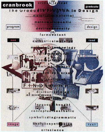
I compiled these images while researching my topic in this brief: Legibility & Readability. The main focus I went with was looking at the difference between legible graphic design, and the graphic design which some consider illegible, and which gets the message across better/more effectively.

Although some may consider simple design to be more professional, there is a lot to be said for work that is a lot more interesting to look at - works by Brody and Carson, for example. People who are not particularly educated in art & design find these works a lot more visually interesting than a bit of black type in Helvetica on a white sheet. Those might communicate the message simply and to the point, but those are the ones that get overlooked and forgotten in my opinion.

The main thing that I noticed was the layout in all of the design works below. The plain simple design is completely controlled and seems restricted, to the point where it is just trying to get the message across in the most uncreative way possible. The designs by Brody & Carson etc are a lot more free and look like the designer put their personal stamp on each piece.

Most of the images below are by the following designers:
  • David Carson
  • Neville Brody
  • Koen Taselaar
  • Mike Perry
  • Experimental Jetset