Monday 29 October 2012

OUGD401 - Studio Task 1: Critical Analysis

Task: From images that I have posted in my blogs, choose two that I don't like, and two that I like, and write a short critical evaluation explaining why.

Don't
This is the first piece of graphic design that I really don't like. I'm a huge admirer of David Carson and his work, which I usually find innovative and fresh. However this piece just grates on me. It just isn't as visually exciting and appealing to me as the rest of his work. I feel that it is quite a bad piece of design because it doesn't really look that thought out or intended. It looks like just a few pieces of text and colour put together into one 'structured' mess.

This is the second piece of design that I don't like. It just doesn't appeal to me. Perhaps that's because of how old it is, but I find it too in your face and too showy of how amazing this company thinks they, and America are. I understand why it is like that, but I just find it unnecessary and off-putting. I'm not really a fan of graphic design which is done with illustrative realism either.

Do
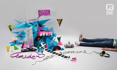
This is the first piece of design which I love. Julien Vallee's advert for MTV One. This shows exactly what MTV is in one image. Fun, cool, innovative and doesn't take itself too seriously. The use of colour and text is the main thing that draws me to it, along with the fact it is all done 3D and edited by a computer afterwards. All the text is made, not added. This could have easily been done on the computer, but it would have certainly not had anywhere near the same effect as it does as a handmade piece.

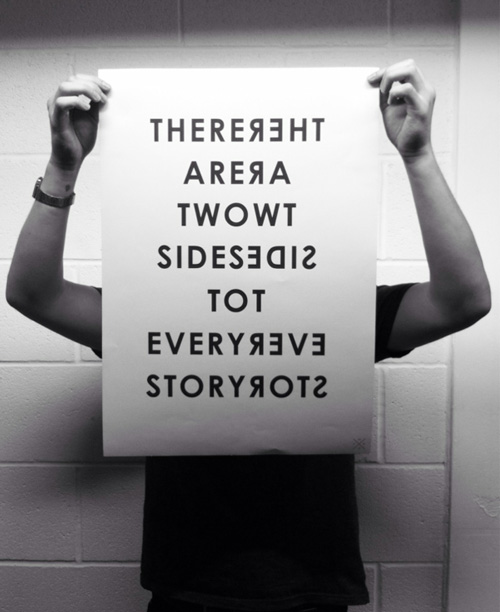
This is the second piece of design which I love. I came across it recently and thought it was very clever for something so simple. Sometimes simple is best, and this is definitely one of those circumstances. It's just a simple print, one colour used, nothing fancy or decorative, just the text. It does exactly what graphic design is - visually communicates the message. It's straight to the point, and is completely successful in my eyes.

  • D- Describe (What Do You See?)
  • I- Interpret (What Is It About?)
  • E- Evaluate (How Good Is It?)
  • T- Theorise (How Could It Be Improved?)


Task 1: 

Identify and explain 5 reasons why critical analysis is an important part of education, learning and developing your understanding.

Critical analysis in an important part of developing understanding because it gives us a chance to look over design work and see what makes it successful or unsuccessful. With this, it allows us to reflect on our own personal opinions on the piece and will help give us a more contextual and better judgement on other pieces of design in the future. Critical analysis allows us to make informed and educated judgements on piece of design, with a clear understanding and reasoning behind our opinion and judgement. By looking at other work and critically analysing it, it helps us think back to our own work and how to improve it and develop it, based on what has been learnt.  It also allows us to develop our own understanding in what elements together make a good piece of design, and where we want to develop or work.

Identify and explain why the crit (group critique) is useful in the development of your work, skills and opinions.

Group crits are useful because it allows us to get feedback on our work. It gives us other people's opinions and helps us see design errors that perhaps we did not see before. If suggestions are given, it gives us a chance to look over our work and see how to improve it and develop it further. It gives an insight to other designers minds and what they perceive good design as. Even if it's not the same as what you feel, they will give something to think about. As everyone is in exactly the same situation in the design world, it gives you a better informed feedback. Feedback can also help with giving confidence in the work you are producing. It can confirm that you are going in the right direction and doing good design work as a whole. It opens up the idea of the industry to you as well, indicating exactly what it will be like when you are out working in the design world, where your work will be criticised and changed a lot.

Choose 5 criteria from the list that were generated during the studio session. For each criteria briefly summarise what will generally affect how you judge what you like and dislike when analysing examples of work. (you should aim to use the images that you brought to the session as examples). colour, layout, communication, visual content, non-visual content, function, quality of execution, legibility, audience, context, concept, message, media/method of production.

Colour
Likes:
Simplicity in two or three colours.
Bold colours.
Coloured stock - not a white background, something different.

Dislikes:
Excessive colours used - clashing and hard to look at design.
White used as just a background and not as a part of the image.

Layout
Likes:
Alignment to the right.
Simplistic layout
Smooth edges

Dislikes:
Random placements of text and images
Un-organised or not thought about placements and amount of information

Visual content
Likes:
Lines and shapes
Simple and related images
Type based design

Dislikes:
Info-graphics
realistic illustrations

Media/method of production
Likes:
Smooth simple computer designs
Screen printing
Hand made designs

Dislikes:
Tacky post-modernism style collages

Function
Likes:
Interesting approaches 
Sometimes when aesthetic is considered to be more important than the meaning of the image (Carson)
No specific audience - more for everyone
Message that is communicated simply

Dislikes:
Completely over the top design for simple uses - (form over function in 3D objects etc)

Wednesday 24 October 2012

OUGD401 - Lecture Notes: Graphic Design: A Medium For the Masses

  • Bison & horses - 150000 - 10000 BC
  • France - communicating actions - visual representations
  • Areva Chapel, Itality - like comic strips
  • Pears soap - using fine art & typography - is it graphic design?
  • Introduction of 'graphic design' - 1922 William Addison Dwiggins
  • Herbert Spencer - mechanical art
  • Max Bill & Muller-Brockman - Visual Communication
  • Paul Rand
  • Richard Hollis
  • 'Looking closer' books
  • Henri de Toulouse-Lautrec
  • Alphonse Mucha - Poster for cigarette paper
  • British graphic design stays illustrations in early 1900's while Europe starts being more abstract
  • British - putting text over realism illustration
  • Abstraction starts to take control of fine art - Kandinsky - Bolsheviks - Red wedge
  • London underground - started as more geographically correct.
Original
Current
  • Graphic design formalises in Bauhaus - 1922 Bauhaus has a logo
  • Breaking up composition & negative space
  • Piet Zwart - phone book - 1938 - mixing image and text (Dutch)
  • Josep Renau (Spanish) - using different new technology - screen printing
  • Russia - used for propaganda
  • Post war - consumerism
  • Paul Rand, 1946
  • Saul Bass, 1950's
  • IBM - 1970
  • 1992 - Keep Britain Tidy - Judy Blame
  • Designers start advertising - Ken Garlard 'First things first' manifesto, 1964
  • FHK Henrion 'Stop nuclear suicide' poster - 1960
  • Seymour Chwast 'end bad breath' poster - 1968 - vietnam war
  • 'And babies?' - art workers collection - saying what needs to be said - showing what is going on.
  • Hiygnosis, 10CC, Deceptive Bled CD Design - 1977 - Punk
  • Jamie Reid, Sex Pistols, 1977
  • Peter Saville - Designer for factory records
  • Post-modernism
  • Neville Brody - The face magazine covers 1980'a
  • Carson
  • Public Image Limited, album, Cd Design, 1986
  • Computer disc, CD packaging, 1986
  • Peter Blake, 1984
  • Chumbawamba - 1986
  • Designers Republic
  • Juliam House (For Introl) - digital media to try look like collage
  • Packaging becomes the object that exists in its own right instead of just a packet.

Monday 22 October 2012

OUGD401 - Study Task 3: Image Analysis


The ‘Daddy, what did YOU do in the Great War’ poster by Savile Lumley is a propaganda poster about World War One, whereas ‘The Uncle Sam Range’ image by Schumacher and Ettlinger is an advertising piece for an oven. The main similarity between the two is the fact that they are both deeply patriotic. Visually ‘The Uncle Sam Range’ is patriotic in a very obvious way, selling the American lifestyle. The colours used are mainly red, white and blue, and the wallpaper and curtains are done in the way of the American flag. It is potentially saying that this cooking range will give you this aspirational American lifestyle. In contrast the Lumley poster is patriotic in the message and not in the imagery. Although it shows a typically British setting, it is the text which makes it truly patriotic.

The Lumley poster is a piece of propaganda aimed at the men during the time of the war. It was create in 1915, which was the middle of the war, with the intention of getting these men to volunteer for the army. The setting is the potential future, with the children asking their father what he did in the war. This is a clever piece of persuasion as the father and man of the household is always seen as the breadwinner and the one who the children look up to. The text is written as if the girl is asking her father, but the ‘YOU’ is in capitals and underlined, speaking to the viewer of the poster and getting them to think about it themselves. It is almost a guilt trip, as a father would be ashamed to tell his children that he did nothing for his country.

There are small references to the past or future in both images. In the Range, there is a clock on the wall which shows the hundred years of independence, along with an eagle, which is the national bird. In the Lumley poster the whole image shows a future of British families, with upper class furniture and clothing, along with children’s toys of British soldiers. This all shows that there is belief that Britain will come out on top when the war is finished. It could also be that the child is playing with the toys as it will be something that he will look up to and aspire to be like.

The main difference is that they are on different ends of the scale on how obvious they are. The Range advertisement has a lot of little things that make up the image, and it takes a long time to realise exactly what it is. There is a play on the words ‘The Uncle Sam Range’ means the cooking range, but at first look, it could definitely mean it as the lifestyle, not the product. The Lumley poster is very obvious and simple. The text and image work well together and immediately gets across the message and makes the viewer think about it.

Wednesday 17 October 2012

OUGD401 - Lecture Note: Post-Modernism

  • Postmodernism since the early 1970's
  • Reaction to the rules - critique of international style - there are no rules - celebrates what might otherwise be termed kitsch
  • Complexity
  • Chaos
  • Mixing up styles and materials
  • Parody, pastiche & irony
  • Attitude of questioning conventions
  • Aesthetic - multiplicity of styles and approaches
  • 'double quoting', borrowing or quoting for a number of historical styles
  • Jux-Tapositions - post-modernism irony
  • Questioning old limitations
  • Space for marginalised disclosure and new voices
  • Post modernism architecture - gone is the clean cut and perfect
  • Phillip Johnson 1978-84 NYC
  • Las Vegas - got all around the world mini monuments
  • Pompidou centre - paris 1972-77
  • Neue Staatsgalarie - stuttgart - Germany 1977-83
  • Michael Graves - Kettle for Alessi - 1985
  • Phillipe Stark - Juicy Salif - 1990
  • Post-modernism fashion - 1975 - punk etc
  • Hussein Chalayan - furniture that turns into clothes - surface & depth - political or just shock factor?
  •  Statements of who you are more than practicality
  • Rothko - modernism
  • Pop Art - consumerism - celebrates everyday - Warhol & Lichtenstein
  • Michael Craig-Martin - Oak tree -1973
  • Jeff Koons - comments on subject matter - not showing an amazingly beautiful piece of art
  • Damien Hirst - mother & child divided - 1993
  • Ofili 
  • Emin
  • Chapman Brothers
  • Wallinger
  • Carson - Raygun
  • Barbra Kruger

  • Rachel Whiteread - House - 1993
  • Banksy
  • Richard Long

Tuesday 16 October 2012

OUGD401 - Study Task 2: LCA 2012 Prospectus

For a prospectus that is supposed to be convincing people to this art and design university, it isn't exactly very convincing. Although it fits the brief of what it is supposed to do, give information about the courses and university, it does it to the minimal as far as I'm concerned. This is an A&D university with plenty of new talent but instead of asking for input, they have been overlooked. To say too much positive would be a lie.
To start with, the front and back covers. The red writing on the front, in some mirror-like paper, on top of deep blue. It was probably done to stand out, but because of the paper used, it clashes and makes it pretty hard to read from afar, or close up for that matter. It would have been much better if it was a lighter blue or even just a different paper for the red. The back cover is probably the worst bit of the whole thing, the fact that the university name/logo isn't centred, as they clearly didn't think about the binding. On a positive note, at least it was easily seen, although on this occasion it would have been better if it wasn't.
There are a few pages in it that look like they have been done on powerpoint, the first page is one of those. The three/four statements in boxes, which makes it look boring and a lot more corporate than it is. In my opinion this has been made to seem more like a bank or business than an art university. There isn't really much creativity or colour used. The main colour is white, and that is really very clear. The one thing I did actually like about it was the double page photographs every now and again. They added much needed colour and interest to the book. Keeping with the corporate look, the photographs and images throughout are all over the place, all different sizes and practically floating on the page, surrounded by white space., which could have most definitely be filled by bigger, better pictures - which aren't stock photos and barely thought about and hardly relate to the subject they are with.
One of the main issues with it is the navigation. Although there is a contents page, it isn't clear on the pages where one section starts and finishes. There are headings on the pages, I'll admit, but they blend into the rest of the page because there is not much differentiation between them and the rest of the text on the page. A bit of colour certainly wouldn't hurt.
Overall the whole thing isn't very appealing. The blue front cover does get your attention, but then you are stuck trying to see what the words say - 'We are the state of the art' - which does not make sense, that has to be said. Every now and again, there are a few pages of black, with white text, and those are the pages that work the best as they are a little bit more interesting than the standard black on white. It would have definitely benefitted if Graphic Design students - even first years - gave an input, because at least then it wouldn't be so corporate looking. Last year's prospectus was a success and interesting because it was design by Graphic Design students. On a positive note, at least there is a whole year where they can improve and make a better one for next year.

Monday 15 October 2012

OUGD401 - Study Task 1: Design I Hate/Love

Hate - 2012 Olympics Logo
The Olympics is a huge thing, and the idea that the UK was hosting it was a huge event. However the fact that this was he best they could come up with for a logo is terrible, in my eyes anyway. Aesthetically I don't feel it's pleasing on the eye at all, the odd choice of straight jolted lines is something that I usually like, but it just doesn't work well in this context. It's barely legible, only the first '2' completely clear, the rest is pretty ridiculous. Even if they had used that '2' a second time, it would look miles better, still a crime to graphic design though. It's clearly some designers way of trying to make London look contemporary and new to the rest of the world, but it hasn't exactly worked.

Love - Julien Vallee MTV One
Julien Vallee's MTV One image from one of the video's he did for them (Click the image for the clip). MTV is all about being new, interesting and controversial all the time, and this image keeps with that. I particularly love the colour scheme used, not too bright and bold, but stands out clearly. The use of wires & tape to create the words related to the channel is genius, including them in with the 3D instead of computer generated edits afterwards. That's the thing I love the most about this piece of work, the fact that it's all hand made, 3D, and not edited afterwards.

Wednesday 10 October 2012

OUGD401 - Lecture Notes: Graphic Design

  • Terms - 'Modern', 'Modernity'
  • Modernity - Industrialisation, urbanism - the city
  • Modern artist responses to city
  • Psychology & subjective experience
  • Modernism design
  • If we start to think about subjective experience we start to come close to understanding modern art and the experience of modernity.
  • 1850 - At the time 'Modern' meant 'of the moment'
  • Late 19th/20th century 'modern' meant improved version
  • Modern - most cutting edge, progressive art etc - goes through until about 1960's/70's. Optimism & faith in the new.
  • Modernism dies, according to Charles Jenks - 15/07/72 - the demolition of Pruitt-Igoe (St Louis), 20 yrs after it was built.
  • Eiffel tower - 1889 - domination of modernism
  • Paris 1900 - 'Modern' city of the world - culturally trying to be most modern country (beat London)
Paris 1900's
  • 'Trottior Roulant' - electric moving walkway
  • People's life becomes regulated by factory times instead of sunrise/set - new concept of times - world time is standardised because of railways
  • New technology - railways, telephone, electric cars
  • World 'shrinks' as it becomes a 'knowledge plane'
  • life rapidly changes & accelerates
  • leisure - cinema, shopping - hyde park picture house
  • Enlightenment project - late 18thC - scientific/philosophical thinking made - people stopped listening to religion
  • Hausman redesigns Paris - 1850's
  • Old Paris - narrow streets & rundown housing - lots of crime
  • New Paris was made to be easier to police. Designed to accommodate modern life
  • Kaiser Panorama - 1890's
Kaiser Panorama
  • fashion becomes important - telling people who you are
  • Cropping became popular - like a photo
  • Max Nordau - anti-modernism pointillism
  • Modernism in Design
  • Anti- historicism
  • Truth to material
  • Form follows function - stripped down aesthetic
  • Technology
  • Internationalism
  • Bauhaus - simplicity - functionality first
  • Modernism education - interdisciplinary
  • functional decisions instead of aesthetic decisions
  • Own typeface - sans serif fonts Futura etc.
  • Building Utopian life
Bauhaus building
Modernist cutlery
Modernist furniture
http://www.technologystudent.com/prddes1/bauhaus1.html
  • Herbert Bayer - Sans serif typeface - franktur font Germany - Times new Roman - signifies british greatness - nationalism not internationalism
Universal vs ITC Bauhaus
http://www.typeoff.de/2011/08/22/some-thoughts-on-geometric-type/
http://www.type.nu/bayer/index.html
  • A language of design that could be recognised and understood on an international basis - internationalism
  • Technology - new material
  • mass production - cheaper & quicker
  • Modernity - 1750 - 1960
  • Modernism - the range of ideas & styles that sprang from modernity