Saturday, 31 May 2014
Tuesday, 6 May 2014
OUGD501 - Module Evaluation
1. What skills have you developed through this module and how effectively do you think you have applied them?
The skills I have developed through this module are my writing ability and my ability to take this written material and contextualise it with a visual element. My writing skills have always been consistently good, however this year I took extra time to find more sources and develop my ideas further when it came to writing my essay.
In terms of synthesis between the two elements of writing and design, I feel that I have applied my skills set to create an outcome which does represent my essay subject well and also my interests well. It is something that I found was quite easy to grasp and create a visual element for.
In terms of synthesis between the two elements of writing and design, I feel that I have applied my skills set to create an outcome which does represent my essay subject well and also my interests well. It is something that I found was quite easy to grasp and create a visual element for.
2. What approaches to/methods of design production have you developed and how have they informed your design development process?
As my work all focussed around digital technology, I used this in the contextualisation on my practice piece. I designed it purely through digital output and media to further strengthen my concept and synthesis across from the essay. I feel that I have experimented with a different way of working as my practice piece was screen based media designed to be printed instead of being interactive on a screen. This was a challenge and something that I have learnt a lot from through the production of these designs.
3. What strengths can you identify in your work and how have/will you capitalise on these?
I think my strength lies in my ability to find a subject from my essay and create a visual piece for it, hitting on exactly what I was saying in my essay. While I initially thought this would be what I found hard in the module, with all the research that went behind the essay, I found I had a lot of ideas and different routes I could go down, and the difficult bit was choosing the idea to go with.
I also think that I have found it easy to relate quotes and sources to one another, as well as see where the writer is coming from when they have written what they have. I believe that my quick grasp of this is something that has aided my written work as well as my practical piece.
I also think that I have found it easy to relate quotes and sources to one another, as well as see where the writer is coming from when they have written what they have. I believe that my quick grasp of this is something that has aided my written work as well as my practical piece.
4. What weaknesses can you identify in your work and how will you address these in the future?
My main weakness in this module is down to triangulation. While I think I did a good job in my essay with this, I do believe there was more depth I could have gone into and a lot more to be taken away from what the writers were saying, and finding other writers who feel the same way.
Something I didn't do in my essay was find an argument against the point I was trying to make. While this doesn't necessarily affect the strength of my essay, I do believe having that insight there would be beneficial to me and show me a wider picture of the subject.
Something I didn't do in my essay was find an argument against the point I was trying to make. While this doesn't necessarily affect the strength of my essay, I do believe having that insight there would be beneficial to me and show me a wider picture of the subject.
5. Identify five things that you will do differently next time and what do you expect to gain from doing these?
- I would like to spend a bit more time on the tasks set after seminars. While I think I did a relatively good job in these tasks, there is definitely room for improvement and a much more developed response to these tasks.
- I would like to develop all the ideas for the visual element to the module instead of focussing on just a couple. I found that towards the end of the brief, while I had a solid design and outcomes, I hadn't thought about packaging or how these would be presented as a pack.
- Working on triangulation and finding more sources is something that I continuously want to improve on as well. I feel that while I have done a decent job this year, there are points which can be developed further.
- I would like to experiment more with ideas for a visual piece by researching more than I have for this brief and having a bit more of a focussed idea initially instead of having a vague idea and seeing where it takes me.
- I would like to further my knowledge in the subjects covered in the lectures and research more into these subjects and how it relates to me and my practice.

OUGD501 - Studio Brief 2: Synthesis Paragraph
The focus of my essay was how brands create desire and I used examples in the technology field to back this up, in particular the Apple products. My practical relates to this as I have created four booklets on four technological products. These four products are; Mobile Telephone, Audio Player, Television & Computer. They are designed in a way to apply to the format of the display screen of the four products. These booklets show the way consumerism has affected the products, from their original use to their use in present day.
OUGD501 - Studio Brief 1: Essay: Consumerism and the desire in advertising - How do brands manufacture desire?
Consumerism and the desire in advertising - How do brands manufacture desire?
‘Publicity is the culture of the consumer society. It propagates through images that society’s belief in itself. There are several reasons why these images use the language of oil paintings. Oil painting, before it was anything else, was a celebration of private property. As an art-form it derived from the principle that you are what you have.’ (Berger, 1972, p.138)
The dominant culture in today’s world is consumerism and publicity. Although it is not entirely obvious in day to day life, everywhere is filled with advertisements and publicity in a huge amount of forms. It is the hidden culture because of how saturated this market has become. Anyone could walk past advertising and not look twice because of how commonly placed they have become. This is down to the fact that companies are selling their brand and a fantasised lifestyle, not a brand. This is also commented on by Naomi Klein in ‘No Logo’. Backing up Berger’s point, Klein states;
‘The astronomical growth in the wealth and cultural influence of multi-national corporations over the last fifteen years can arguably be traced back to a single, seemingly innocuous idea developed by management theorists in the mid-1980s: that successful corporations must primarily produce brands, as opposed to products’ (Klein, 2000, p.3)
Both Klein and Berger are hitting on the point that while a product is simply a product, the promises given with the product is what draws the consumers in. This essay is an investigation into this dominant consumer culture and how brands are capitalising on presenting products in a desirable way, with a prime focus on the technology industry, and in particular Apple Inc.
Berger states ‘you are what you have’, and this plays a large part in today’s consumerist society. Consumerism and publicity plays on a false sense of security and deceives the consumer into believing that these products will some how give them an identity and will make them stand out amongst everyone else in the world, when in reality, millions of people are buying the same products, all with the same fantasy provided by the brand.
Backing up the principle of ‘you are what you have’, writer Sut Jhally comments on the idea that it is in human nature and instinct to take what is around us and make it part of our identity and use in in our every day life. He comments on the idea that we, as humans, objectify ourselves and our lives and compare them to others, and says,
‘Objectification lies at the basis of what we can call distinctive human experience, the mediation of human needs through objects’ (Jhally, 1990, p.2)
By objectifying ourselves and our lives, we instantly compare ourselves against others and their material worth, and with this comes a level of satisfaction, which Jhally also comments on. Satisfaction of ones material worth is the centre-point of consumerism. When purchasing a new product, or being seen with a new product by another, the satisfaction level is high. However once the consumer sees the next big product, or sees someone with the same product, but the newer version, this level of satisfaction lowers, and it is at this point when consumers go and purchase the new product, not for the need of it, but for the self-serving. This satisfaction level is what brands play on most, creating advertisements that create desire, envy and make the viewer mildly dissatisfied to the point where they consider buying the new product because of how it will apparently benefit their current state of life and social situation. Leading on from what Jhally says, Klein also comments on this;
‘With this wave of brand mania has come a new breed of businessman, one who will proudly inform you that Brand X is not a product but a way of life, an attitude, a set of values, a look, an idea’ (Klein, 2000, p.23)
Both Klein and Jhally are saying that consumers are more interesting in the lifestyle promised and the satisfaction of ‘having’ this lifestyle than the product and the actual purpose of the product. In a more general outlook, Jhally says,
‘Consumption is socially based (and judged) it describes a relative rather than absolute activity. The satisfaction that people derive from this is then also relative. Satisfaction is measured against a social scale, or an average standard. As a society gets richer and more goods are available to a wider group of people, so the average standard also rises and the ‘level’ of satisfaction remains stable’ (Jhally, 1990, p.13)
Kim Sheehan backs up these points made by Berger, Jhally and Klein. She uses the example of Christmas time to reaffirm this belief of satisfaction and vanity. She writes,
‘The Christmas holidays have become commodified because many in society no longer view the holiday as a religious celebration or as a way for individuals to personally reaffirm their belief system. Instead, Christmas has turned into a festive of gift giving. Rather than reaffirming a set of religious values, our self-worth can be affirmed based on how good the gifts are that we give and receive’ (Sheehan, 2004, p.18)
All four writers comments show the disturbing truth surrounding current day consumerism. The fact that most individuals in society believe that these products will give them a higher value against other people shows truly how much the culture of today is led by consumerism and publicity.
A further point is made on this idea of identity by Rick Poynor, in ‘Obey The Giant’. He writes,
‘There are no images to measure yourself against, apart from other human beings’ (Poynor, 2001, p. 124)
Poynor is right in this fact, and advertisers play on the idea of this in the majority of their adverts. Within those few moments of seeing the advert, the viewer will go through a number of stages in which by the end, they will be convinced that the product being shown is exactly what they need to give them that lifestyle shown.
With constant advances making distribution of images and text quicker, easier and on a larger scale reaching a larger audience, advertising and publicity of products has taken full advantage of this. The market is saturated to the point of individuals ignoring advertisements, however more advertisements are being distributed, and more products are being created. Both Jhally and Poynor write about Jean-Paul Satre in relation to this. Poynor focusses on Satre’s novel ‘Nausea’, and mirrors his own account analytically with that written in the novel. At one point in the novel, the narrator wonders about the existence of trees, when many resemble one another and the need for all of these if that’s the way they all are. Poynor compares this to walking down a high street, looking into one shop window and noticing the amount of items in one display, stating that there was too much to look at in one small space. Applying this thought he writes;
‘You can experience this anywhere, in any shop or high street or shopping mall, at any time. Too much variety. Too much duplication. Too many choices that have nothing to do with need. Too much fantasy. Too much stuff’ (Poynor, 2001, p.120)
When writing about Satre, Jhally comments on the idea that items are how people measure their true worth, depending on how much these products are used in their lives. Advertising of products is constantly around, each showing a different application for a product that another similar one does not have. The state of market saturation has put a challenge on the businesses to differentiate their products from competitors. There is a constant need for more creative, sometimes over the top advertising and publicity, which sometimes has nothing to do with the product, but to do with the lifestyle surrounding it. This is what has become the advertising culture, selling a desirable moment/lifestyle instead of a focus on the product and only the product.
At the centre of this culture is the brands providing these products, with the ability to send out messages with these products to persuade viewers that it is exactly what they need. They present their products in ways which are attractive to the target audience, from colour schemes to the people in the advertisements; these are all choices made is an ultimate attempt to draw a viewer in. Within this there are a number of different approaches taken dependant on the product. Each product has a different audience, so each needs to appeal to the audiences needs and desires as well as stand out against all the products which are near-identical or similar. As well as this, a business may want the product to appeal to a newer market and attract them with the same tactics of playing on desire.
An example of this is the first case of publicity, Edward Bernays for the American Tobacco Company in the 1920’s. Bernays was at the forefront of Public Relations ‘PR’, and used ideas based on Freud to draw in customers, the main one being that underneath all the formalities and personalities, everyone has the same human instinct. The ATC gave Bernays the task of targeting smoking at women, while at this time it was unladylike and a taboo for women to be associated with this, meaning it was near impossible to market the product. Bernays pinpointed exactly what the women’s desires were at that time and manipulated this. His way of targeting the product at women was for a group of women to openly smoke during a parade, tipping the press off that these women were suffragettes, creating the illusion to the general public that these women were feminists and smoking openly was a symbol of freedom and power. This instantly made smoking attractive and desirable to women because of the version of life that the product had been associated with. It created the illusion that having the cigarettes will make you a free, powerful woman.
All advertising and publicity stems from this theory, that showing a certain lifestyle with a product will give the viewer the illusion that this is the product, and not the product itself. It dupes the viewer into believing that their life will be enriched by having this product. Berger states,
‘Publicity can never really afford to be about the product or opportunity it is proposing to the buyer who is not yet enjoying it. Publicity is never a celebration of a pleasure-in-itself. Publicity is always about the future buyer. It offers him an image of himself made glamorous by the product or opportunity it is trying to sell. The image then makes him envious of himself as he might be.’ (Berger, 1972, p.132)
To this end, the publicity can not be too far from the reality of where the viewer is. If the advert is displayed in a way in which it is impossible for the viewer to ever get to that point, the viewer becomes aware that the product will not give them that enrichment. Instead advertisements play on smaller, achievable desires. These advertisements often show exactly what the viewer is missing out on and will gain in purchasing the product. They show a mirror image of the viewer, but an improved image, proposing the life that could be and will be with this product. John Berger states,
‘Within publicity, choices are being offered between this cream, and that cream, that car and this car, but publicity as a system only makes a single proposal. It proposes to each of us that we transform ourselves, or our lives, by buying something more. This more, it proposes, will make us in some way richer - even though we will be poorer by having spent our money. Publicity persuades us of such a transformation by showing us people who have apparently been transformed and are, as a result, enviable.’ (Berger, 1972, p.131)
Backing up these points made by Berger is Katherine T. Frith, in ‘Undressing The Ad - Reading Culture in Advertising’. In this book, she talks about the analysis of advertisements and how to see through them. Referring to what Berger is saying, in the first chapter she talks about the association that brands give products to gain interest from viewers.
‘Advertising manipulates symbols to create meaning and in our society, the values expressed in advertising mirror the dominant ideological themes’ (Frith, 1997, p.13)
A prime example of this is Apple, and their range of products. Advertising for Apple is done in a way which to look like it is all about the product and less about the desire. The advertisements are all similar, with rarely any people in, just the product and showing what the product does. However, there are subtle actions that are placed to make the viewer desire everything about the product. When showing what the product can do, it doesn’t just show something generic, it shows something desirable, for example in the ‘Official Apple iPad TV Commercial’, everything shown is relating to a certain desirable lifestyle. What makes this advertisement clever is the large amount of content referring to specific areas of this lifestyle, and in turn appealing to a larger viewing audience as different people will pick up on different elements within the advertisement, persuading them to buy the product.
Another writer who makes comments on this subject is Gillian Dyer, in ‘Advertising As Communication’. Dyer writes,
‘You might think that the meaning of an inanimate object or place is fairy straightforward. But physical objects can convey meanings to us in both literal or objective ways and also more subtly by suggestion and association. Objects are cultural as well as physical. Their appearance, shape, size and colour are the intentional result of a series of conscious choices and decisions made by human beings. The look of things is rarely accidental’ (Dyer, 1982, p.104)
All these writers are commenting on the idea that the surroundings of a products are more important to the advertisement than the product itself. The environment, objects and associations are what will gain the viewers attention and persuade them into buying this product. It is human instinct to be loved, wanted and ultimately accepted by those around, so when it comes to consumerism, this equates to the want of the newest and trendiest product.
This is happening more than ever in the technology industry with the leaps that are being made in recent years and the amount of products that are now available. Brands are coming out with large product ranges and convincing viewers that these will make their life that little bit easier, and make them the subject of other people’s envy, because their life is not as easy as yours as they don’t have the product. Berger comments on this;
‘Being envied is a solitary form or reassurance. It depends precisely upon you not sharing your experience with those who envy you. You are observed with interest but you do not observe with interest.’ (Berger, 1972, p.133)
It can be argued that advertising for technology is one of the most competitive markets, with brands continuously trying to outdo each other with advertisements which show a range of applications, in a number of situations, all trying to appeal to the masses and gain customers. In showing these applications in many situations, it shows the viewer exactly what they could be doing and how this piece of technology will enrich their experience over the experience they would have without it. Referring to this, Berger says,
‘The purpose of publicity is to make the spectator marginally dissatisfied with his present way of life. Not with the way of life of society, but with his own within it. It suggests that if he buys what it is offering, his life will become better. It offers him an improved alternative of what he is.’ (Berger, 1972, p.142)
Brands are continuously and frequently bringing out newer versions of each product, in which they then market to be the one the consumer needs, as the product they already have is old and suddenly they are not the subject of envy anymore. In reality, this product is probably no different from the previous version with a few changes, but these products are marketed in such a way which makes the past versions seem ancient and like they are not worth keeping anymore because if seem with it instead of the newer version, a viewer would not be envious anymore and it is possible that you could become envious of them.
The products ranges by Apple are appropriate to this as much as any other technology company. They are constantly bringing out new technology, but in reality Apple only has five physical products. Focussing on the iPad, since it’s launch on April 3rd, 2010, there have been seven versions of this product. To keep customers buying the product Apple is continuously relaunching the product with its clean and slick advertisements. Their advertisements are generally in the same format, making them recognisable to the viewer. Like the advertisement discussed earlier, they have always followed the same look of showing the product off, but putting in the subtle lifestyles and desires within this. In Apple’s advert for the new iPad Air, it expands on this idea of targeting a large audience with a number of desires. In this, Apple does something new in associating the product with another object, a pencil. A pencil is a fundamental tool of life, something which is timeless and will always be needed, and throughout the advert Apple plays on this and ultimately compares their new product with it. They are telling the viewer that it is of the same importance in life, and more importantly in the viewers life, showing an amount of possibilities for the device and lifestyles in which it can be used. This advertisement is about associating the product with something iconic instead of showing what the product can do.
While brands are constantly rolling out advertisements filled with persuasion and desire, it is noted that consumers are aware of this. Dyer makes a point about this in the fact that people are not as stupid and naive as advertisers like to believe, as they realise what is happening for the majority of the time, yet buy the products anyway. Dyer states,
‘It is probably true to say that most people are consciously sceptical of advertising. However, although they might not believe the claims made for a product by an advertiser, they might find it more difficult to resist the more general social image or message presented along with the overt sales pitch’ (Dyer, 1982, p.72)
This essentially sums up how advertising persuades society into buying products. Brands do not sell the product for what it is. The brands are selling a lifestyle around a product, using key objects, images, colours or actions. Each of these are relating more and more to the target audience, and through the advertisements they create a false need for the product on the back of the viewers human instinct of the need to be loved and accepted. These advertisements play on this, showing scenarios of life before and after the product, often creating two completely different worlds. Linking back to what Berger said ‘you are what you have’, while society is clearly intelligent enough to create a wide variety of technology and advancements every day, the same instinct applies to everyone in that there is the need to be accepted by everyone else. Brands playing on this desire and manipulating it to give them what they want is essentially what makes up the consumerist society of today.
Word count: 3,299
Bibliography
Books
Berger, J (1972) ‘Ways of Seeing’, London, Penguin Books, LTD. Pg. 131, 132, 133, 138, 142
Dyer, G (1986) ‘ Advertising As Communication’, London, Routlege. Pg. 104, 72
Frith, K (1997) ‘Undressing The Ad, Reading Culture in Advertising’, New York, Peter Lang Publishing, Inc. Pg. 13
Jhally, S, (1990), ‘The Codes of Advertising: Fetishim an the political economy of meaning in the consumer society’ London, Pinter Publishing, LTD. Pg. 2, 13,
Poynor, R (2001) ‘Obey the Giant’, London, August Media. Pg. 120, 124,
Sheehan, K (2004), ‘Controversies in Contemporary Advertising’, USA, Sage Publication, Inc. Pg. 18
Klein, N (2000), ‘No Logo’, UK, Flamingo. Pg. 3
Videos
Apple - iPad Air - TV Ad - Pencil, 2013, YouTube. [ONLINE] Available at: http://www.youtube.com/watch?v=o9gLqh8tmPA. [Accessed 4th January 2014]
Official Apple iPad TV Commercial, 2010, YouTube. [ONLINE] Available at: http://www.youtube.com/watch?v=R41NNPBqRCk. [Accessed 4th January 2014]


Friday, 2 May 2014
OUGD501 - Studio Brief 2: Theory Into Practice (3)
At this point I had a quick tutorial with Richard to check the idea was going down the right route and wasn't too far away from what my essay was and what is being asked for in this brief.
While the idea was good, there were a few good ideas made on the way the content is delivered. While I had all the booklets all in uniform, it was suggested that a better delivery might be something more in context with the products, perhaps to the scale of the packaging of these products or something similar.
What I took away from this tutorial was that while the content was good and in the right area, my delivery and contextualisation of this needed improvement.
After some thought I did a brainstorm of a couple of different ideas I could do.

I did a brainstorm of this idea.

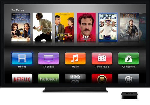
While I am familiar with the display on a Macbook, iPhone and iPod, I was not familiar with the display on the Apple Tv or how this works or if it is even viable for this idea. I did some research into the different displays for each of the devices.
Apple TV


iPod


iPhone


Mac


iCloud use:


From this research I feel that I have got a good understanding into how each format works and what kind of thing is similar across the media.
The iPhone and iPod layouts are very similar now so I will need to figure out some way in differentiating them a bit more past the initial design. The scale of them is also something that I will need to figure out.
I then did a few layout designs and 'navigation' ideas. Something I found quite hard is to design these so they will be printed, but still be like they will be on screen. On screen it is all interactive so the page order is something that I will need to work on to really make the booklets work well.


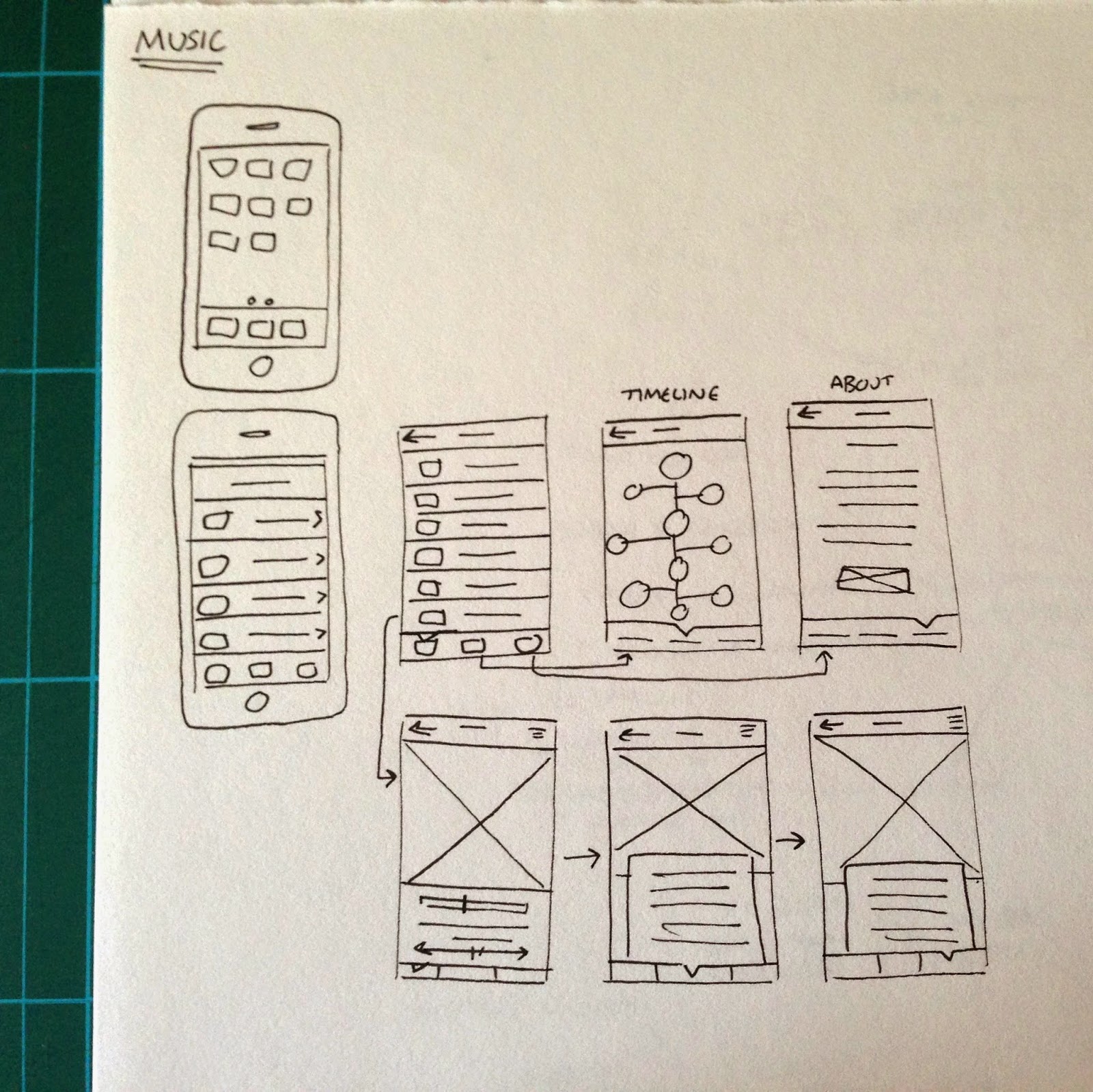
After this I started working on the first product - the mobile phone. This is the one that I feel the most comfortable with straight away as I am designing it as an App and I find this kind of thing very straight forward.
I decided that while I was scrapping the initial booklets, I do still like the elements used so will be keeping the illustrations and use of photographic images & written content. I just need to display it all in a much more interactive way which works better in the context.
Initial digital designs:


At this point I am quite happy with the progress I have made. I think the typeface chosen works much better and is much more readable because it isn't as abrupt as the previous typeface.
When starting this second idea I wanted to keep to a consistent colour scheme across the books, however I do think that a differing colour scheme might be a bit more interesting for the reader and won't make everything look the same. With this in mind, I decided that each booklet can have its own colour scheme, like in the original booklets.
Looking at what I have done for the mobile booklet, while I think the majority of what I have done is good, something I definitely don't like is the way the photographic image is displayed. I think that this will look better at full screen size because it just looks a bit amateur as it is this moment. However, at full size there was the issue of the image looking a bit strange going into the navigation triangle so I will need to do something to make it work. With this all in mind I made the changes and added in the body copy.


I think that the image works much better on the page now, and adding the year and product name gives the viewer that information straight away instead of having to go to the 'about' page to find it out.
I also created the following three pages to complete the 'App'.


Computer individual pages:


iPod individual pages:


Television individual pages:


Mobile Phone
Audio Player
Computer
Television
Subscribe to:
Posts (Atom)