Stop Stealing Sheep & Find Out How Type Works
Spiekermann, E. (2014) ‘Stop Stealing Sheep & Find Out How Type Works, 3rd Edition, USA: Adobe Press

‘A newspaper gets its look, it’s personality, from the typefaces used and the way in which they are arranged on the page. We easily recognise our favourite newspapers on the newsstand, even if we see only the edge of a page’

‘Anyone looking at a printed message will be influenced, within a split second of making eye contact, by everything on the page: the arrangement of various elements as well as the individual look of each on.’
‘We read best what we read most, even if it is badly set, badly designed, and badly printed.’

‘If you look closely at a letter, you can see personality expressed in its physical characteristics: light or heavy, round or square, slim or squat.’

‘What makes a typeface trendy is almost unpredictable - much to the chagrin of the people who have the market to them. A corporation, a magazine, a TV channel can pick a typeface, expose it to the public, and a new typographic fashion can be born. But, like with fashion and pop music, it usually takes more than one designer in the right place at the right time picking the right font off a website or out of a catalog’

‘Using a bland or overused typeface will make the brand and its products or media equally bland and even invisible.’

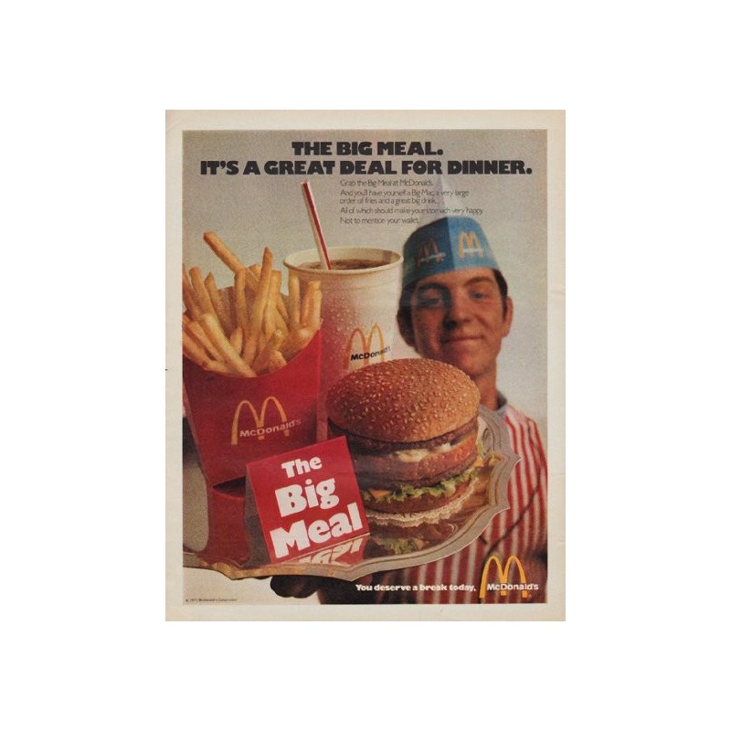
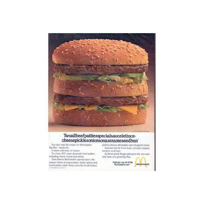
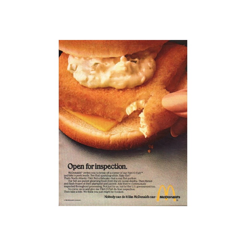
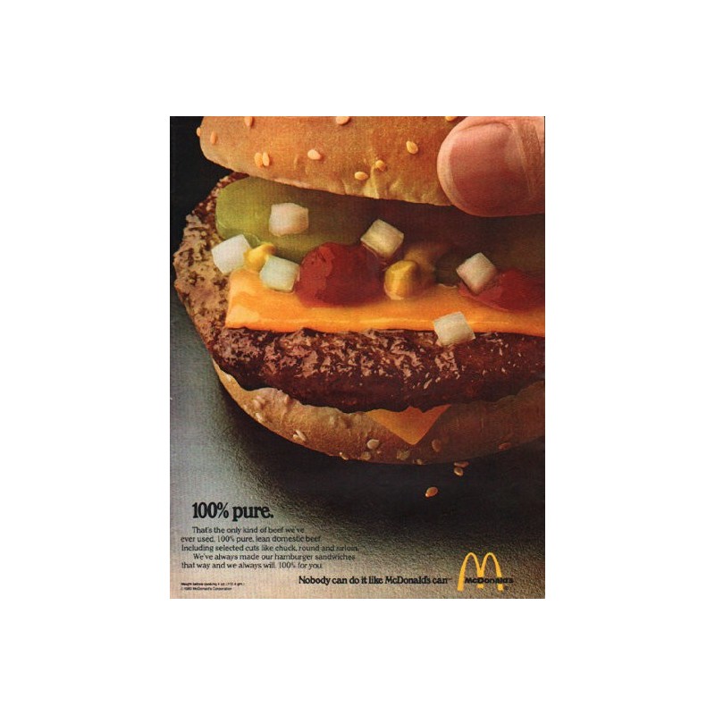
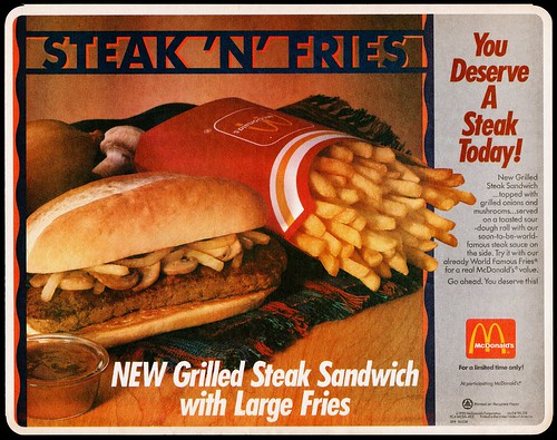
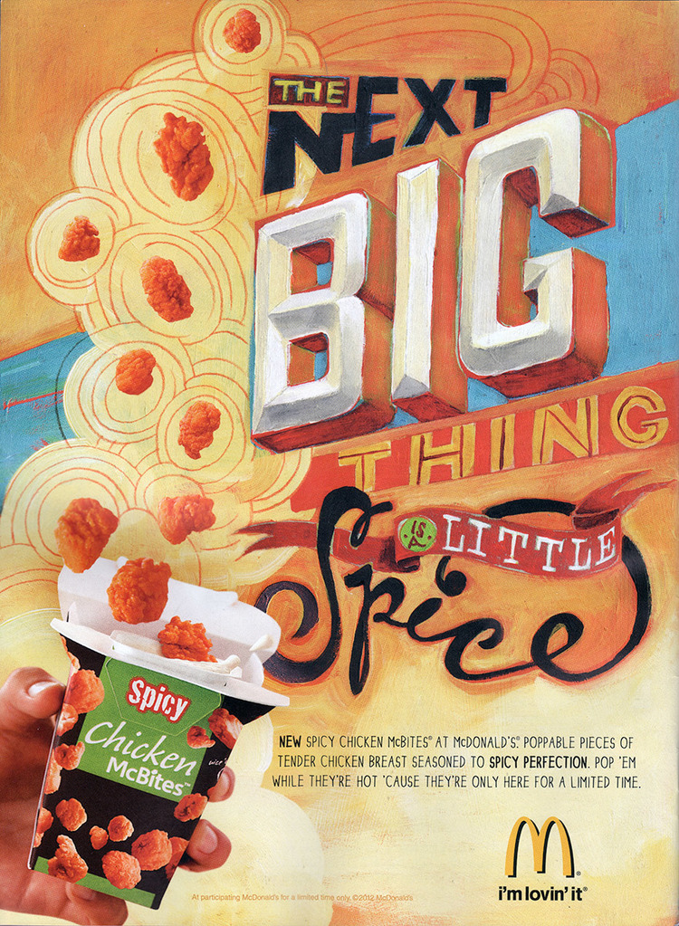
‘Although display advertising does not have a lengthy tradition, it’s style is as established as that of the traditional book. Headline of the top, attention-grabbing picture underneath, subhead, main copy, logo, pay-off line, address, URL, or telephone number.’
Stop, Think, Go, Do: How Typography & Graphic Design Influence Behaviour
Heller, S. and Ilic, M. (2012) ‘Stop, Think, Go, Do: How Typography & Graphic Design Influence Behaviour’, Massachusetts: Rockport Publishers

‘How these messages are framed can mean the difference between action and inaction.’
‘Beautiful typography and elegant imagery are not always the most effective motivators. Pleasingly designed compositions may lull the viewer into acquiescence rather than spark the flame that steams the engine’
‘The right balance of good and appropriate design is requires, and this cannot be predetermined with a one-size-fits-all template.’
Advertising Design And Typography
White, A. (2007) ‘Advertising Design And Typography’, New York: Allworth Press

‘While it is true that visuals get a reader to look, type delivers the message and the meaning, the tone of voice and the feeling, and an explanation of the ad’s importance.’
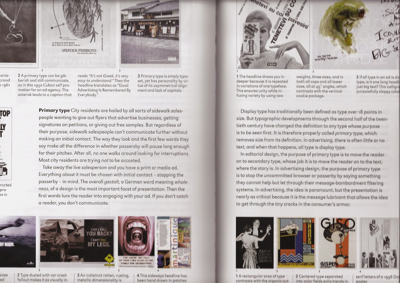
‘The overall gestalt, a German word meaning wholeness, of a design is the most importance facet of presentation. The the first words lure the reader into engaging with your ad. If you don’t catch a reader, you don’t communicate.’
‘In advertising design, the purpose of primary type is to stop the uncommitted browser or passerby by saying something they cannot help but let through their message-bombardment filtering systems.’
‘In advertising, the idea is paramount, but the presentation is nearly as critical because it is the message lubricant that allows the idea to get through the tiny cracks in the consumer’s armour.’
Typographic Design: Form and Communication
Carter, R. and Day, B. and Meggs, P. (2012) ‘Typographic Design: Form and Communication’, New Jersey: John Wiley & Sons, Inc.
‘As dynamic representation of verbal language, typography must communicate. This functional message clearly and accurately understands what is in the mind of the transmitter. This objective, however, is not always accomplished.’
How To Use Type
Marshall, L. and Meachem, L. (2012) ‘How To Use Type’, London: Laurence King Publishing Ltd

‘Choice of typeface is one of the must fundamental factors in conveying the meaning of a type design.’

‘The relationship between a typeface and its meaning may be obvious - for example, using a handmade style of typeface in a brochure for a craft fair - or it may be more subtle. For example, traditional serif typefaces such as Bembo derive from handwriting, so choosing such a typeface for an autobiography would reinforce the personal natures of the text.’
‘Harmony and contrast may be incorporated in designs to help convey meaning.’

‘Good use of type, particularly in terms of hierarchy, can even help in clarifying difficult-to-understand texts or concepts. An example of this would be a complex for, such as a tax return, which can daunt and confuse many people.’
Branding Typography
Sandu Publishing Co. Ltd (2013) ‘Branding Typography’, Hong Kong: Sandu Publishing