
I have decided to look at post modernist typefaces, so that includes looking at the deconstruction of type and the anatomy, as well as reconstruction, as this is the way post modernist typefaces are created.
I want to create a publication in the form of a book, which is easy to read and simply set out as this is the best way to do it for the information I want to put across.
I want to create two books, one based on the deconstruction of type, and the other on reconstruction, and perhaps involve a DIY or interactive element into the second book.
I looked into Experimental Jetset as they are a design studio which deals with a clear, clean and minimal version of design. They have a modernist approach to design, which I think will benefit the message I want to put across in my publication.


Their work usually works in blocks of text and images, broken up into a number of boxes depending on how large the information content is. Each piece of text/image has space to breath and has a definite and well constructed place on the page, all of it working well together with nothing that looks out of place. They all have a set form throughout the publications, keeping them very consistent.
From these and previous research I did a design sheet for design ideas of layout and a front cover.


I started by looking at font choices to use as a basis for the front cover and general tone of voice.
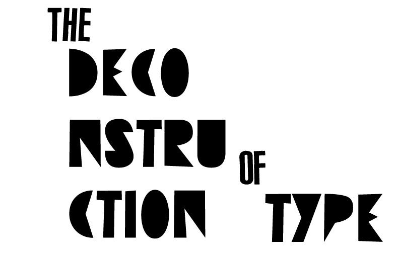


Although I like the typefaces, I don't feel the overall design is appropriate anymore. Initially with this design I wanted it to have a DIY and informal look to it, but after doing a few layout designs and looking at Experimental Jetset, a more formal approach will suit this side of the publication.
So because of this I used an already existing Post Modernist typeface 'Dead history' and created some of the other variations I considered.


From here I decided that I wanted to use green as the primary colour as it will stand out enough against the black and white and be clear to the viewer that this is the part to look at throughout the publication.
I looked at six alternate colour schemes to work with through the publication.

Initially I was using colour scheme 1, so I experimented with the other five on the title pages, seeing how the colours stood out against each other and a white background.


I have found that the schemes that work best are number 1, 3 & 6 work the best as they have the biggest contrasts against the page. For the overall colours, I decided that colour scheme 3 worked the best because of the dark green colour.
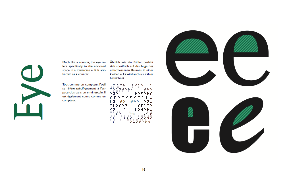
Within the publication, for each element of the deconstruction of type, I want to show it on the four main type groups so it shows a fuller understanding and is a lot more helpful for the reader so they can see the anatomy on more than one typeface.
I looked at a series of different typefaces under the four main typeface styles; Gothic, Roman, Block & script.

I decided to use four fonts which were recognisable and typical in their fields, so I decided on; Avenir, Georgia, Impact & Brush Script.
I have also decided to use Gill Sans as the body text, and Dead History for the headings, like the front cover page.
I started to create the layouts that I designed, using the typefaces I chose.


When looking over them all as a whole I have decided that having one anatomy piece per page is the best design as the ones with two or four are a bit too cluttered and too much on the page. They lose their individuality on a page together, so because of this, I will give each piece of the anatomy a page each.
I also like the layouts which is half and half with text and image, as well as the title at a 90º angle along the width of the page. For readability purposes the body text looks better in a couple of blocks of text instead of one or two large columns.
I have decided to combine the two following layouts:
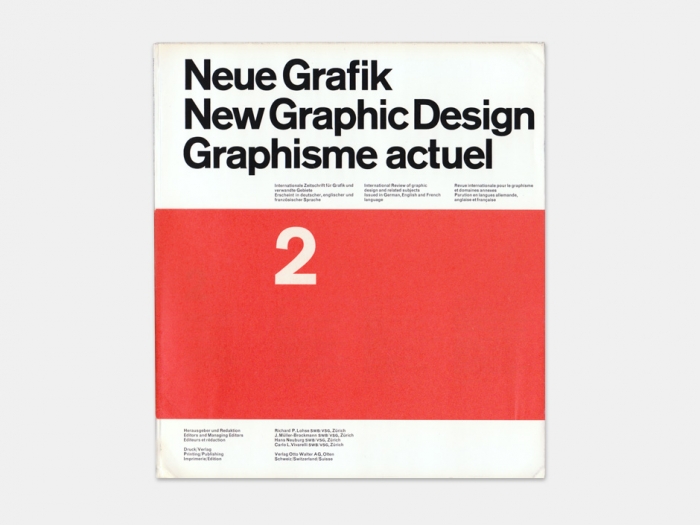
As the layout is of a modernism influence, I have also considered the idea of having more than one language throughout the pages. Like the publication Neue Grafik, which used English, German & French throughout it all.

For the content on the pages, for the anatomy pieces of type, I need them to stand out so they are clear to the viewer, so to do this, I need something that makes these clear.
I created five different variations which could be used, using the green colour.


I also tried them on the other three typefaces that I am going to use.


I then experimented with the idea of having the letters in green. However I didn't think these worked as well as the letters in black.


I decided that the best was the two green colours together on the black as it looked the best and stood out the most.
From here, I made each set of letters for the 16 parts of the anatomy I thought were the most important and needed to be known more commonly.
These are the; Ascender, Arm, Apex, Bar, Counter, Bowl, Descender, Ear, Eye, Shoulder, Spine, Leg, Stem, Stress, Tail & Terminal.


Initial publication layout:


I felt that although the pages were in depth about the sections of type anatomy, there was nothing relating to post modernist typography in the book, which is the main aim of the entire publication. So I created three layouts which explained post modern typography shortly:


When it came to inputting the body text I found that most of it didn't fill the text boxes completely, leaving it look quite uneven with large gaps between the boxes, whereas the filler text filled it and made it look very clean. I started to experiment with the point size and layout to see which looked better. I also experimented with the last language to use instead of Braille.
 |
| English, French, German, Braille. 8pt |
 |
| English, French, German, Braille 9pt |
 |
| English, French, German, Japanese 9pt |
 |
| English, French, German, Russian 9pt |
 |
| Smaller leading |
 |
| Larger leading |
 |
| Bottom alignment with smaller leading |
 |
| Bottom alignment with larger leading |
 |
| Larger point size with larger leading |
 |
| Larger point size with smaller leading |

After completing the first publication I started work on the second, which is more specifically to do with Post Modern type and the reconstruction of type.
To begin with, I created a front cover. The letters are formed from three different typefaces reconstructed together.

1 2
2
 2
2
3 4
4
 4
4
5 6
6
Although the intention and idea goes with the idea of the whole project, I don't feel I have executed it well enough to use. On it's own, maybe it would be fine, but as it is part of collection, it doesn't work. It is too different from the original title page for the first book. 6
6
I scrapped this idea completely and started working on a title that could be manipulated and suit both titles.

As I needed it to suit both, I decided on an approach to not have the title defined by the content, and more fitting in with the aesthetic look of the books, which has a modern layout and design to it. I went back to the original typefaces looked at and began using the first typeface 'Absurdsans'.
|
| Original Typefaces |
 |
| Absurdsans |
1 2
2
 2
2
3 4
4
 4
4
5 6
6
 6
6
7 8
8
 8
8
After careful consideration & feedback from a couple of people, I decided upon the third because it has the different languages, but isn't overcomplicated or have a ton of unnecessary information on the front. It is also neat and all in one place with nothing else to distract the viewers eye. I adapted it to the second title, and it worked just as well as only one letter was being changed.


The Reconstruction of Type is the interactive side of this publication. It is a chance for whoever reading it to do their own reconstructing to understand Post Modern type, instead of just a book telling them about it.
The initial idea was to have the page with six typefaces per letter, each letter deconstructed, so they could create their own. However I found that it was quite a boring layout and I had trouble trying to make it a bit more interesting than just a few deconstructed letters on a page.
 |
| Initial Layout |
I went back to the publication research I did prior to creating anything, looking at Experimental Jetset again, and came across the book pages below.

They show the final image, with three smaller images at the side. I found that I could apply this to my book as I could create a final letter form, have the three typefaces used, and a bit of text, in the same format as the Deconstruction book. I created the mock up below.
 |
| Mock up Layout |
The only issue with this one is that there is no DIY element anymore. It is exactly what I didn't want to do, in just showing and writing about it instead of letting the reader do it. To resolve this problem I added in a DIY box and made the finished letter a smaller element of the page, so it would be like a title or page number, not the final image.


Once I was happy with the mock up, I took it over to InDesign and created it. To keep in with the same appearance of the Deconstruction book, each double page spread would be symmetrical.
 |
| Single Page |
 |
| Double Page |
 |
| Double Page with image content |
No comments:
Post a Comment