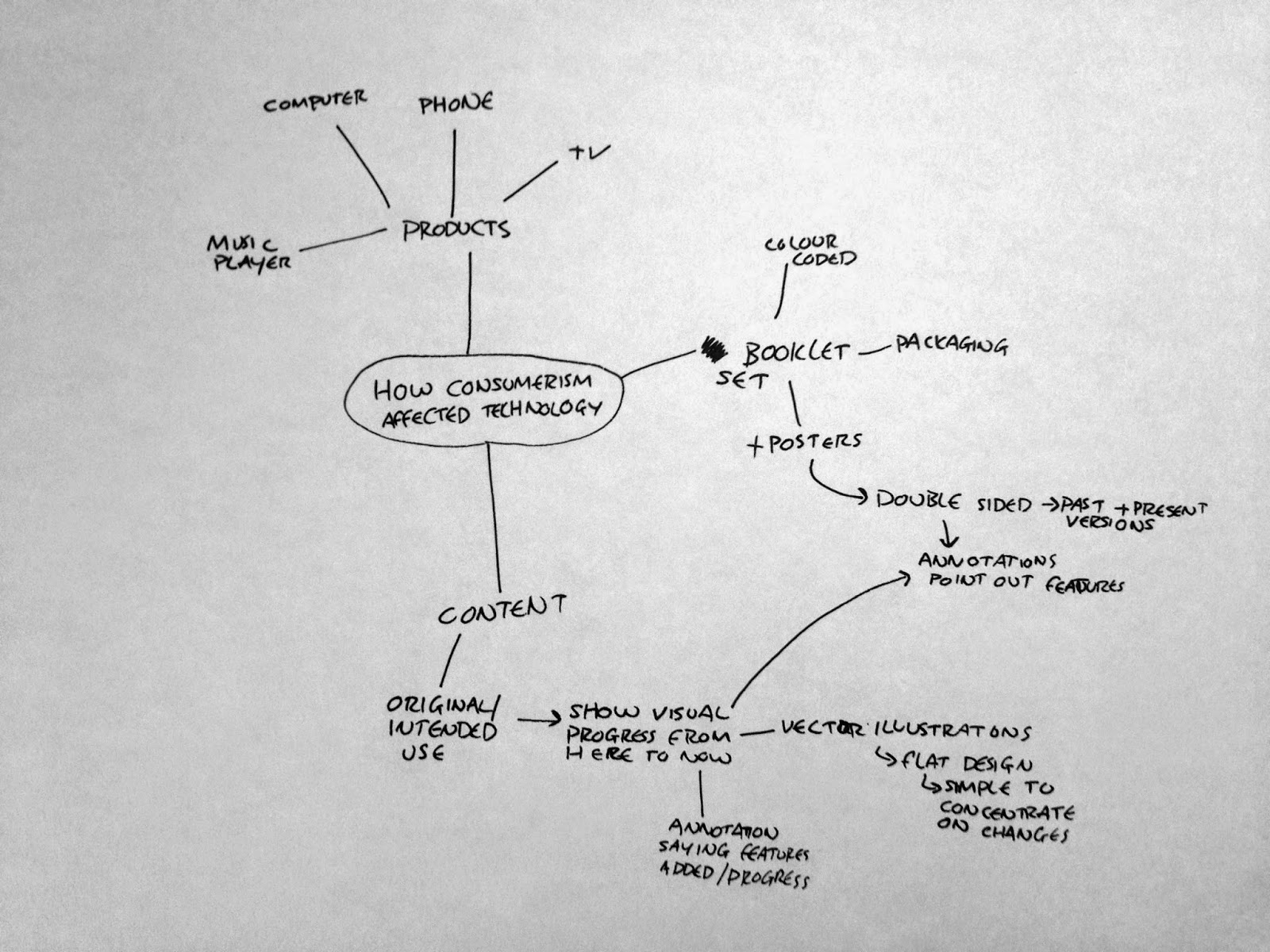
At the starting point to this brief I broke down my essay into the two main elements to it: technology and brands creating desire for a product.
For synthesis I knew I wanted to focus my outcome on technology, and particularly to Apple products, however as this is quite a limited area, technology as a whole would be a good place to start so I can get a general idea of what I want to do.
My idea was to create something which shows how brands, such as Apple, have changed products through history and manipulated their original purpose to that of something that does everything. For example, the original use of a telephone was to voice call other people. Now a telephone is mobile, can connect to the internet, play music, record videos. The original intention is almost lost amongst everything the device can now do. To strengthen this point I wanted to focus on more than one product so it shows that this is in affect over all pieces of technology, and strengthens my project as a whole.
I first did a brainstorm of a few different routes I could go down.

The first idea I have is to create material for a fictitious exhibition which is all about how there is a false need in technology.
I came up with a few different names to use but decided that 'Pixelate' was a strong name and the one to go with.
I felt that this was a strong name as pixelate in itself means to make something hard to see, to ruin the quality, the visuals and the viewers judgement. I thought that this fitted well as this is essentially what brands do to their products. They promise a huge amount to the viewer, clouding their judgement and blurring reality just to make money on a product which the viewer doesn't actually need.
The first thing I did was experiment with potential logo designs for the exhibition.


While I like this idea and the general content of it, I'm not entirely sure it is the correct route to go down for this brief. Something a bit more physical, such as a publication might be more appropriate, and while I could create a publication for the exhibition, I'm not entirely confident in my ability to do so and stick to the way the exhibition would be.
With this in mind I did another brainstorm with the idea that I could do an Ad campaign instead. This would be promoting useless pieces of technology in a way to convince the viewer that this was what they wanted.

At this point I reviewed all three of the idea I had and decided on the route to go down in which I felt the most comfortable with and would have a focus on the content.
I decided on creating a set of booklets, each detailing a product each and showing the change from the original use to the present use.
The products I have decided on are: Telephone, Television, Audio Player, Computer.
I thought that these were the right four products to go with because they are essentially what makes up modern technology use for the average person. It can also be argued that with technology as it is today, all four of these products now have the same technology to do the same tasks and run the same programs. I thought that this would be an interesting point to play on and something that could certainly build up a strong concept and meaning behind my publications.
With this I started to experiment with a couple of ideas I had for the aesthetic design of the booklets.
I wanted to definitely work with vector designs as this is a large part of designing for screen and these technologies. I had two different routes I could go down in terms of how I created the imagery and aesthetic for the booklets. I could either go with realistic image designs or flat design.
Flat design is something that has become very popular in recent times in technology and I think that this does need to be in my booklets somewhere as ignoring it would be ignoring my subject and content.
I experimented with these two ideas.

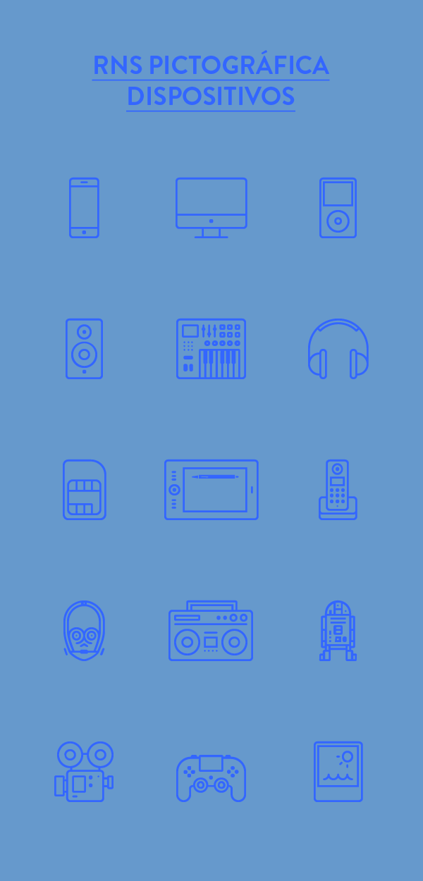
I started researching into the kind of design which is currently popular for when it comes to technology and found that iconography is very popular at the minute, and this is something I could use consistently through all four of the products I am going to be using.
As designing this way is very simple it will show the visual changes in the technology in the simplest form without the distraction of colour and shading.
Iconography:
At this point I am happy with the general design aesthetic I want to go with so I started researching into the four products.
The first thing I did was research their original intended purposes. This also gives me an idea of how viable this idea is.
Mobile Telephone:
A telephone with access to a cellular radio system so it can be used over a wide area, without a physical connection to a network.
Television:
A system for converting visual images (with sound) into electrical signals, transmitting them by radio or other means, and displaying them electronically on a screen.
Computer:
An electronic device which is capable of receiving information (data) in a particular form and of performing a sequence of operations in accordance with a predetermined but variable set of procedural instructions (program) to produce a result in the form of information or signals.
Audio Player:
Audio players are defined as a media player which can only play audio files.
I am happy that the original uses of these devices will give me a good basis for these booklets as they are specific in what their purpose is, and there is a big difference to what these devices can do now. I then started looking into the content I needed.
Audio Players:
- Phonograph/Gramaphone
- Portable cassette player
- 'boombox'
- Cd player
- MP3 player
- iPod
After choosing these I started on creating the simple illustrations I wanted to use throughout the book to represent the devices. I created twelve illustrations of the products and others related to the subject.
 I thought the use of black was good for defining some areas of the design.
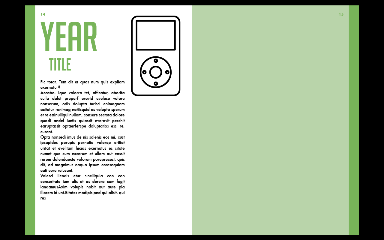
I wanted each booklet to be in the same uniform layout so it makes it easier for the reader to follow the information across all the booklets. To differentiate each booklet I gave each product their own colour to use.
Audio player - green
Computer - dark red
Television - blue
Mobile phone - orange
I then took these and put them on InDesign to create a front cover for the booklet.
 I found that the illustrations in white, the colour doesn't work as well and looks like inverted images and too bulky. While it worked in black, it definitely doesn't in white.
I then went back to Illustrator and changed them so they were all line illustrations instead.


I then moved onto the mobile telephone.
Research link: http://www.webdesignerdepot.com/2009/05/the-evolution-of-cell-phone-design-between-1983-2009/


I then moved onto the last product, the computer. I found a website from the Computer History Museum which had a timeline of the important turning points in computers.
http://www.computerhistory.org/timeline/?category=cmptr
From here and a bit more further research I created the twelve illustrations and put them onto InDesign.


 Something that I need to keep in mind is that the illustrations are all different shapes. There are some which are very wide and some that are very tall, so I needed to find a size which would work well with both of these shapes in mind.
I tried this layout out with the rest of the booklets.


 At this point I am quite happy with the progress of the booklet. I think that everything is working well and the illustrations do show off the products well. What I have to do now is get all the written content I want to use and find the photographic images.
I wanted each booklet to be in the same uniform layout so it makes it easier for the reader to follow the information across all the booklets. To differentiate each booklet I gave each product their own colour to use.
Audio player - green
Computer - dark red
Television - blue
Mobile phone - orange
I then took these and put them on InDesign to create a front cover for the booklet.
I then went back to Illustrator and changed them so they were all line illustrations instead.
I then experimented with a few different layout ideas.
I like the last two because they flows well with the text and don't cut it off abruptly like the other designs do.
I then moved onto the television illustrations. I first looked into the development of televisions to get an idea of which sets were large jumps in terms of technology and meeting customers needs.
I then took the most recognisable and important sets and created the illustrations.
I then took these onto InDesign to create the front cover to the booklet.
Research link: http://www.webdesignerdepot.com/2009/05/the-evolution-of-cell-phone-design-between-1983-2009/
I found that the website above was very helpful in defining each phone and how it was technically more advanced. From it I took twelve of the mobiles and created the illustrations.
For these illustrations, as some of the buttons are very small I needed to use block colours instead of lines. As they were in small areas it didn't go against my intended design so much and worked well.
I then moved onto the last product, the computer. I found a website from the Computer History Museum which had a timeline of the important turning points in computers.
http://www.computerhistory.org/timeline/?category=cmptr
Final front covers:
After completing these front covers I moved onto the interior pages. As I want the pages to be all the same I had to create one page layout which would work for all the content.
Content to include on each page:
- Year
- Product Name
- Features text
- Illustrations
- Photographic image
After deciding on what needed to be included I experimented with a few different layout ideas.
I decided that the first couple of very simple layouts were probably better for the subject and making it easier for the user to read.
I applied it to one of the products in the colour and illustration to see how it worked.
While the size of the illustration seemed fine in the layout experimentation, having the actual illustration in, it is far too big. With this in mind, I experimented with a couple of different sizes to see which worked best.
I tried this layout out with the rest of the booklets.
At this point I am happy with the way the layout works. As it is so simple I think it works well in all the products in showing everything off in a very easy to read way.
I then moved onto the first couple of pages of the booklet. This is where I want the original definition of the product to be.
No comments:
Post a Comment