At this point I had a quick tutorial with Richard to check the idea was going down the right route and wasn't too far away from what my essay was and what is being asked for in this brief.
While the idea was good, there were a few good ideas made on the way the content is delivered. While I had all the booklets all in uniform, it was suggested that a better delivery might be something more in context with the products, perhaps to the scale of the packaging of these products or something similar.
What I took away from this tutorial was that while the content was good and in the right area, my delivery and contextualisation of this needed improvement.
After some thought I did a brainstorm of a couple of different ideas I could do.

I did a brainstorm of this idea.

While I am familiar with the display on a Macbook, iPhone and iPod, I was not familiar with the display on the Apple Tv or how this works or if it is even viable for this idea. I did some research into the different displays for each of the devices.
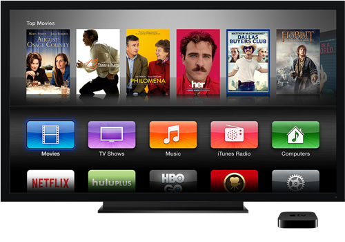
Apple TV


iPod


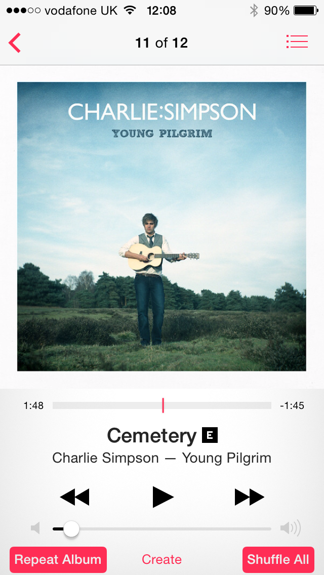


iPhone


Mac


iCloud use:


From this research I feel that I have got a good understanding into how each format works and what kind of thing is similar across the media.
The iPhone and iPod layouts are very similar now so I will need to figure out some way in differentiating them a bit more past the initial design. The scale of them is also something that I will need to figure out.
I then did a few layout designs and 'navigation' ideas. Something I found quite hard is to design these so they will be printed, but still be like they will be on screen. On screen it is all interactive so the page order is something that I will need to work on to really make the booklets work well.


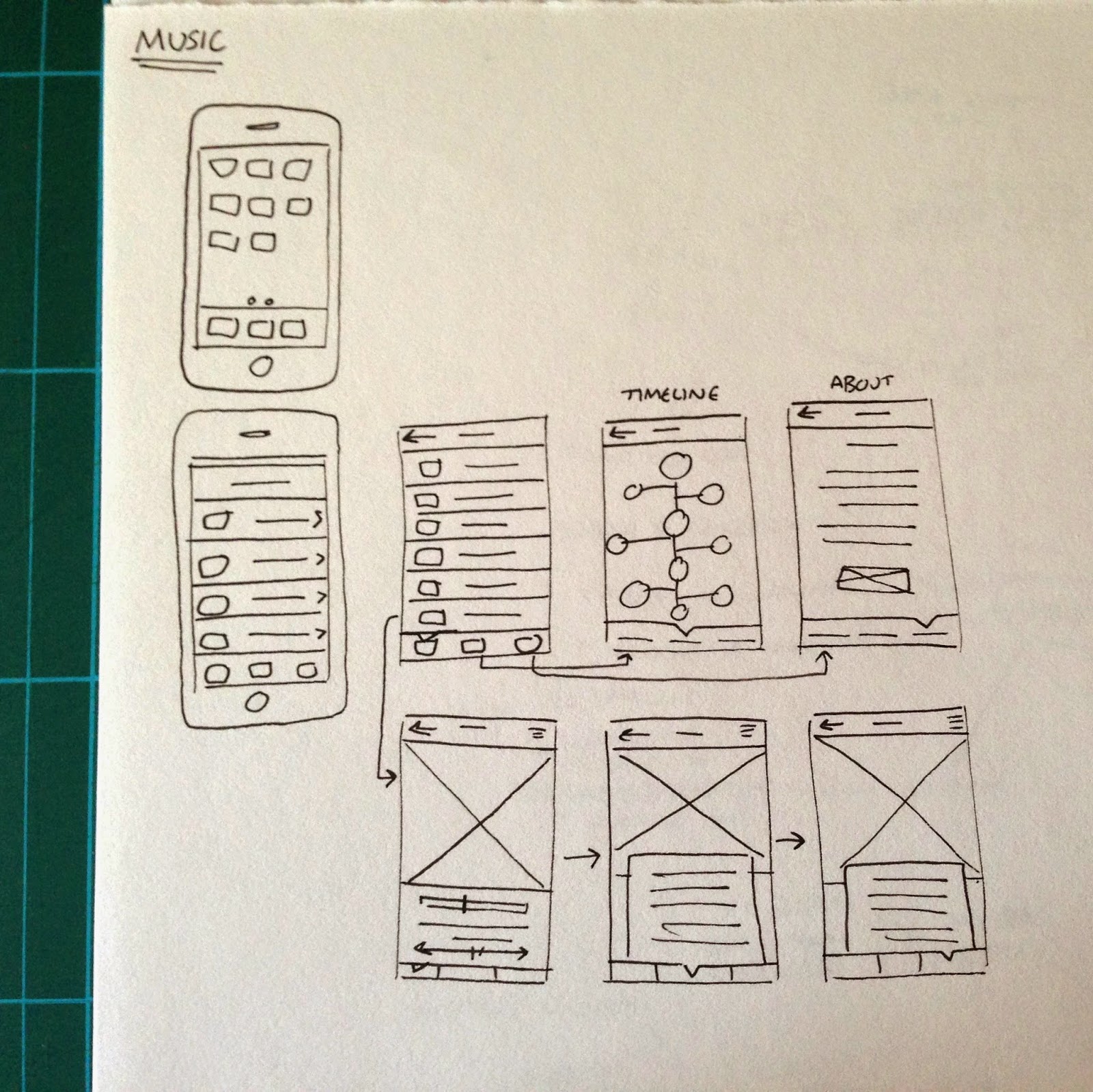
After this I started working on the first product - the mobile phone. This is the one that I feel the most comfortable with straight away as I am designing it as an App and I find this kind of thing very straight forward.
I decided that while I was scrapping the initial booklets, I do still like the elements used so will be keeping the illustrations and use of photographic images & written content. I just need to display it all in a much more interactive way which works better in the context.
Initial digital designs:


At this point I am quite happy with the progress I have made. I think the typeface chosen works much better and is much more readable because it isn't as abrupt as the previous typeface.
When starting this second idea I wanted to keep to a consistent colour scheme across the books, however I do think that a differing colour scheme might be a bit more interesting for the reader and won't make everything look the same. With this in mind, I decided that each booklet can have its own colour scheme, like in the original booklets.
Looking at what I have done for the mobile booklet, while I think the majority of what I have done is good, something I definitely don't like is the way the photographic image is displayed. I think that this will look better at full screen size because it just looks a bit amateur as it is this moment. However, at full size there was the issue of the image looking a bit strange going into the navigation triangle so I will need to do something to make it work. With this all in mind I made the changes and added in the body copy.


I think that the image works much better on the page now, and adding the year and product name gives the viewer that information straight away instead of having to go to the 'about' page to find it out.
I also created the following three pages to complete the 'App'.


Computer individual pages:


iPod individual pages:


Television individual pages:


Mobile Phone
Audio Player
Computer
Television
No comments:
Post a Comment