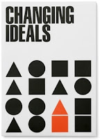
In groups we discussed the six images we brought it; two type, two image & two type and image. One from each was one that we did not like, the other that we did like. We discussed our reasoning as to why we liked and did not like them.
Type & Image
Image
Type
We then chose two, one we did like and one we didn't like. We turned them over and after a timed interval we turned them over for a second and then had to write the first word that came into our head about the aesthetic of the design.
From these, as a class we complied the lists together:
Good Design
- Illustrative
- Simple
- Relatable
- Clever
- Clean
- Symmetry
- Minimal
- Sophisticated
- Interesting
- Crisp
- Hand rendered
- Harmonised
- Organic
- Colourful
Bad Design
- Blurry
- Dull
- Cheesy
- Cluttered
- Random
- Ilegible
- Boring
- Grainy
- Confusing
- Cheap
- Weird
- Colourful
We swapped tables and were given four images face down, two type and two image, and had to do the same process for the images that we had never seen before, and would see if we got the same as they did/responded to it the same.
We then joined up as a big group with the table we swapped with and said what we wrote down for the four images, comparing with each other.
We were then split into two to come up with the 10 Aesthetic rules - the ones that we both agree upon - that make good design. I was paired with Abi, and we both have pretty much the same taste in design works so it made the list very easy for us to do.
We then chose the top three individually and put them up on the board.
My three: Innovative/creative/new design. Effective layering. Complimentary colours/colourful.


No comments:
Post a Comment