DIY KIT
The DIY kit is the main part of this brief. It is the bit where people will truly learn what I am trying to put across in the pack as a whole.
The DIY kit is a chance for the reader to create their own post-modernist letters. To do this I need three things;
- A selection of typefaces for each letter
- Paper
- Tracing paper
I want it all to be loose so it is all easy to use and there's not messing around trying to keep pages open if it's in a book or anything like that.
Belly Band
The belly band is to hold all the pieces of paper and tracing paper together in their packs so they don't go all over the place when put in the packaging.
I wanted to make something that reflected the modernist style of the two books, so wanted the belly band to have a logo on it which said exactly what it was.


The edge around the circle looks like a ruler, which is exactly what I wanted as it fits in well with the DIY side of things. In the middle of the circle I wanted something that was recognisable and related to deconstruction/DIY, so decided upon a compass as that is a typical piece of equipment that is used when doing hand rendered work.

Once happy with the compass I had drawn out, I added the text and angled the compass to balance it out.

 |
| Final DIY Logo |
 |
| Final Logo |

To tie it in with the colour scheme of the project, I printed it on green paper which was the same as the green used in the books.
 |
| Tracing Paper & Band |
 |
| Paper & Band |
The DIY sheets are going to be made up on six different typefaces per letter, a mix between the four groups of type; Gothic, Script, Roman & Block.

I wanted to include the logo onto the sheets so they wouldn't just look like a sheet of letters. Once decided on the first six typefaces, I took these into InDesign and started to look at different layouts and sizes for each.
 |
| Layout 1 |
 |
| Layout 2 |
 |
| Belly Band variation |
To fix this issue, I decided to include a variation of the belly band to place it in. I then started to experiment with this.


After some feedback, it was decided that the letters were too big on the page and were invading each other's space, and that making them smaller will benefit & balance the whole page.
 |
| Final Design |
Final Print Outs:


PDF
Final Products

To keep all the products together, I needed to come up with some kind of packaging which would show them all well and in a good light, as well as being presentable and representing the aesthetic appearance of the products as a whole.
I started by going into Illustrator to do some quick mockups of what I could do.
Content:
 |
| DIY Kit |
 |
| Books |
 |
| Packaging 1 |
 |
| Packaging 2 |
 |
| Packaging 3 |
 |
| Packaging 4 |
 |
| Packaging 5 |
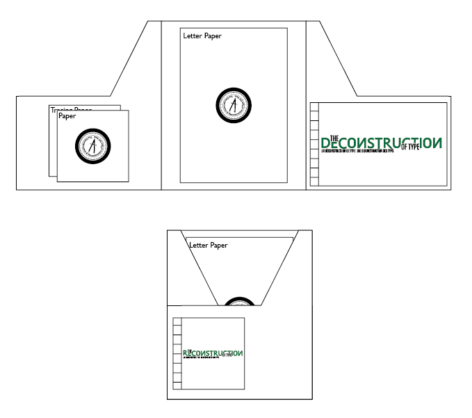 |
| Packaging 6 |
 |
| Packaging 7 |
 |
| Packaging 7 - Green |
I made changes to placings of the two books, swapping them around as it makes more sense to have the reconstruction book with the DIY kit and the deconstruction book as an introduction of sorts to the pack as a whole.
 |
| Chosen Packaging |
Slip mock-ups
 |
| Slip 1 |
 |
| Slip 2 |
 |
| Slip 3 |
 |
| Slip 4 |
 |
| Slip 5 |
To go in the packaging I thought about using a couple of short explanations. One for the reconstruction example book, and another for the pack in general.
Text mock-up


After creating the mock up, I have decided that explaining text isn't necessary as the pack is pretty self explanatory.
Final Packaging Choice

Final Images


No comments:
Post a Comment