The audience that I am working to is designers/people who are interested in my topic of hand drawn type.
I spoke to a number of people on what they would expect to find on a website of this topic and what they would like to see/how they would like it to work.
Their needs:
- Visual images
- Context & reason behind the work/what it is for
- A variety of different designers, work & situations for the work
- Easy to navigate website with clear links/buttons
- Clear layout if content is large - gridded systems - no cluttering
- Sub-categories
- Creative use of hand drawn type throughout the website itself
- Not just an archive - some personality/potential blog updating with new additions of work
- Links to works origin
- Videos of work in motion
- Comments from the designers themselves
- Simple colour scheme so it doesn't draw away from the content
- Type web animations
- Responsive design for phones/tablets
I then looked into websites which incorporated hand drawn type into their websites to see how well it all worked


Overall there is a mixture to the approach of using hand drawn type. Some use it for headings/navigation, others use it for body text and the overall tone of voice for the whole website. It all depends on the content and the message that they want to put across.
My opinion is that using hand drawn type on websites makes the page a lot more relaxed and playful than using digital typefaces. It gives the website a personality, and this is something that I would like to convey when designing my website.
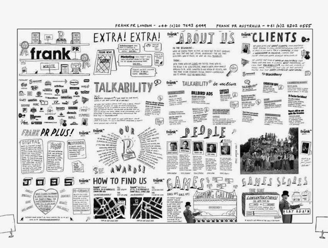
The first website design has the most personality to it as it is for a specific designer who is obviously interested in combing digital and hand-drawn elements. The use of icons for the links gives a bit of quirkiness as well. The whole layout of this website is almost like the designer drew it out in hand and scanned it in. This makes it stand out in this subject area compared to the others below it.
The last website design is using hand drawn type and design as a way to appeal to the users of this website. It is for yoga, and the general idea of people who do yoga is that those people are interested in natural, ethical products and things in the world. The design for this website attracts a completely different audience to the first website design, which shows the huge variety of tones of voice and audience that this aesthetic can give.
After looking at these, I looked into websites that I personally found appealing, forgetting all about the hand drawn type element and just looking at the general design decisions that I like visually.
I then looked into some websites that I found visually appealing.


I found that the websites I liked the most are the ones which are simple and very clear, with large images and with a set colour throughout the website. I like the websites which have a grid of images or articles as pages I find this way of navigation more interactive for the user.
The websites that I prefer are the ones with the larger navigation bars at the top. Each button is given a large amount of space, and all of these seem to just have one large image below it for the rest of the page. These layouts are simple, but very effective because of how visually bold they are.
These are all generally the complete opposite to the website designs incorporating hand drawn type. Those websites have a lot less structure and limitations on their designs, whereas these ones are built through the same wireframes for each page and a consistency.
I the tried find websites which had a simple, clean layout, but also incorporated hand drawn elements, whether it be type or image. I found that the majority of the ones with what I was looking for had a very similar style, a large image of hand-drawn/hand rendered work, and a simple sans serif navigation bar/buttons along the top.
I also found this article which talks about hand drawing style in web design: http://www.smashingmagazine.com/2008/01/03/hand-drawing-style-in-modern-web-design/


Although these websites do incorporate both elements, the clean simple design & hand drawn design, I do find that these don't appeal to me as much as either of the other two kinds I have been looking at. It seems that there hasn't been much of an advance in the way of incorporating the two together to create a website. This is something that I could definitely explore while doing this brief.
As part of the brief we have to consider how our websites will look on a tablet or phone, so I looked at some responsive websites, which change completely when put onto one of these devices. This will give me an insight into some of the features and designs which are consistent throughout the websites when they are put onto a smaller screen. These websites onto tablets/phones are also working on the fact that they will be touchscreen based media, so I will need to take into account the usability and size of each section/buttons through the designs.
Responsive websites
As part of the brief we have to consider the layout for the website in the different formats it could come in, for example a phone or tablet. I looked into responsive designed websites to see how they translate from the original computer screen design to one for the mobile or tablet.


As the phone and tablet formats are touch based instead of a mouse, the websites designs need to be made in a way which makes interactivity as easy as possible. Looking through the examples I found, a lot of them were either scroll down type of tap a button. The layouts are much more simple and more about the content than the overall aesthetic of the website, just having a few key points to show what website it is.
On a computer screen, a lot more information can be seen at once so the designer has a lot of leeway in terms of the visuals. On a phone screen, it is much more limited and needs to be as easy to use as possible.
The websites have been stripped down to their simplest form, just including the title and a small navigation bar before going into the content, text or image based. The majority of the computer websites have a homepage which is only the size of the screen, however on the mobile designs, these are made to be scrollable or are condensed down to fit onto the smaller screen.
Visually, I think that the dieline works best as a responsive website. It doesn't change the aesthetics much in terms of the content used and style in which it is all set out. It is all very clear and have a focus on the images instead of having a lot of menu bars like other responsive apps.
https://stockhouse.com/blogs/best-web-development-company-in-pune-quleiss-technologies-pvt-ltd/december-2020/get-the-best-web-design-and-web-development-services-at-quleiss-technologies
ReplyDeletehttps://ello.co/quleiss/post/g5cttzgze7shs0swid0onq
http://kaalchakra.com/post/93253/get-the-best-web-design-and-web-development-services-at-quleiss-technologies.html
https://www.tripoto.com/trip/get-the-best-web-design-and-web-development-services-at-quleiss-technologies-5fedce669e7c0
https://www.article1.co.uk/Articles-of-2020-Europe-UK-US/get-best-web-design-and-web-development-services-quleiss-technologies