For the first part of this studio brief we have been asked to create a 16 page publication of our research which we will use for the second part of this brief. This can be any scale we wish and on any stock. As I already have all the content, what I need to do is design the publication to hold it all. To start this off, I researched into publications so I could get some ideas of how I could go about this.
Transworld Surf Redesign
http://www.behance.net/gallery/Transworld-Surf-Redesign/13052023
This is the first publication that appeared on behance when I searched, and it has immediately become very helpful and a good source of inspiration. As it is a redesign it takes existing content and is redesigning the pages of the magazine.
Variations of front cover:
Initial page grids:
Examples of Page wireframes:
Putting the content in the wireframes:
I found this very useful because instead of just showing the final outcome, it shows how these pages work around the wireframes designed and how these work together in a set to create the publication. It uses a wide variety of wireframes which each have different image sizes and different amounts of text. This is especially useful to me as I will have similar sort of content with a mixture of image and text. In terms of consistency, through the examples I have deduced that whatever colour the front cover background is, this will remain the colour of the pages throughout the publication. In the examples of page wireframes it shows how this colour can be used, in either the full page or in half the page.
The clean layout is something that is more typical of a fashion magazine, not of a sports one. It makes it look very professional and of a very high quality, differentiating it from other magazines in the same area. These layouts seem to be quite image based, with the images at the top and text below, with large images dominating the pages. The amount of text varies, either in columns of two or three throughout the pages. In this context the text and image relationship works very well, and with the full colour printing the pages look like there has been a lot of time spent creating them.
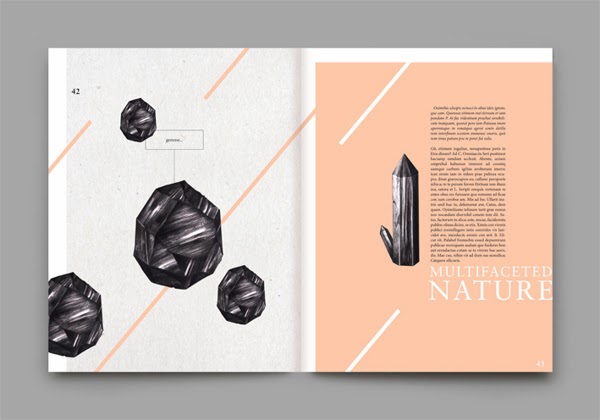
Rocca Stories
http://www.behance.net/gallery/R-O-C-C-A-stories/13845343
This publication is about stones, rocks, nature and it's creation. This is useful to me as it is a much more experimental use of layout design than the previous publication. While the one above was very structured, this has a bit of spontaneity to it.
I like this publication because it integrates the images and text together on the pages, working them together to create the page instead of having them in separate sections. I also like the use of the black and white images and the one colour chosen. It keeps it simple and makes the pages flow well together. What is interesting about this publication is the use of diagonal lines across the background. It shows that the pages don't have to be all in one colour to work well with the content, and can be a bit more exciting and become part of the content themselves. This also keeps the consistency throughout the publication.
Goodness Magazine
http://www.behance.net/gallery/Goodness-Magazine/13415323
This publication is a magazine dedicated to the 'goodness' of food and plant life. This one is interesting because of the very simplistic approach to the layout of the text and images.
This publication uses full colour, full page images and a fairly small amount of text. The focus is clearly on the images. The variation in the use of images is very consistent, either doing a full page, full double page or a page and a half. There is an inconsistency in the fourth image because that has a boarder, and the last image displays the text differently. The use of columns breaks down the information into readable chunks and the centralisation of it makes the overall publication seem very sophisticated.
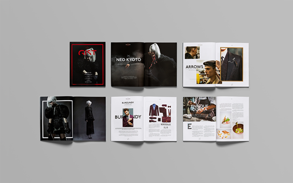
GIST
http://www.behance.net/gallery/GIST/13712111
GIST is a lifestyle magazine that reports on many different subjects, from fashion to gadgets. I am looking at this one because it shows multiple pages in one image and shows the variations but consistency throughout.
There are similar attributes throughout the pages, particularly the thick square box, which keep the consistency and branding throughout the publication. There is a wide variety of images and text based pages. The images are variated from full page to cut out images with a transparent background. The text is broken down into two columns consistently through the pages, and there is the occasion page with the text broken up and shaped around a larger piece of text. This adds a bit of diversity and makes it more visually interesting. The use of coloured pages also breaks up the publication into sections.
Parallex Magazine
http://www.behance.net/gallery/Parallax-Magazine/8295435
A magazine dedicated to photography. I like this publication because it is a pure focus on the content as it is all in black and white.
This publication is much more image driven due to the focus being on photography. There is a wide variety of layouts throughout the pages but a clear consistent gridded approach. These gridded systems and wireframes help display the photographs in a impactful way and gives each page its own individuality. This publication is a clean design which is utilising the white/black space of the pages. The colour use of black and white stops there being any bright colours on the page that could potentially be distracting from the main content of the pages.
Animalia
http://www.behance.net/gallery/Animalia/10356949
Experimental publication about a fictionalized narrative based on the exploration of various concepts and behaviors in a relationship between the human species and the irrational animals.
What I am most interested in this publication is the experimental use of text and how this corresponds to the images on the pages. Some of the pages are treated as single sheets, whereas others are treated as a spread, creating a diverse range of layout designs. The use of two bold colours makes this a very eye-catching publication and these colours contrasts well against each other when put together. This publication shows that the layouts don't have to be in a completely consistent format, that the content can be experimental and still go by a grid. It also shows that the grid on each page doesn't have to be the same throughout to make it a consistent publication. It can be purely down to the concept, colours and experimental layouts.
After looking at these for the layouts I started looking for publications that had interesting stock choices or finishes.
Taiwan Design Expo 2013
http://www.behance.net/gallery/SPECIAL-ISSUE-OF-TAIWAN-DESIGN-EXPO-2013/12016549
The front cover of this publication has a finish of laser cutting. The contrast with this, a dark sheet has been put as the next page, which really shows off how successful this design is and how to addition of this print process can be quite simple but have a large impact on the design as a whole. It adds another dimension to something which is usually very flat design.
Nº3/OBLIQUE
http://www.behance.net/gallery/N3-OBLIQUE/13691319
This publication shows off three potential finishing choices that could be considered; embossing, foiling & metallic ink. These each add a certain quality to where they have been applied and overall make the publication look very professional and have a very clean finish. The embossing is an alternative to adding a colour/other layer to a sheet, while keeping it interesting for the viewer. The foiling is something that isn't seen so often in publications, but adds a lot more visually to a sheet than a digitally printed gold instead. The same can be said for metallic ink being used.
Fedrigoni - Ispira Visual Book
http://www.behance.net/gallery/Fedrigoni-Ispira-Visual-Book/14092485
This catalog by Fedrigoni shows a wide variety of stocks that are possible to use, and also shows different processes possible on these colours. It shows a wide range from simple digital printing to a mixture of print and embossing, as well as UV coated text. It shows that detail doesn't have to be massive changes, that it can be small subtle things that add to the design to make it much more visually interesting.
0.01%
This publication is one that aesthetically reflects the subject matter. The subject was wood and trees, and immediately it is obvious that just by looking at the book it is very much about this subject. The layout is fairly simple throughout and remains consistent. The colours reflect the subject matter as well, sticking to browns/oranges throughout.


No comments:
Post a Comment