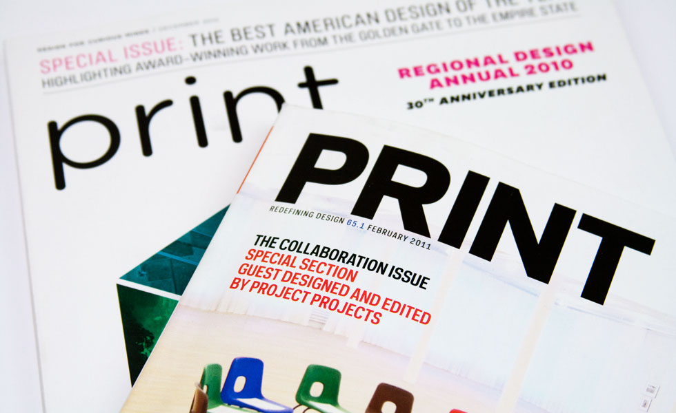
In comparing hand drawn typography and a sans serif typeface, I have decided to focus on 'Gotham'. This is a relatively recent typeface and is hugely popular in modern day. I felt that this was more relatable to advertising today than perhaps Helvetica or a older sans serif typeface.
Original source:
I initially found information about Gotham in Ellen Lupton's book 'Thinking with Type'.

Lupton, E. (2010 [2004]) ‘Thinking With Type’, 2nd Edition, New York: Princeton Architectural Press, Pg. 13
Background:
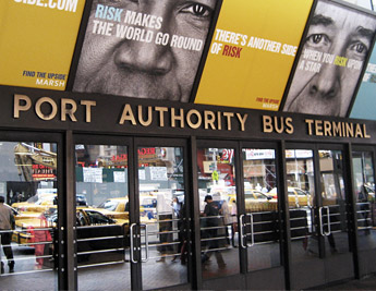
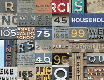
Gotham was born in 2000, when men’s fashion magazine GQ commissioned New York-based Hoefler & Frere-Jones to create a new typeface for use in their publication. Provided with a brief to create something “masculine, new, and fresh,” type designer Tobias Frere-Jones drew influences from post-war building signage and hand-painted letters seen around New York City. Using the seemingly plain, geometric lettering from New York’s Port Authority Bus Terminal as the project’s touchstone, an American “working class” typeface was born.
Influence:
In 2002, GQ’s exclusive license had expired and the typeface was released publicly. Spreading rapidly, it has been used in newspapers, corporate logos, movie posters, and packaging for brands like Coca-Cola, Netflix, Crest, and countless others.
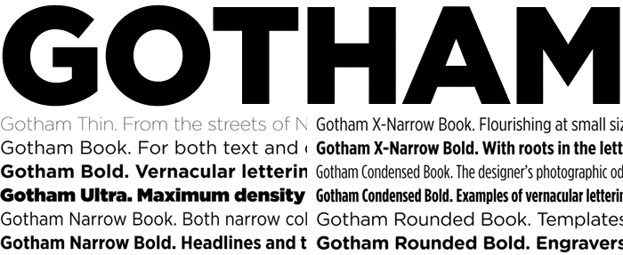
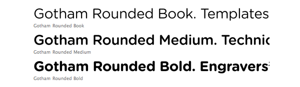
Due to its popularity, a Rounded variant was created in 2005—again the result of a commission, this time from the graphic design magazine Print. In 2007, after Print’s exclusivity had passed, the font became available to the general public. In 2009 Narrow and Extra Narrow variations were introduced, creating a total of 66 Gotham styles.
In GQ:


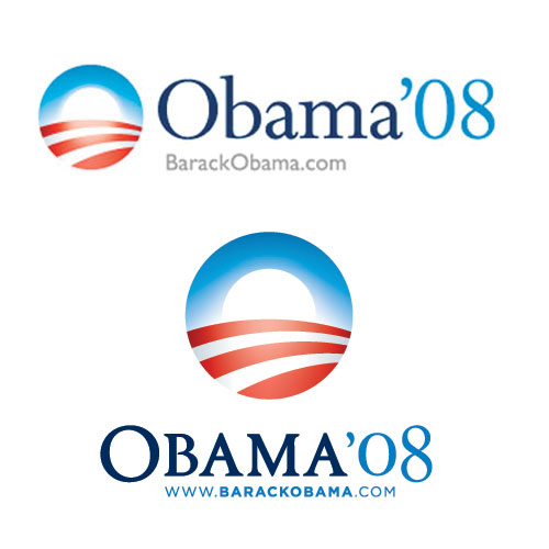
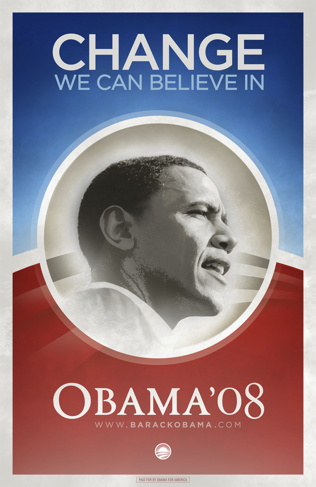
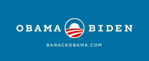
In Obama Campaigns:
Gotham became synonymous with President Obama during his 2008 campaign. It was a brilliant design decision as it’s a modern, fresh and very American font.
Original materials for the Obama campaign used the serif Perpetua. Later, however, upon hiring John Slabyk and Scott Thomas, the campaign made the change to Gotham, and the font was used on numerous signs and posters for the campaign.
If you compare this choice to his opponents choices it is the most modern looking font. Hilary Clinton used New Baskerville, a font known for libraries, law firms, etc. And John McCain used Optima, the same font used for the Vietnam Veterans Memorial.
Perpetua Font:
Change to include Gotham:
Use of Gotham:
2008 Campaign:


2012 Campaign:


Other uses of Gotham:


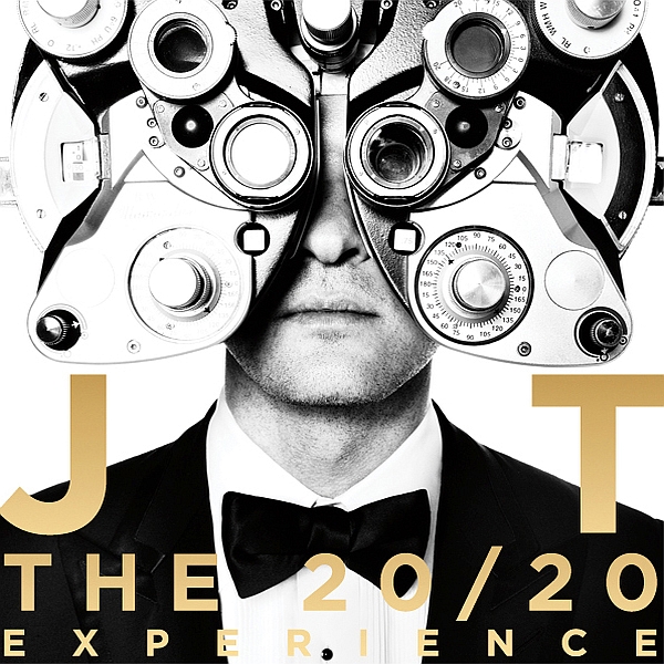
Gotham is a typeface which has had a huge growth in popularity over recent years, largely due to the exposure given in the 08 Obama campaign. It has now been used over a wide range of media, from branding to CD album covers, showing the diversity of the typeface because of its very geometric design.
References:
http://www.typography.com/fonts/gotham/overview/
http://www.whatthehelvetica.com/2012/03/30/font-fetish-fridays-gotham/
http://idsgn.org/posts/know-your-type-gotham/
http://fontmeme.com/gotham/
No comments:
Post a Comment