When I chose the Domino's brief, the first thing I did was look into the brand and the pre-existing advertising campaigns.
Domino’s story began with the opening of its first store in 1960 called “DomiNick’s.” Five years later, the company was renamed Domino’s Pizza, Inc., opening its first franchise location in 1967. Today, Domino’s has nearly 10,000 locations worldwide and $6.9 billion in annual sales.
The first thing I looked into was the rebranding that Domino's introduced in 2012. Their aim was to have a more memorable logo and consistent style throughout their brand. A lot of the Domino's takeaways will be franchises with their own local advertising which may all be inconsistent. Domino's issued brand guidelines, from logo styles to typefaces to use and how to use them, meaning there will be consistency through every country. This creates a much stronger brand image.
Original Logo:

New Logo:

Domino's aim was to make a logo which was memorable without the use of type. As the original logo was so well known, Domino's didn't go too far away from this, just taking away the unnecessary elements and creating a much stronger, simpler logo.
There are three variations of the logo:

From these guidelines it is clear that Domino's wants to solidify the domino on it's own as the main brand identity, however when more branding is required they do have the name as well. They have dropped the 'Pizza' and changed the typeface to something a bit more individual.
In terms on appearance, Domino's is very patriotic to America. With this being it's heritage, the colours red, white & blue are the only allowed colours in advertisements now (plus photographs). This has been very clear through previous advertisements:

Domino's has been continuously building as a brand and has adapted a certain quirky and humorous tone of voice to the way it is put across to customers. They are informal, witty and friendly in advertisements, giving the viewers/customers a sense of friendliness and home comfort.
A lot of the printed advertisements have been from before the rebrand. A lot of the focus for Domino's advertising is now on the television or the internet because of the new technologies that around.
One of the main campaigns Domino's has done in recent years is the 'Oh Yes We Did' campaign. This was in response to a large survey Domino's conducted, asking customers to give honest feedback on how to improve their products.
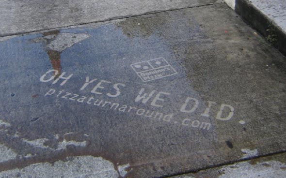
With this campaign, Domino's essentially started their rebranding shift. This is where they started changing their ethos and products for the better, updating recipes and listening to what the customers wanted and what they thought was wrong with the products.
Domino's has always prided itself on being all hand-made pizzas and fresh takeaways, however it was getting a bit of a reputation for being a lot more expensive than it was worth. To compete with other pizza takeaways they had to improve their services.
One part of this campaign was to make it personal to some of the customers who gave feedback, involving them in the campaign publicly. The following image shows one ad where this is happening:

By aiming it at a number of individuals it is really quite a risky thing to do in advertisements, however it is clear that Domino's values its customers and wants to keep the current customers happy instead of just focussing on getting new customers.
In terms of their most recent campaign, it has been purely tv advertisement. The 'Greatness from Domino's' is aimed to show Domino's quirky & fun side in an effort to get more customers. It's once again taking inspiration from America and the Wild West, making it look like the delivery guy is on a horse.

After this I looked into the ordering options they have, starting with their website. The British and American websites are very different, with a clear amount of time difference spent on designing these. This reflects Domino's primary market, which is predominantly the US, however the homepage for the UK site does show deals, so it does as it needs to.


At this point I had collected enough secondary resources to look over the designs and see exactly what Domino's design is all about. I also referred to the Brand guidelines that have been specified for this brief (Shown on Design Practice).
The only colours used are red, blue and white - their specified colours, and the only colours that I am allowed to use in the brief (black can be used for a monotone logo if needed). The only typefaces I am allowed to use are the ones specified, and these are used across all of their recent advertising, especially the Trade Gothic No.20.
They like the use of banners and effects on the type to make it more visually interesting than just typed out. They like the use of lines, stars and anything which is visually striking. They like big and bold, meaning this isn't a brief where I can shy away from this. The designs I do must reflect this bold personality that Domino's have built up. They like the use of photographs of their products, and layering text over the top in boxes or banners. Overall the designs are quite simple and advertisements seem to be lead primarily by the photographic images, with the text as a bit of context.
I then moved on to looking at the takeaway order App that is available from Dominos.
In the launch for this App they had the 'On The Go' campaign, as shown below.

Working on the idea of Google Maps & the pinpointing system, it replaces the pins with pizza slices, showing that wherever you are, you can order pizza.
App:


This App is clearly designed for functional use and doesn't really have much of a correspondence to the overall look of Domino's. Due to it being on a mobile phone screen, there isn't much room for their usual designs which would be used. It is purely about giving the user the easiest experience possible for use.
I then started looking into the advertisements Domino's already had for Two For Tuesdays and the advertisements by competitors.


Primary Research:


No comments:
Post a Comment