Typography & Advertising
Question
Is Typography more powerful than Image in Advertising?
Chapter Plan
Chapter 1 - Typography: The Basics and History
Origins of Type & initial uses
Gutenberg & the Gutenberg Press
Type Classification
Hierarchy - weighting, style, colour etc.
Chapter 2 - Typography and Advertising
Initial use of type in advertising
Typography use today in advertising
Sans serif vs Hand drawn type
Packard's 'eight hidden needs' of advertising
Tone of voice & the message
Chapter 3 - Case Study: McDonalds
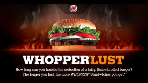
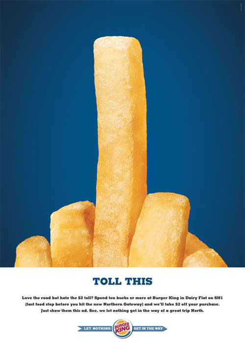
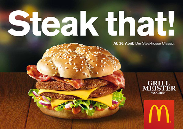
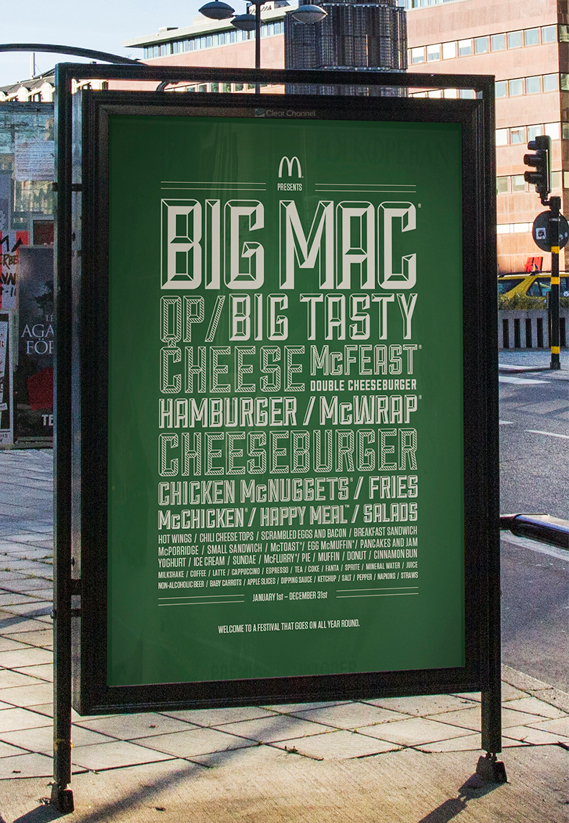
Progression of advert designs
Comparison of 3/4 through the time
Tone of voice - masking of a large corporation
Move to hand drawn type - why & how
Packard's hidden needs
Things to consider
Examples to use & when
Sans serif vs hand drawn type - choosing one sans serif to focus on
Main text for each of the chapters to refer to
Imagery to collect
Initial Sources
Ambrose, G. and Harris, P. (2011 [2006]) ‘The Fundamentals of Typography’, 2nd Edition, Switzerland: AVA Publishing SA
Carter, R. and Day, B. and Meggs, P. (2012) ‘Typographic Design: Form and Communication’, New Jersey: John Wiley & Sons, Inc.
Garfield, S. (2011 [2010]) ‘Just My Type: A book about fonts’, 2nd Edition, London: Profile Books
Heller, S. and Ilic, M. (2012) ‘Stop, Think, Go, Do: How Typography & Graphic Design Influence Behaviour’, Massachusetts: Rockport Publishers
Hollis, R. (2011 [1994]) ‘Graphic Design, A Concise History’, London: Thames & Hudson
Jury, D. (2006) ‘What Is Typography?’, Switzerland: RotoVision SA
Lupton, E. (2010 [2004]) ‘Thinking With Type’, 2nd Edition, New York: Princeton Architectural Press
Perry, M. (2007) ‘Hand Job: A Catalog of Type’, New York: Princeton Architectural Press
Vignelli, M (2010) ‘The Vignelli Canon’, Switzerland: Lars Müller Publishing
Practical Direction
To create one advertisement for McDonalds & variating the typography on a number of versions depending on what has been found in the essay.


