Following the initial design decisions I made, I set about creating the document to start to put the poster together. This would give me a much clearer idea of how the content worked together and what needed to be changed.
I started by creating a rough document on Illustrator. This meant that I could edit the text layout and design at the same time instead of having to go between Illustrator and InDesign every time. It also means that when I'm happy with a layout I can copy and paste it into InDesign and then create the design with this as a guide.
I decided on an A4 size to start with. Posters are often in this format, so it means I can just scale it up to a larger size in InDesign later on.
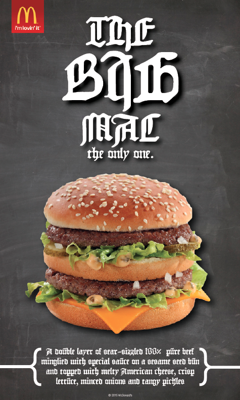
I started with the chalkboard background and placed the burger over the top. I had decided on the format of having the heading at the top, then the image, then the body copy. The logo would be in the top left hand corner like in all recent McDonald's advertisements. I wanted to keep the poster as simple as possible because the main focus is on the typography. Also, the majority of McDonald's ads have always been quite simple in design. I didn't want to add anything which could be distracting from the main purpose of the poster.

I added the logo to the top left corner, leaving a space between it and the edge, just like their current ads, fitting with their brand guidelines.

I then added the body copy below. I decided on starting with the Slab Serif poster. (Poster #5).

As well as the body copy, I added a McDonald's copyright sign to the central bottom. This gives the authenticity of it being a McDonald's ad. To do this, I had to move both the image and body copy higher up the document.

At this point I am slightly concerned with the space on the poster, especially as the body copy is so close to the bottom of the page and the burger. To try counter this, I made the body copy slightly smaller, putting it to the width of the burger and freeing up a bit more space.

I am happy with the progress of the poster, however at this point I don't think that there is quite enough space on the poster to fit all elements comfortably. With this in mind I decided to make the poster longer so that I could fit a good sized heading to match the prominence of the image.
I started with a simple design for the heading, with the words at an even width. I added a drop shadow to the heading so it would fit in with the drop shadow of the image, giving that overall appearance of having a bit of height and not being a completely flat design. I also made the burger slightly smaller to balance the distance between each of the elements on the page.

I then played around with the size of the type and placement of all the elements on the page.


The image below is the overall design that I like. The logo is at a good place in terms on it looks purposely away from the edge of the page, but there is enough room between it and the heading.

The heading still needed work on because I was unhappy with the layout of it. While I like each word on its own line, I don't like that there's not much of a difference between each of these, and a bit of hierarchy will benefit the poster. I decided on having the 'big' at the same size, and making the other text smaller, accentuating the 'big'.
Once happy with this design, I applied it to the six other headings for the other posters.
Headings:

Looking at the six like this, there are clear differences and similarities immediately which are points I think will be picked up in the response part to this brief.
Something that is very obvious is the legibility of the Blackletter font. It is pretty unclear, however to keep this as authentic and fair as possible, the typeface must be used as it is a clear reflection of actual blackletter type.
The Old Style and Transitional typefaces are very similar. This is a little bit concerning, however wasn't a surprise given that Transitional is essentially a revised Old Style.
I went through the headings and kerned them appropriately.
Adding the new heading to the poster:

At this point I printed out a copy of the poster to see how well it worked when printed as it always looks different physically to what it looks like on screen.
Overall I am happy with the design, however there was a bit of an issue in the fact that the right hand edges of the burger didn't really fit well against the background. While it's not hugely noticeable, I would like to experiment with this and try see if I can come up with something which disguises this a bit better. The problem is that it was originally against a white background, and fits against this seamlessly, but now I have put it against a dark background.
I tried adding a bit of a white flare behind it, adding a bit more of an illustrative feel to the poster. I tried a couple of different variations of this, varying in the subtlety of this.


I decided against this idea as I wasn't confident in the use of it. I felt that it didn't add anything to the design and did sort of take away from the professionalism of the design.
I decided that the way the poster was before was clean, clear and simple, and would work with the best. However, I did feel that he poster was lacking something so thought about how I could add a bit more character to the design. I experimented with the idea of adding brackets around the body copy. I felt that the body copy didn't have much of a presence on the page, and something could be added to make it a bit more noticeable.

I liked the way the brackets work on the page and think it balances the design out in terms of what the viewer will look at first. It gives the body copy a bit more presence on the page.
Happy with this design, I took this into InDesign, and created the six posters.


At this point I am really happy with the way these posters have turned out. They all work well and all the content fits on the pages well.
The next step to take is to create the final poster using hand drawn type.
No comments:
Post a Comment