I started the posters by collecting the imagery and text that I would need. With the idea of printing these posters out to at least A2 size, the imagery had to be of a good quality and high pixelation, at least 3000px in width otherwise it would become too blurry at this large size.
Luckily I was able to find an extremely high quality image of a big mac, which was already at 300 dpi, meaning it was perfect for printing at a large scale. The only thing it needed was editing to take away the background.
Image:

The image looks like it's from a photoshoot and looks professional, so that is a really good start for the poster in looking like an actual design McDonald's would have. For this project to work, the poster must look as realistic as possible.
I started by editing away the background so the burger could move freely and be over any colour background. The colours and brightness didn't need changing at all because clearly the initial photoshoot had good lighting.
Edited Image:

Once happy with the cleanness of the editing, I set about finding a background for the poster. A lot of McDonald's advertisements are either on a white or red background, however I think something a bit more interesting will work better. Their more recent advertisements involve chalkboard (McCafe advertisements), and I really like the idea behind this as it gives texture and doesn't make the ad look flat. It will hopefully make the burger look like it has a place as well instead of just being stuck there.
I found an high quality image of a chalkboard online, big enough for print.

I then placed the burger over the top of it to see how it would work.
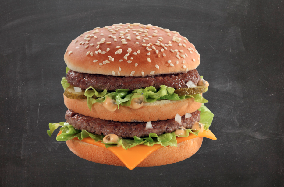
I like the contrast between the burger and the chalkboard, however the image does look like it's stuck on. This is obviously to do with the fact that there are no shadows or tonal difference in the background around the burger.
To try and counter this and make it look a bit more purposeful, I tried adding a drop shadow to the burger.

I played around with this tool until I found something I was happy with. The first attempt was a bit too thick and noticeable, where I really wanted something quite subtle, but clear at the same time.

Following this I went onto the McDonald's website to see what information I could gather about the big mac. I looked on both the American and British sites, which did differ in information and overall style.


I liked the way the American website spoke about the product. The British one is not as playful in description, and I think this would work well on the poster. I also liked the 'There is only one.' It seems like quite a good tag line, however I do want to change it a bit so it's not a direct copy.
Following this I started on creating the type for each of the posters. I started by going through the seven classifications and choosing typefaces which suited each of the classifications well.
Typefaces chosen:
- Blackletter - Gutenberg 1454 replica
- Old Style - Garamond
- Transitional - Baskerville
- Modern - Didot
- Slab Serif - Museo Slab
- Sans Serif - Montserrat
- Graphic - Claire's Hand
At this point I had made a few decisions on the heading and tag line. I had decided on the heading being very simple, with 'The Big Mac' as the main heading, and 'the only one.' as a tag line. This enforces the name immediately, and the idea of it being the only product of its kind, which McDonald's have always pushed.
Hierarchy is something I will have to take into consideration when doing the headings. I will have to decide what I want to be accentuated and what I will want a bit smaller.
I started by applying these typefaces to the body copy. I decided on a four lined layout, keeping it condensed but also readable in the line lengths. I decided against justifying the lines because I think the shape of the text works well and works better than it would with the justification. It also allows each typeface to act in the way it was designed for, not to space further apart than intended.
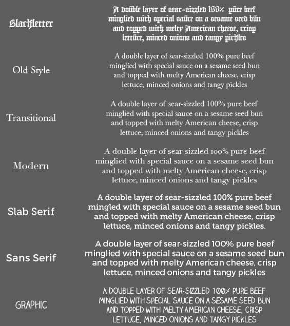
A this point I am happy with the progress I have made in terms of the typography and finding a suitable image. I was very lucky to find such a high quality image that will print well at large sizes. I think that the typefaces chosen show each of the classifications off well and show contrast.
The next step is to work these elements together on a document and also create the hand rendered type for the 'Graphic' classification poster.
No comments:
Post a Comment