Sunday, 26 January 2014

OUGD505 - Study Task 1 - Trainers: Background

For this research task I have decided to focus on 'Trainers'. I am someone who has a fair few pairs and is interested in all the different types of trainers/shoes that there are. This makes it an interesting research topic for me because it will benefit me as much as it will for this module.

To start the research off I decided to go with the obvious and look into the background of trainers, where they came from and how they have become what they are today in a fashion item as much as the original use for sport.
  • Athletic shoe is a generic name for the footwear primarily designed for sports or other forms of physical exercise but in recent years has come to be used for casual everyday activities.  
  • They are also known as trainers, sandshoes, gym boots, joggers, running shoes, runners, gutties, sneakers, tennis shoes, gym shoes, tennies, sports shoes, sneaks, tackies, rubber shoes or canver.
Plimsolls
Plimsolls

  • In the late 18th century, people wore rubber soled shoes called plimsolls.
  • As more families took weekend holiday trips to the seaside, demand for special footwear designed for leisure and the beach increased. Early leisure shoes had a cotton canvas structure with a leather sole - a design that was flimsy and not durable. 
  • In the 1830s, the Liverpool Rubber Company developed reliable and comfortable beachwear with a canvas upper and a rubber sole, with a rubber band wrapped around the shoe to give the footwear a strong structure. 
  • Plimsolls were widely worn by vacationers and also began to be worn by sportsmen on the tennis and croquet courts for their comfort. Special soles with engraved patterns to increase the surface grip of the shoe were developed and these were ordered in bulk for the use of the Army
  • British company J.W. Foster and Sons designed and produced the first shoes designed for running in 1895. The shoes were spiked to allow for greater traction and speed. The company sold its high-quality handmade running shoes to athletes around the world, eventually receiving a contract for the manufacture of running shoes for Team GB in the 1924 Summer Olympics.

Keds

  • This style of footwear also became prominent in America at the turn of the 20th century, where they were called sneakers. In 1892, the U.S. Rubber Company came up with more comfortable rubber sneakers with canvas tops, called Keds. 
  • In 1916 Keds created the original trainer, the 'Champion'. By 1917, these began to be mass produced.
  • In 1926 these trainers were starting to be worn for more than just sport - for every day life too.
  • In 1938 Keds launched a line of 'Kedettes' for ladies. These featured a small high heel which offered a comfortable shock absorbing rubber sole.
  • In 1950 Keds launched a casual shoe campaign.
  • In 1960 the 'Pointer' makes it's debut for women.
  • In 1970 Keds relaunches the 'Champion'.
  • In 1980 Keds becomes the shoes for teenagers to wear with anything.
  • In 2011 Keds expands into fashion.
  • In 2013 Keds get's its first celebrity endorsement in Taylor Swift.


Converse
  • In 1917, Marquis Converse produced the first shoe made just for basketball, called Converse All-Stars.
  • In 1923, an Indiana hoops star named Chuck Taylor endorsed the shoes, and they became known as Chuck Taylor All-Stars. These are the best-selling basketball shoes of all time. Soon basketball teams as well as American boys were wearing Converse “Chuck Taylor” All Stars. 
  • In the 1930s Chuck Taylor designed the white high top model for the 1936 Olympics, and the shoe with its patriotic red and blue trim became very popular along with all black canvas and leather models of the All Star.
  • The classic black and white Chuck Taylor All Star High Top was introduced in 1949. 
  • Chuck Taylor All Stars were the shoe for professional, college, high school, and all serious basketball players, and these distinctive black or white high tops were part of the look of each team. 
  • Since 1949, the basic design of the ‘Chuck’ Taylor basketball shoe has not changed. Converse All Star Chuck Taylor basketball shoes in their distinctive high top and low cut oxford models are the classic American sneaker, and a favourite shoe for people of every age all around the world
  • In 1957 the low cut All Star was introduced and became popular as a more casual alternative to the high top. By this time Converse had an 80% share of the entire sneaker industry. 
  • In the 1970s, athletic shoes became so popular that many new athletic shoe companies emerged and marketed a wide variety of basketball and other sports and leisure shoes. The Converse "Chuck Taylor" All Star, once the premiere shoe of elite basketball players now became the shoe of the counter-culture and of baby boomers who refused to stop wearing their favourite pairs of chucks. 
  • The shoes became very popular with rock musicians, and younger generations wore them for their distinctive looks, colors, and comfort and as an alternative to the high priced high performance shoes made by Nike and other companies. They were considered a leisure shoe and now were purchased because they were fashionable. 
  • Converse responded by manufacturing chucks in hundreds of different variations that included prints, patterns, unusual colors, and special models for different age groups.
  • In the 1980s and 1990s, the Converse Company began to experience hard times. The ownership and management of the Converse Company changed several times. These changes along with their loss of market share took its toll on the company, and in 2001 they filed for bankruptcy. But the brand was too well established to abandon, and new ownership took over, closing all North American manufacturing and moving the manufacture of Converse athletic shoes from the USA to Asia. The brand was reestablished successfully and the company was eventually purchased by its rival, Nike.
  • Despite all of the innovations and changes in the athletic shoe industry, ‘Chuck’ Taylor athletic shoes continue to live on. Thousands of pairs of high top and low cut chucks are still sold each week worldwide. Because they are a unisex design, the same sneakers are worn by both men and women, girls and boys. 
  • As of today more than 800,000,000 pairs of chucks have been sold. Unlike other sneakers that lose their popularity, the Converse All Star ‘Chuck’ Taylor still remains fashionable and people who like chucks are fanatical in their devotion to the shoes.

Adidas
  • In 1924, brothers Rudolf & Adolf Dassler founded the company 'Gebrüder Dassler Schufakbrik' (Dassler brother shoe factory), in Germany. The shoes designed by the pair were worn by Jesse Owens when he won four Olympic gold medals in the 1936 games.
  • On August 18, 1949, Adi Dassler started over again at the age of 49, registered the “Adi Dassler adidas Sportschuhfabrik” and set to work with 47 employees in the small town of Herzogenaurach. On the same day, he registered a shoe that included the registration of the soon-to-become-famous adidas 3-Stripes.
  • In 1954 Adidas designed specially made football boots for the German National Team for the 1954 World Cup. These were half the weight of original British football boots and featured screw in studs that can be adapted to ground conditions. When Germany won, these boots became a sensation in the football world.
  • In 1967 Adidas expanded into tracksuits. When the Franz Beckenbauer tracksuit model celebrated its debut, it became the first piece of apparel for adidas and opened a whole new business to a company. 
  • In 1972, the world turned to Germany when the Olympic Games opened in Munich. Just in time for the event, adidas presented a new logo that was here to stay: the Trefoil. Then, symbolising performance. Today, the adidas Originlas collection stands for lifestyle and street. The 3-Stripes kept expanding to more and more sports throughout the years. This is reflected in the broad range of 
  • athletes who trust adidas to make them better.
  • In 1984 Adidas introduced the Micropacer - a computer in the shoe - known today as miCoach - providing performance statistics to athletes.
  • In 1992 Adidas was near bankrupt.
  • In 1993 Robert Louis-Dreyfus, The new CEO made an almost impossible job seem easy. He understood that the almost bankrupt Adidas did not need to be reinvented, it simply needed a new direction. He turned the sleeping giant from a sales- to a marketing-driven company and steers adidas back on the growth path. 
  • In 1995, six years after becoming a corporation, Adidas went public and its new marketing slogan could not sum it up better: “We knew then, we know now”. 

Puma

  • In 1924, brothers Rudolf & Adolf Dassler founded the company 'Gebrüder Dassler Schufakbrik' (Dassler brother shoe factory), in Germany. The shoes designed by the pair were worn by Jesse Owens when he won four Olympic gold medals in the 1936 games.
  • In 1947 Puma was founded by Rudolf Dassler - the brother of Adidas founder Adolf Dassler.
  • In the same year Puma's first football boot 'Atom' was launched. In the first post-war football match in 1950, several members of the German team wore these boots.
  • In 1952, Dassler developed a football boot with screw in studs, the 'Super Atom'. When launched this became the forefront for Puma and footballs successful relationship for years to come. Development of this began on the enhanced version the 'Brasil'.
  • In 1954 Heinz Fütterer breaks the 100m world record wearing Puma running shoes.
  • In 1958 Puma introduced their trademark logo.
  • In 1960 Puma become the first shoe manufacturer to use the technologically advanced vulcanisation production technique - where the sole and shaft of the shoe are bonded.
  • In 1977 Puma had established itself as a supplier for top athletes.
  • In 1985 Boris Becker used Puma shoes & a Puma racket to win Wimbledon.
  • In 1996 Puma created contact lenses displaying the logo as part of a campaign used at the Atlanta Olympic games.
  • In 1998 Puma became the first sports brand to merge sports & fashion, co-operating with designer Jil Sanders.
  • In 1999 Puma launches 'Puma Mostro'. This quickly became a fashion trend and was picked up by fashion icons like Madonna.
  • In 2001 Puma entered a partnership with Jordan Grand Prix to enter the world of motor racing.
  • In 2008 Usain Bolt wore Puma as he broke three world records & won three gold medals at the Olympics.
Nike
  • Nike was founded in 1960 by Bill Bowerman and Phill Knight.
  • The initial shoes sold were Tiger shoes by Onisuka, a Japanese brand. Knight sent these to Bowerman, who instead of buying them offered to be a partner and provide his footwear designs to Tiger. They then founded 'Blue Ribbon Sport'. Knight sold the shoes out of the trunk of his car while Bowerman tore them apart to see how he could improve them.
  • In 1965 they hired Jeff Johnson as a full-time employee.
  • In 1971 Johnson created the first product brochures, print ads and marketing materials, and even shot the photographs for the company’s catalogues. He established a mail-order system, opened the first Blue Ribbon Sport retail store, and managed shipping/receiving. He also designed several early Nike shoes, and even conjured up the name Nike.
  • Around this same time, the relationship with Onitsuka was falling apart. Knight and Bowerman were ready to make the jump from being a footwear distributor to designing and manufacturing their own brand of athletic shoes.
  • They selected a brand mark today known internationally as the “Swoosh” which was created by a graphic design student at Portland State University named Carolyn Davidson. 
  • The new Nike line of footwear debuted in 1972, in time for the U.S. Track & Field Trials.
  • One particular pair of shoes made a very different impression on the dozen or so runners who tried them. They featured a new innovation that Bowerman – an outsole that had waffle-type nubs for traction but were lighter than traditional training shoes.
  • With a new logo, a new name and a new design innovation, they needed an athlete to endorse and elevate the new Nike line. Steve Prefontaine.
  • Pre challenged Bowerman, Johnson and BRS in general to stretch their creative talents. In turn, he became a powerful ambassador for BRS and Nike, making numerous appearances on behalf of BRS and sending pairs of Nike shoes to prospective runners along with personal notes of encouragement.
  • In 1980 Nike launched the 'Nike Air' technology in 'Tailwind' running shoes.
  • Sales took off in 1984, when Michael Jordan signed a contract to wear a Nike shoe called Air Jordans—the most famous trainers ever made. Even after Jordan retired from the NBA, his shoes continued to be best sellers.
  • In 1987, Nike readied a major product and marketing campaign designed to regain the industry lead and differentiate Nike from its competitors. The focal point was the Air Max, the first Nike footwear to feature Nike Air bags that were visible.
  • In 1994, Nike signed several individual players from what would be the World Cup-winning Brazilian National Team. 
  • In 1995, Nike signed the entire team, and began designing the team’s distinctive uniform. Nike also signed the US men’s and women’s national soccer teams, as well as dozens of national teams around the world.
  • In 1996, Nike Golf landed young golfer named Eldrick “Tiger” Woods for a reported $5 million per year. Tiger won the 1997 Masters by a record 12 strokes.
  • In 2000 Nike launched a new footwear cushioning system called Nike Shox. The development of Nike Shox culminated more than 15 years of perseverance and dedication, as Nike designers stuck with their idea until technology could catch up. The result was a cushioning and stability system worthy of joining Nike Air as the industry’s gold standard.
Reebok
  • In 1895, JW Foster and Sons started to manufacture shoes and sell them all over the United Kingdom. Even though they never garnered much attention, they were successful enough to be worn by the athletes in the 1924 Summer Olympics. 
  • In 1958 Reebok was founded as a sister company to JW Foster & Sons. They picked the name Reebok, which means African Gazelle, because they wanted to depict speed, style, and grace. Even though the company was selling the shoes at a decent rate in the United Kingdom, they were still having a hard time getting the shoes noticed on a world wide scale. 
  • In 1979 at the Chicago International Sneaker Trade Show, Paul Fireman took notice of the Reebok brand. He was drawn in by the customization of each shoe, as well as the high quality. Without wasting anytime, Fireman negotiated a deal to license and distributes the Reebok brand in the United States; it was at this time that Reebok USA was born. 
  • That same year, Fireman introduced three running shoes to the market.  He had so much confidence in the product that he priced the shoe at $60 which made it the highest priced offering on the market. By 1981, Reebok USA had exceeded $1.5 million in sales; and this was all done by selling simple track shoes.
  • In 1982, the company made a move that took the sneaker industry by surprise, and sent sales through the roof. Reebok introduced the first athletic shoe for women. This move helped Reebok grab the majority of the market share in the early 1980’s.
  • In 1989, Reebok introduced the Pump to the basketball world. These shoes were designed specifically with basketball in mind. The shoe used an air bladder which could be inflated by a small pump that was located on the tongue of the shoe. The pump was in the shape of a basketball, and when pushed it would inflate the bladder so that the shoe would conform tightly around the ankle. This shoe was designed to take on the “Nike Air”, and debuted with a sticker price of $170; nearly double the price of other basketball shoes.  But despite the huge price difference Reebok had a hit. Over a four year period they sold over 20 million pairs worldwide.
  • But just as quickly as it took off, the Pumps began to fade out of the public eye. This left Reebok without a number one seller, and scrambling for another big break through. 
  • As sales continued to decline throughout the 90’s, Reebok was looking for a way to regain a share of the market that was being dominated by Nike. After numerous efforts failed to produce results, Reebok decided to look for endorsements as a way to increase brand awareness.
  • In 1996, they pegged NBA newcomer Allen Iverson as a target. From 1996 to 2000, Iverson and Reebok had a lot of success promoting the brand both on and off the court. With Iverson quickly becoming an NBA superstar, his shoe which was known as “The Answer” was selling at a fast pace and helping to bring Reebok back to the forefront of the industry. 
  • In 2001, Reebok made a huge commitment to Iverson by signing him to a life long contract which guarantees that he sports the brand until his days in the NBA are over.
  • Then in 2005, during NBA All-Star weekend Reebok introduced the new 'Above the Rim' Pump. This shoe is based off of the same technology as the original Pump, but this time the pump is located on the outer ankle of the shoe. It again allows for the athlete to get a perfect fit. 
  • During the 2005 All-Star game, NBA superstars Allen Iverson and Yao Ming showcased the ATR Pump to the world. This gave the industry their first look at the new Pump in action. In addition to Iverson and Ming, superstars Steve Francis, Baron Davis, and Jerome Williams are also wearing the new Pumps.
  • Shortly after the new ATR Pump debuted, Reebok was shook up once again. They were bought out by Germany’s Adidas for $3.78 billion. Reebok and Adidas were constantly dueling it out for second place behind sneaker giant Nike. By joining forces, they may be able to overthrow Nike and become the number one sneaker manufacturer in the world.
  • In 2004, Nike had approximately 36% market share in the United States shoe industry; where as Adidas and Reebok combined for about 21%.
Types of trainers - Shown in Converse
    High-tops - Cover the ankle
      Low-tops - Do not cover the ankle
        Mid-cut - in-between high-tops and low-tops
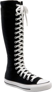
          Sneaker boots - Extend to the calf
          Sources

          Thursday, 16 January 2014

          OUGD501 - Lecture 11: Synthesis

          Aims

          • To provoke you into thinking about design rather than just 'doing it'
          • To encourage you to pursue issues in more depth
          • To form your own conclusions independently of practitioners and academics
          • To experiment with ideas to see if they work in practice

          Learning Outcomes

          • Knowledge & Understanding
          • Cognitive Skills
          • Practical & Professional Skills
          • Key Transferrable Skills
          • Knowledge & Understanding 2 - Synthesis

          PEST Analysis

          • Political
          • Economical
          • Social
          • Technological

          David Hoffman

          • Dead End Streets: Photography, Protest and Social Control
          • Variety of photographs - was exhibition
          • PEST Analysis - the way photography is used as a political took - about how technology is transforming our social relations with each other
          • Everyone has the ability to become a documentary photography because they have the tools to do it

          Synthesis

          • All component parts of the project engaging in one complex, dynamic process
          • Informed engagement
          • The realisation of theory in, and through, practice
          • PRAXIS

          The purpose of a theoretical discipline is the pursuit of truth through contemplation; its telos is the attainment of knowledge for its own sake. The purpose of the productive sciences is to make something, their telos is the production of some artefact. The practical disciplines are those scions which deal with ethical and political life; their telos is practical wisdom and knowledge. (Carr & Kemmis 1986:32)

          Kolb's Experiential Learning Theory


          • Practitioners are right to worry that academic study of what is essentially a hands-on subject removes it from the reality of practice.
          • Designers often work intuitively, without knowingly applying theory. This module aims to get you to reflect on that process.

          Thursday, 9 January 2014

          OUGD501 - Lecture 10: What Is Critical Analysis?

          Aims
          • To explore the meaning of critical analysis
          • To develop critical thinking and writing skills
          • To begin critically analysing some examples
          Definitions
          What is it?
          • `In academic terms, critical analysis means considering the claims of theorists, governments, authorities and so on, what they are based on, and how far they seem to apply or be relevant to a given situation.  (Univ of Sussex Language Institute (1998) Critical Analysis, Argument and Opinion. [online]  http://www.sussex.ac.uk/langc/skills/conc-det.html  [Accessed 28.06.04]
          Why use Critical Analysis?
          • Critical analysis is a key skill for writing essays
          • it allows you to assess the various ideas and information that you read, and decide whether you want to use them to support your points
          • it is something we do everyday when assessing the information around us and making reasoned decisions, for example whether to believe the claims made in TV adverts
          • it does not always mean disagreeing with something; you also need to be able to explain why you agree with arguments
          How does it work?

          Critical analysis involves:
          • Carefully considering an idea and weighing up the evidence supporting it to see if it is convincing
          • Then being able to explain why you find the evidence convincing or unconvincing.
          Bloom’s (1956) Hierarchy/Taxonomy of Thinking Skills
          Differences between descriptive and critical analytical writing
          Differences between descriptive and critical analytical writing
          Also involves analysis of images.
          Next image happened before 9/11.
          Natural reaction is that it is referencing 9/11, when really it is very different.
          If 9/11 didn't happen, the image probably wouldn't have been withdrawn.
          Some considerations …
          • Date?
          • What was happening at the time?  
          • Historical, social, political, economic factors etc.
          • What is it?
          • What is it for?
          • Who is the target audience?
          • Is it fit for purpose?
          • Who produced it?
          • Where was it produced?
          • Where was it designed to go?
          • Where is it now?
          • How was it produced?
          • Production techniques
          • Materials

          Practicing critical analysis
          • It helps if you ask yourself a series of questions 
          • about the material you are reading:
          • Who is the author and what is their viewpoint or bias?
          • Who is the audience and how does that influence the way information is presented?
          • What is the main message of the text?
          • What evidence has been used to support this main message?
          • Is the evidence convincing; are there any counter-arguments?
          • Do I agree with the text and why do I agree or disagree?
          How to get more critical analysis into your essay

          • Avoid unnecessary description – only include general background details and history when they add to your argument, e.g. to show a crucial cause and effect. Practice distinguishing between description (telling what happened) and analysis (judging why something happened).
          • Interpret your evidence – explain how and why your evidence supports your point. Interpretation is an important part of critical analysis, and you should not just rely on the evidence "speaking for itself”
          • Be specific - avoid making sweeping generalisations or points that are difficult to support without specific evidence. It is better to be more measured and tie your argument to precise examples or case studies.
          • Use counter-arguments to your advantage – if you find viewpoints that go against your own argument, don't ignore them. It strengthens an argument to include an opposing viewpoint and explain why it is not as convincing as your own line of reasoning.
          Writing Critically
          How do I criticise the work of established academics/practitioners? 

          • By reading other established academics/ practitioners that may have different views
          • By looking for practical evidence that may support or refute the established theory. 

          How can I criticise other’s work?

          • Check for logical coherency of the arguments.
          • May the author be biased?
          • Cultural, gender, professional biases, etc. 
          • Does the author clearly outline his/her theoretical base?
          • Are the author’s arguments supported by relevant evidence and other people’s work? 
          • Are the author’s methods trustworthy? 

          Is critical writing about criticising other’s work?

          • Yes but it is only a small part. 
          • It is also about:
          • Integrating different sources of information (books, articles, etc.) to provide a fuller picture of your topic. 
          • Giving an overview of your topic:
          • What are the key themes, arguments and conclusions?
          • How were they developed?
          • Do the authors in the area agree/disagree with each other?
          • What does the theory in your topic mean for practice? 
          • Providing practical evidence to illustrate and support your arguments. 
          Critical Analysis at work

          • Walter Benjamin, ‘The Work Of Art In The Age Of Mechanical Reproduction’, 1936
          ‘One might subsume the eliminated element in the term “aura” and go on to say: that which withers in the age of mechanical reproduction is the aura of the work of art. This is a symptomatic process whose significance points beyond the realm of art. One might generalize by saying: the technique of reproduction detaches the reproduced object from the domain of tradition. By making many reproductions it substitutes a plurality of copies for a unique existence. And in permitting the reproduction to meet the beholder or listener in his own particular situation, it reactivates the object reproduced. These two processes lead to a tremendous shattering of tradition which is the obverse of the contemporary crisis and renewal of mankind’
          ‘Even the most perfect reproduction of a work of art is lacking in one element: its presence in time and space, its unique existence at the place where it happens to be.  This unique existence of the work of art determined the history to which it was subject throughout the time of its existence.’

          Presence, Authenticity, Authority

          Monday, 23 December 2013

          OUGD504 - Design For Print & Web: Website Research

          When it came to starting designs for my website, I looked into a few other restaurant websites that were around, looking into the content which was on them and how this was displayed.

          Montagü
          The designer of this website has created it in a format that can be replicated easily onto any sized screen as it works in squares/rectangles to built the page up. Throughout the different responses each is maintaining very clear grid lines and not straying from these. This design also means that no gutters are needed between sections.
          I like this design because of how striking each page is. The concept behind the design is very simple, but uses bold images and white content boxes to contrast against one another and create a very clean, professional looking website.
          http://www.behance.net/gallery/Montague/11632237

          Oyler Market Barbecue & Brewery
          The branding of this restaurant is all monotone, and this is reflected through the website design. There is a mix of photographs, vectors and technical drawn elements, particularly in the phone App design. Everything is centralised and the information displayed is only the necessary information.
          I like this website design because of it's simplicity. The background is simple a photograph, and then the content boxes/content appears over the top. It is clearly a website built for it's purpose and not to have all the bells and whistles. The monotone also works well, especially when the information is in the white writing over dark images.
           
          http://www.behance.net/gallery/Oyler-Market-Barbecue-Brewery/12801457

          Daffodil Cottage Cafe
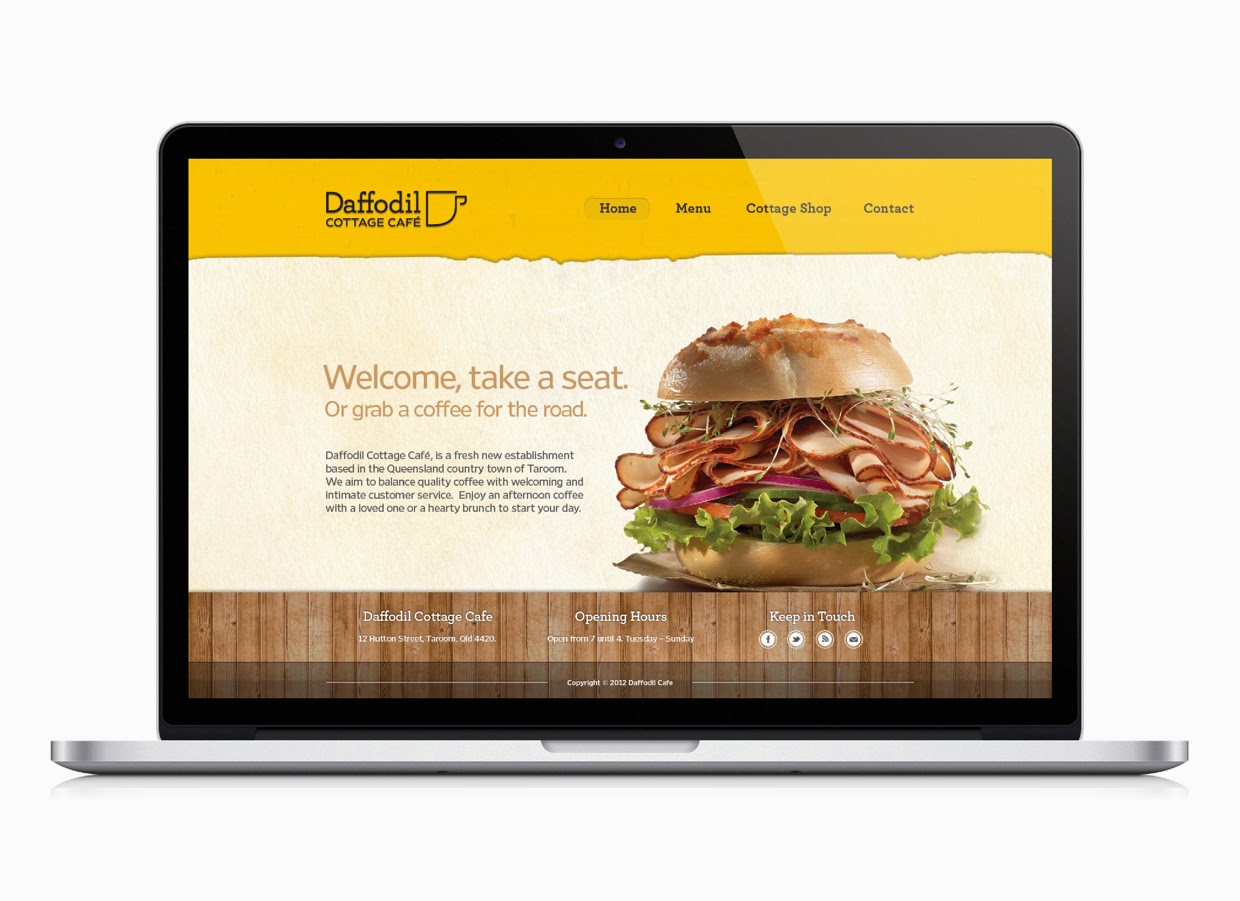
          The design for this website is different from the two above because it is built to look a lot more homely and welcoming than them. There is still a clear grid to the way these pages have been built, but the content within the pages is what is making it a lot more of a clean design. The App has an interesting idea where users can take photos of their purchases, so this is one of the better parts of the design.
          I am not too keen on this website because I prefer the more professional and striking ones, but it does show how a more relaxed and laid back approach to a website.
          http://thomasbutler.prosite.com/93772/836856/projects/daffodil-cafe

          Savini Gusto
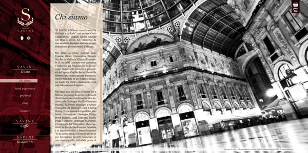
          This design of website reflects the professionalism of the restaurant itself. It is structured in a clear way and keeps the same format for every page, just the content box spreading across depending on the page. The deep red of the navigation bar makes it obvious to the viewer that this is the most important element on the page, and makes it stand out against the content and background images.
          I like the initial first page, however I'm not a huge fan of the content moving out from the side. In this instance it does work because of the context, but I would prefer the information to be central.
           
          http://www.behance.net/gallery/Savini-Gusto/10314831

          Common Man
          This is the homepage for the Common Man restaurant. It has a very simple layout, which works very well because of the contrast of the text to the images, and then the images to the background. It is all central and all fits onto one page so there is no scrolling necessary.
          I like the way the rollover buttons work, changing colour dramatically and bringing that image to the forefront of the website against the brown. I like these buttons in general as not many websites use images like this for the links.
          http://www.josipkelava.com/41371/505875/gallery/common-man-restaurant

          Tequila Grill
          Once again this website uses images as the background to the pages. The navigation bar on this website is fixed and in the orange, which stands out against any of the images used in the background. The way the logo has been incorporated into the bar makes the whole website look very fluent as none of it looks just cut and paste.
          Overall I'm not too keen on the website, however I do like the way the headings have been put onto the pages, with the bold white around them to make them stand out. I also like the way the navigation bar has been put together to work with the rest of the page.
           
          http://www.behance.net/gallery/Tequila-Grill/11862641

          Mundo Cafe & Bakery
          This website works on a clear grid system with all the content centralised on every device is it used on. The colours used are quite earthy and natural as it is for a cafe & bakery. It reflects the quality of the products served.
          I like the simplicity of the layout and how drawn images and photographs are incorporated into the design to create a very clean and professional, but contemporary website design.
          http://giselabeer.com/Mundo-Cafe-Bakery

          After this I started looking into some websites which had elements that I found visually appealing.

          Horten Hus
          I like the general layout of this website. There's a lot of space and everything isn't crammed in small spaces close together. It works to a clear grid system and doesn't have so much information on each page. I also like the way the navigation works on this website, with an initial four icons and then the larger navigation bar which opens when clicked on. It is all very clean and simply laid out so it is very easy to navigate and look around.

          http://www.hortenhus.no


          Metta Skincare
          I like this one because of the simplicity of it. A navigation bar along the top, and then one larger image with a bit on text on explaining the purpose of the website. I like this use of photography, using the white space in it to place the text there. Moving onto the content pages, the information is displayed very simply with a large amount of space around the content. It makes everything much easier to focus on and view.
          http://www.mettaskincare.com/partners/

          House Creative
          I chose this one because of the layout. This website holds a large amount of information but has displayed it in a simple and easy to navigate way, with a lot of large clear links onto other pages. This website also doesn't have much of an emphasis on the navigation. It is only a small bar along the top.
          http://www.housecreative.co.uk

          Demi Creative
          I like this website because it combines simple design and photographic images. It uses different colours to differentiate the pages from one another, and when scrolling down the page, it goes through different tones of that colour, breaking up the information into readable sections. This is a much more interesting way of displaying information than just having it sat on the page all together, it encourages the user to scroll through.
          http://demicreative.com

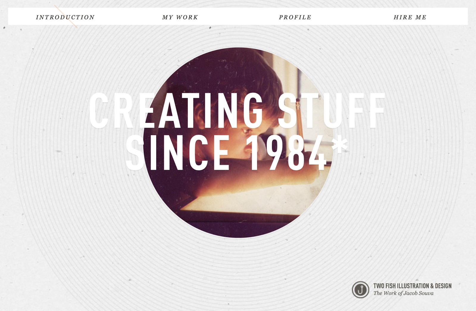
          Two Fish Illustration & Design
          I like this website because of the lack of colour on it. It keeps everything quite monotone, apart from the image which is in colour and stands out against the rest of the page. The main feature of this website that I like is that it is a completely linear website and all the information is on one scrollable page.
           
          http://twofishillustration.com

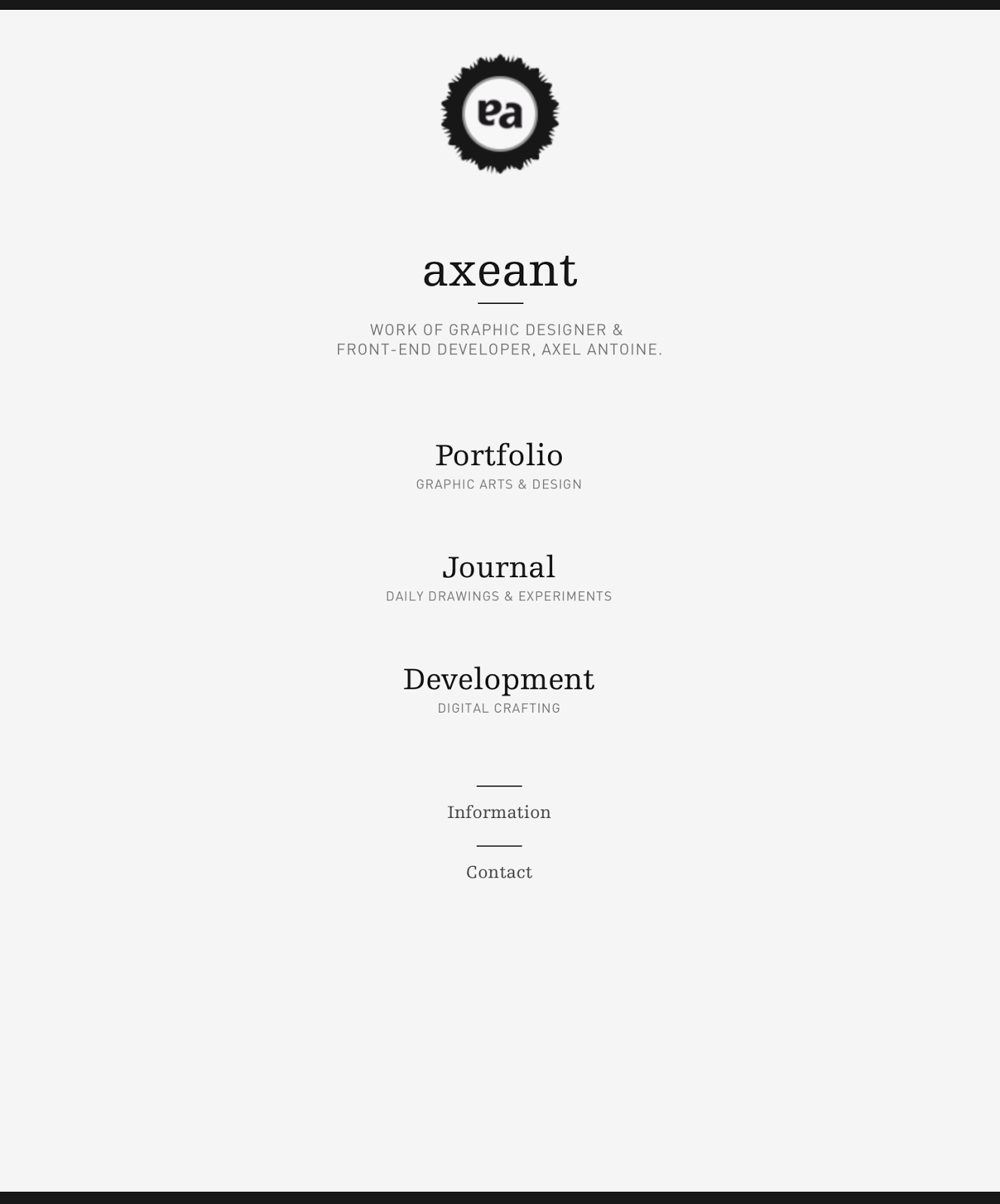
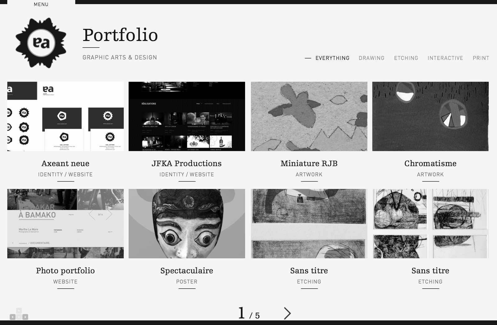
          Axeant
          I like this website because of how simple the homepage is. There isn't any noise and each link is given a large amount of space on the page. This website definitely works more for function than form, and doesn't have anything that isn't necessary.
          http://www.axeant.net

          MediaBoom
          This website is a bit showy at first, with a big video introduction, but when looking through the pages I found I did like the overall layout of information. The navigation bar is easy to use, with all the options appearing when a link of hovered over, and a lot of icons around the place relating to different content.
          The things I don't like about this website is how long it takes to load. The designer has packed it full with a lot of effects and moving images behind each page which makes it very inconvenient for the user.
          http://mediaboom.com

          I then looked at what these websites looked like on a phone & tablet to see the difference in design.
          Horten Hus
          iPhone:
          The adaptation of the website to the iPhone screen size is an obvious one, where it has kept the same design features as the website, but displayed them in ways that are much more user-friendly at this screen size. The icons have now become clear buttons and the format has been changed to suit the orientation of the screen.What I like the most about this design is the navigation. I like this on the original website and like the simple way they have adapted it to this screen size. Overall the initial website is designed with easily adaptable content, which has definitely made this much easier for the smaller screen sizes.

          iPad:
          The iPad site is much the same as the website visually. It is identical, but with this screen size it still works well because of how simple the original design is to begin with.

          Metta Skincare
          iPhone:
          There isn't much change to the website in terms of adapting it to this screen size. The one noticeable different is the top menu bar. On the website there are a number of links, but on this one there is only two. Clicking on the 'menu' brings up the rest of the options for this website. The initial website is quite simple so adapting it to this screen is something that was very easy.
          However something I don't like about the design is when it gets down to the picture links. These work ok on a portrait screen, however on a landscape orientation these become as large as the screen and suddenly you only have one link on the page instead of having all three. This seems pointless and an inconvenience to the user as they now have to scroll through to get the next link.

          iPad:
          The adaptation to the iPad is exactly the same as the iPhone. The only difference is that when in a landscape orientation the website is immediately the original desktop website, with the full navigation restored. Once again I have a problem with the picture links, but this time on the portrait orientation. Like on the iPhone these fill up to the edges of the screen, which isn't really necessary. On the phone as it is much thinner it works ok, but on this screen size it seems pointless, especially when it is a larger size where these can be viewed just as easily at a smaller scale.

          House Creative
          iPhone:
          The adaptation to the phone screen isn't something I am overly impressed with. On a desktop it works well, but at this size, the large heading pushed the rest of the information off the page, which isn't exactly a good use of space. Another issue is the navigation bar on a portrait orientation. The buttons become very small and hard to use without having to zoom in.
          The 'work' page works well on a portrait orientation, but on a landscape one it doesn't really because the image is the width of the screen, meaning you can't see all of it without scrolling through it.

          iPad:
          This iPad version of the website isn't much different from the original, however something that does annoy me is the navigation bar again. While they have the chance to make it larger and easier for a user, they haven't. The text is small and in turn quite hard to use. However the layout of the 'work' page is much better on a landscape orientation than the phone as you can see the full image easily.

          Demi Creative
          iPhone:
          The designer of this website has clearly thought about how it will adapt to a phone screen. Instead of having the title in the navigation bar, it is replaced with a small logo instead, which means the words can be larger and easier to use instead. It is very similar to the original website because it is of a design that can easily be adapted. It works well on a portrait screen, but less so on a landscape one. The information is displayed well on both, but the 'work' links aren't entirely suitable for a landscape page as it only fits barely two at a time.

          iPad:
          This adaptation is like the desktop website, however slightly changes on the 'work' page with the links, making it much more efficient for use of space and for the user to see everything at once. The website is built in a way of having a few main pages and then a linear system through each of these, making it easy to apply and adapt the content to any screen size, as shown here.

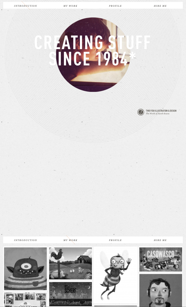
          Two Fish Illustration & Design
          iPhone:
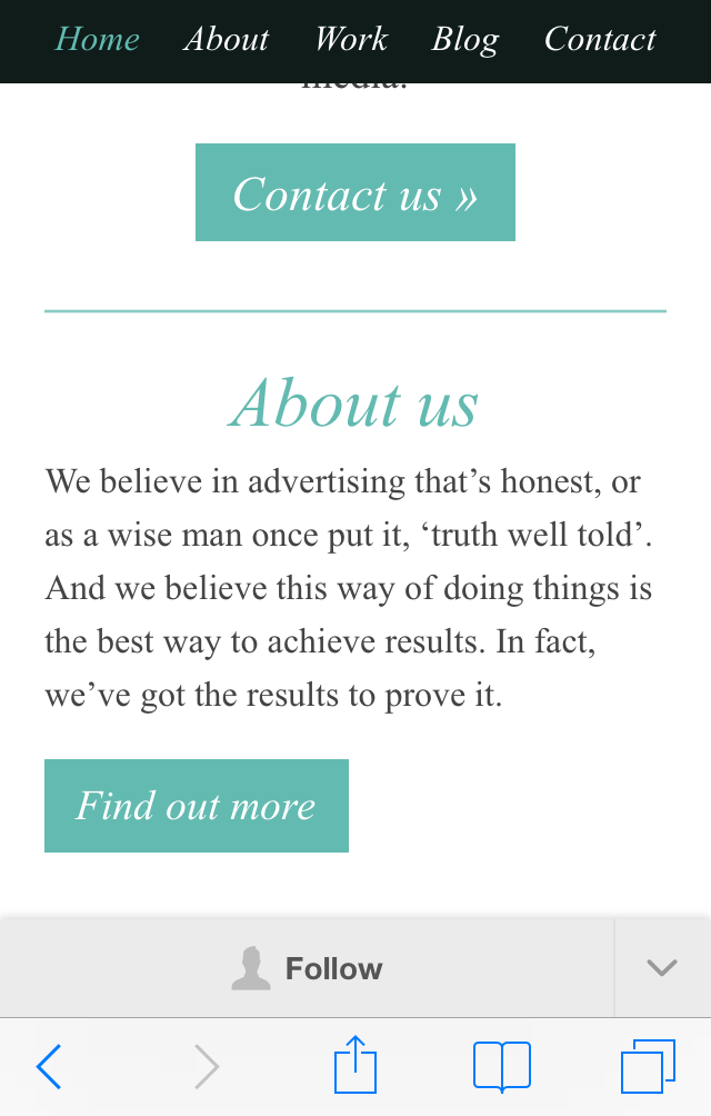
          This is a clear example of a website that hasn't been changed it any way to suit the screen size of a phone. It is exactly the same layout as on the desktop, which isn't necessarily a bad thing in some cases, but when it comes to putting the website portrait on a small screen there are some issues. The use of space isn't very good, as shown above. There is a huge gap, which could be easily used up so there could be a clearer and larger navigation bar. Also the way the work is displayed makes it hard for a viewer to see the images at a good quality.

          iPad:
          On this larger screen size the website works ok, but there is still the issue of the large gap, which could be used for expanding the navigation bar. The website could definitely benefit from being redesigned for a different screen size.

          Axeant
          iPhone:
          This website shows a clear change from the desktop version to the phone version. The layout is different throughout and has been designed to be more useful for the user. The adding of the menu bar makes it especially easy to the user, and the layout for the content is much more driven to a smaller screen.

          iPad:
          The adaptation to the tablet screen is interesting because it is a mix between the desktop version and the phone version. It shows how a website should be designed for different screen sizes and uses, the desktop with all the bells and whistles, and then that content narrowed down for the tablet, and narrowed down further for a smaller screen.
          The menu selection on the landscape orientation is an added feature that isn't on either of the others, showing that there has been some consideration into adding new features and measures to ensure usability is at the easiest it can be.

          MediaBoom
          iPhone:
          I was a bit skeptical as to how this website would adapt to the smaller screen size as it really is a website that goes all out with all the features, with videos and moving images on the background of every page. However I found that this responsive size was much simpler and cut out all of that, just having the base website and the information on it. It worked well at both orientations though I do think the navigation on the portrait orientation could be bigger. But overall it works well and fits to the page nicely.

          iPad:
          Like the phone screen size this fits nicely to the size and keeps a consistent grid system throughout each of the pages, with each to read information. As the screen is larger the small navigation isn't so much of a problem, but still could be improved for usage.

          Looking into the phone/tablet versions of these websites has been helpful as it has shown me the big do's and don't's of designing for different screen sizes. Using the websites on my devices was extremely helpful as well as I was the user of these websites and went through all the pages, noting the problems with each and the inconveniences to me as the user. This helps me as a designer because I can now design around those ideas and try avoid as many of these problems as possible.
          The biggest problem I found was the navigation on some of these websites weren't adapted correctly for the screen size. It seems some have been designed depending on the pixel size of the screen instead of the reality of what they would be displayed on, with some of the menu bars being ridiculously small on a phone screen, making them very hard to use without zooming in. Also the use of large images is something to avoid if a user is looking at the website on a small screen at a landscape orientation. Having them fill the width of the screen causes it to be very hard to look at it as a whole, especially without the option to zoom out.
          The elements that did work were the websites that made changes to clearly adapt to the screen sizes and had thought about the devices themselves and how they are used. Where the menu bars have been increased in size or turned into buttons rather than words were much easier to use and navigate through the website.